TypeMedia is an intensive one year master program held at The Royal Academy of Art, The Hague in The Netherlands, that gives participants the possibility of delving deeper in the field of type design. At TypeMedia, students work intensively in small groups under the guidance of expert and enthusiastic teachers from the permanent and visiting faculty. Courses include calligraphy exercises, stone carving, non-latin scripts, the creation of typeface revivals, Python programming, the usage of state of the art font editing software as well as sketching techniques all leading up to the creation of new letters. The original typeface families exhibited on this website are the result of the final four months of the course. For more information, please visit the TypeMedia website.
This year’s students would like to thank the regular teachers, visiting teachers and supervisors at TypeMedia for their incredible help, support and commitment: Françoise Berserik, Peter Biľak, Erik van Blokland, Petr van Blokland, Frank E. Blokland, Marja van der Burgh, Paul van der Laan, Just van Rossum, Fred Smeijers, Jan Willem Stas, Peter Verheul and our external examiner Phil Baines.
The guest critics and instructors who graciously gave us their time and valuable feedback: Paul Barnes, Tobias Frere-Jones, Frank Grießhammer and Luc(as) de Groot.
And finally, a big thank you to all the people who helped us with their applications, scripts, books, replies and everything else to make this easier and doable, as well as all the foosball table backers.
Website developed by Benedikt Bramböck, Bahman Eslami and Loris Olivier with additional help from Alexandre Saumier Demers. Interpolation video using Drawbot by Bahman Eslami. Text set in Output designed by David Jonathan Ross, soon to be distributed by Font Bureau.
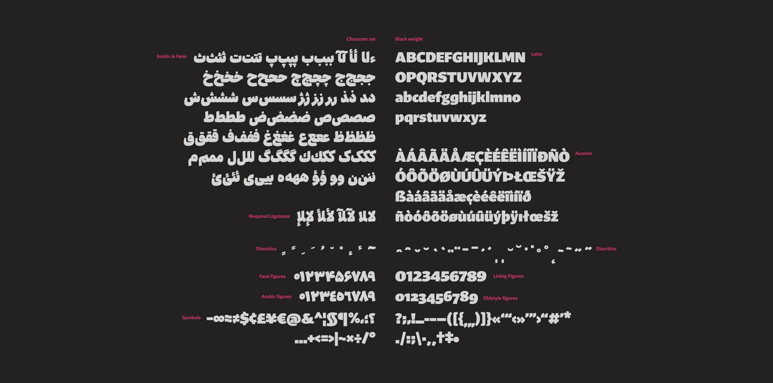
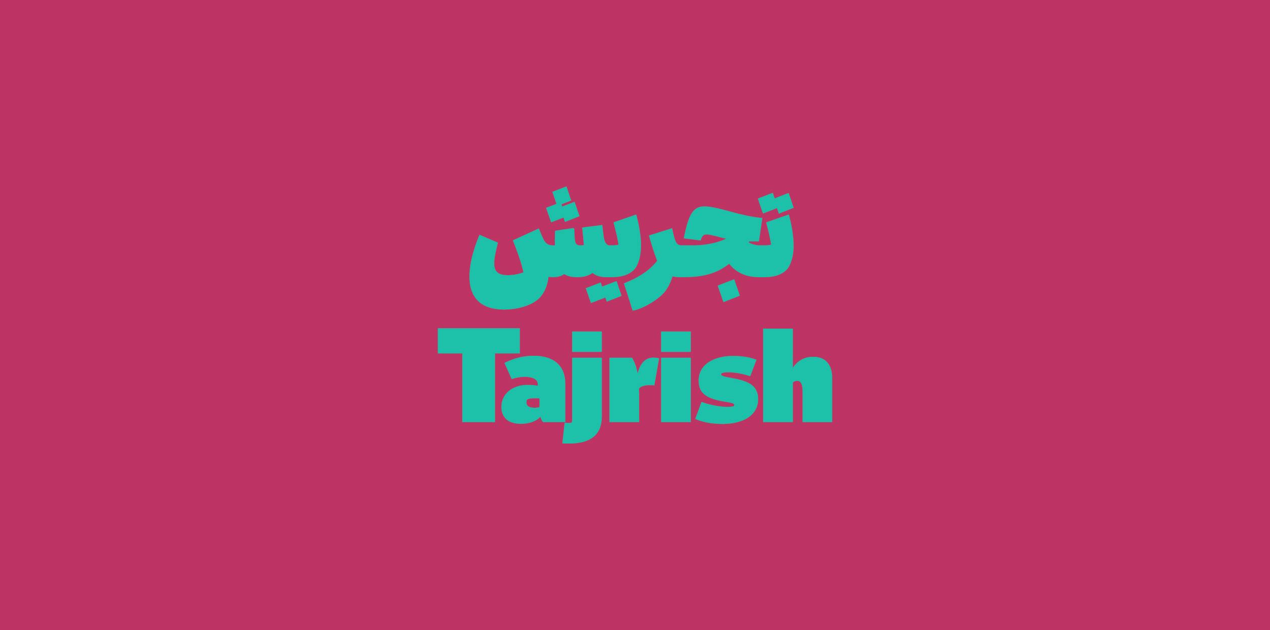
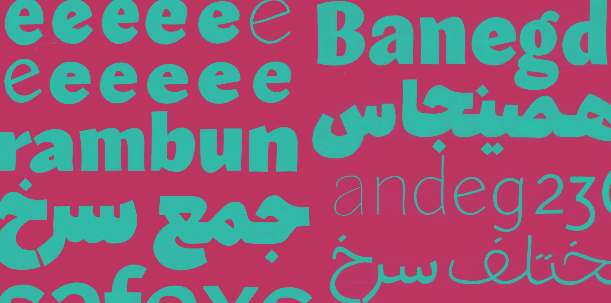
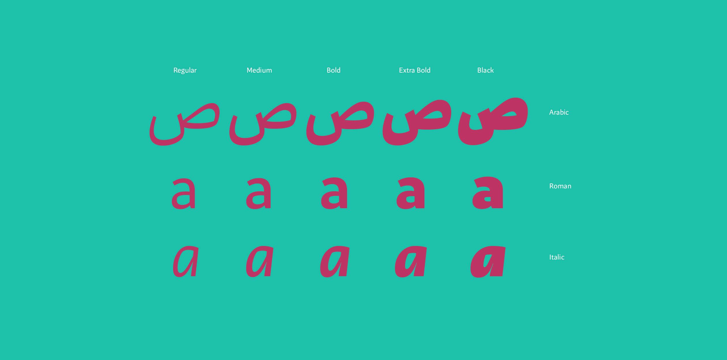
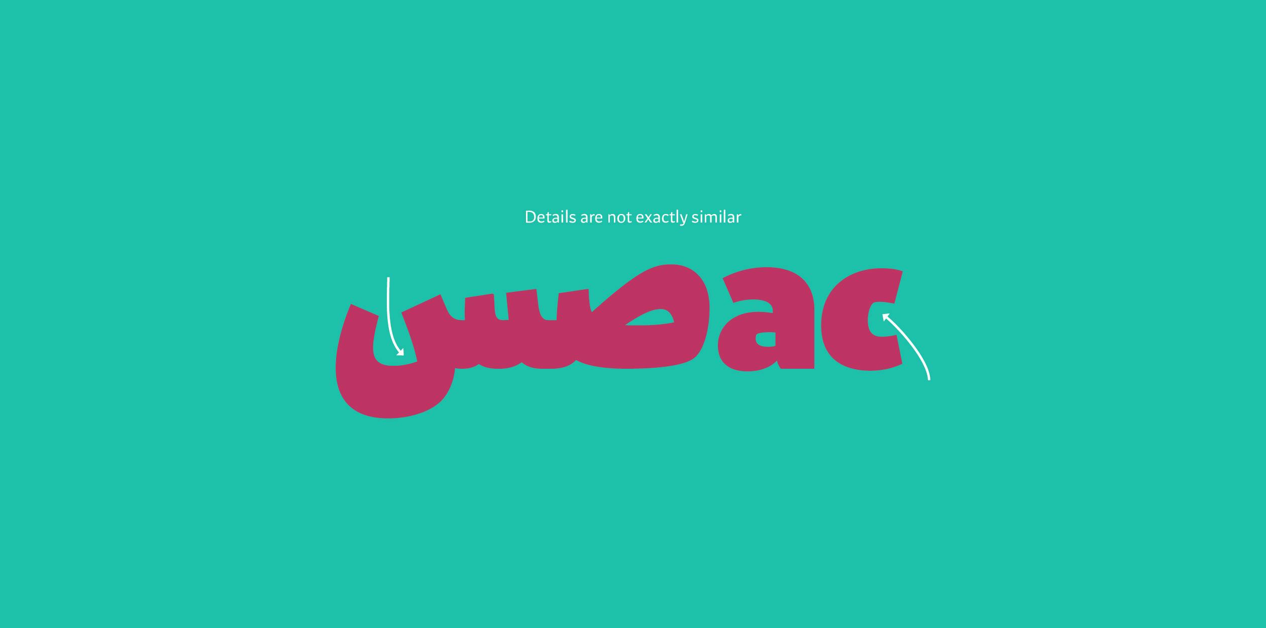
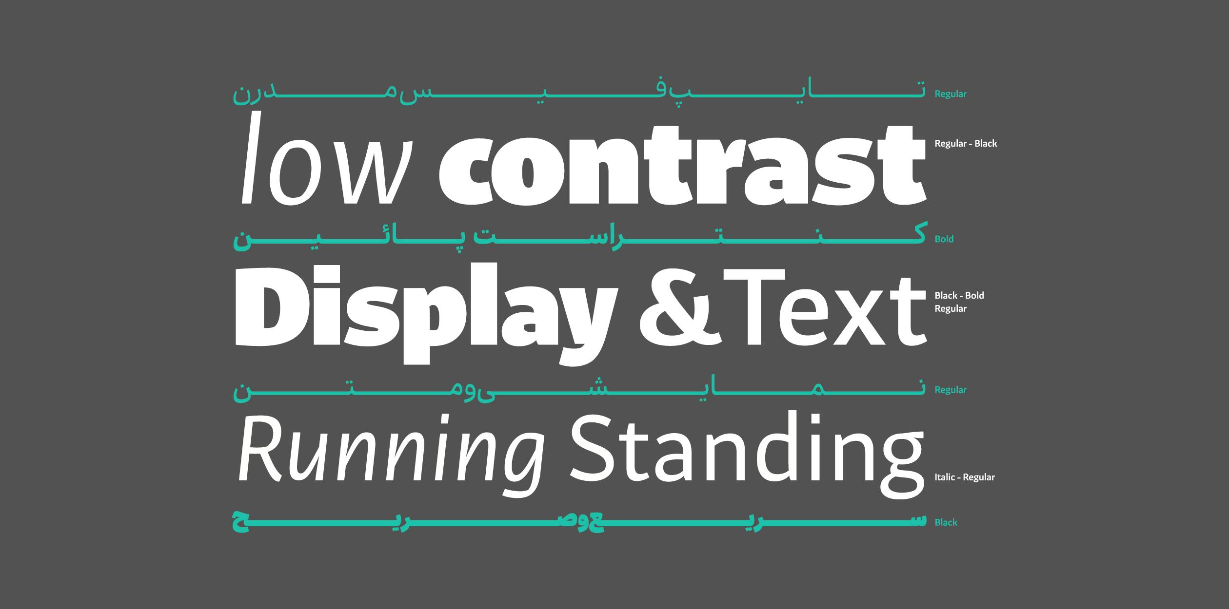
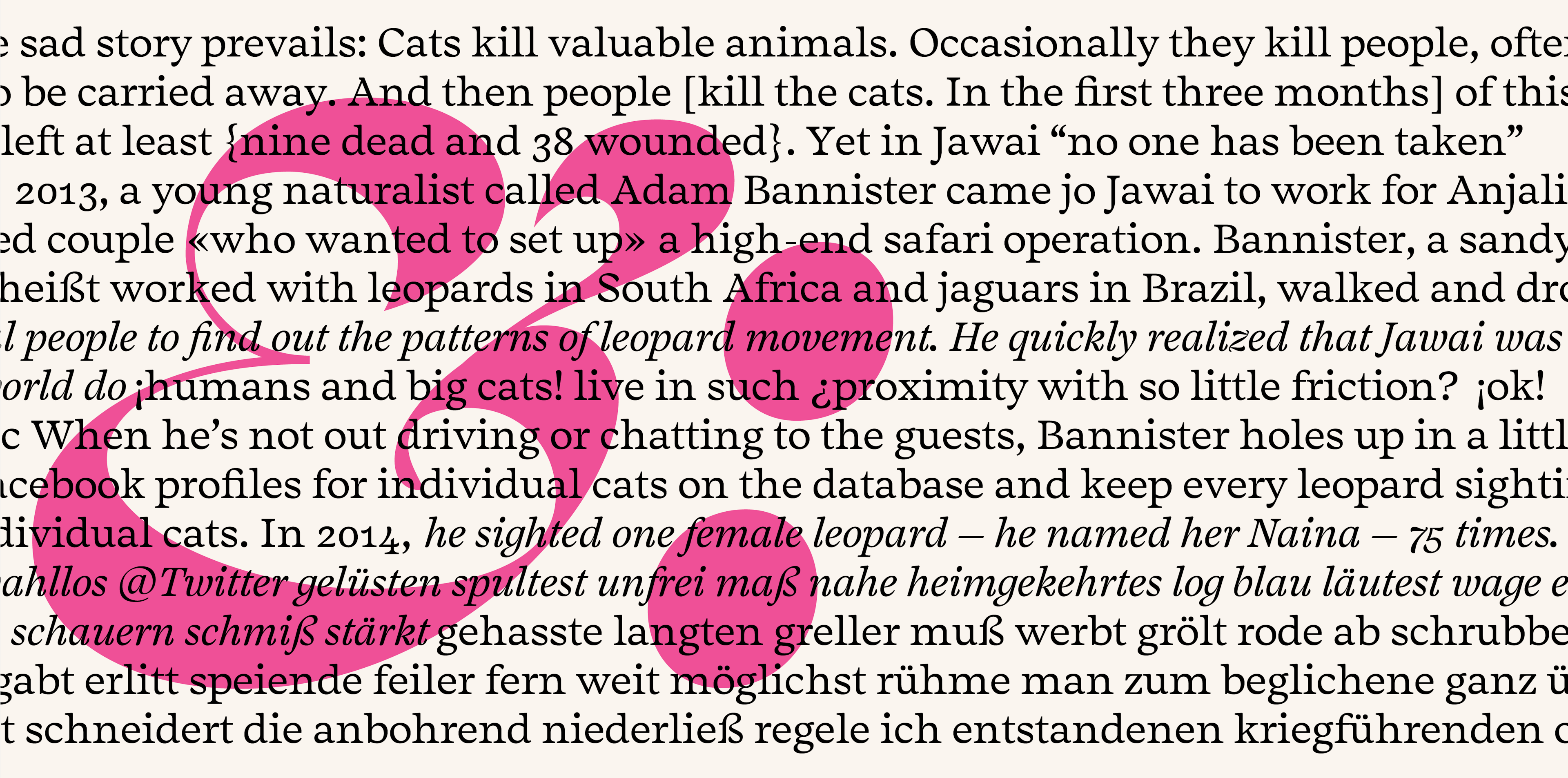
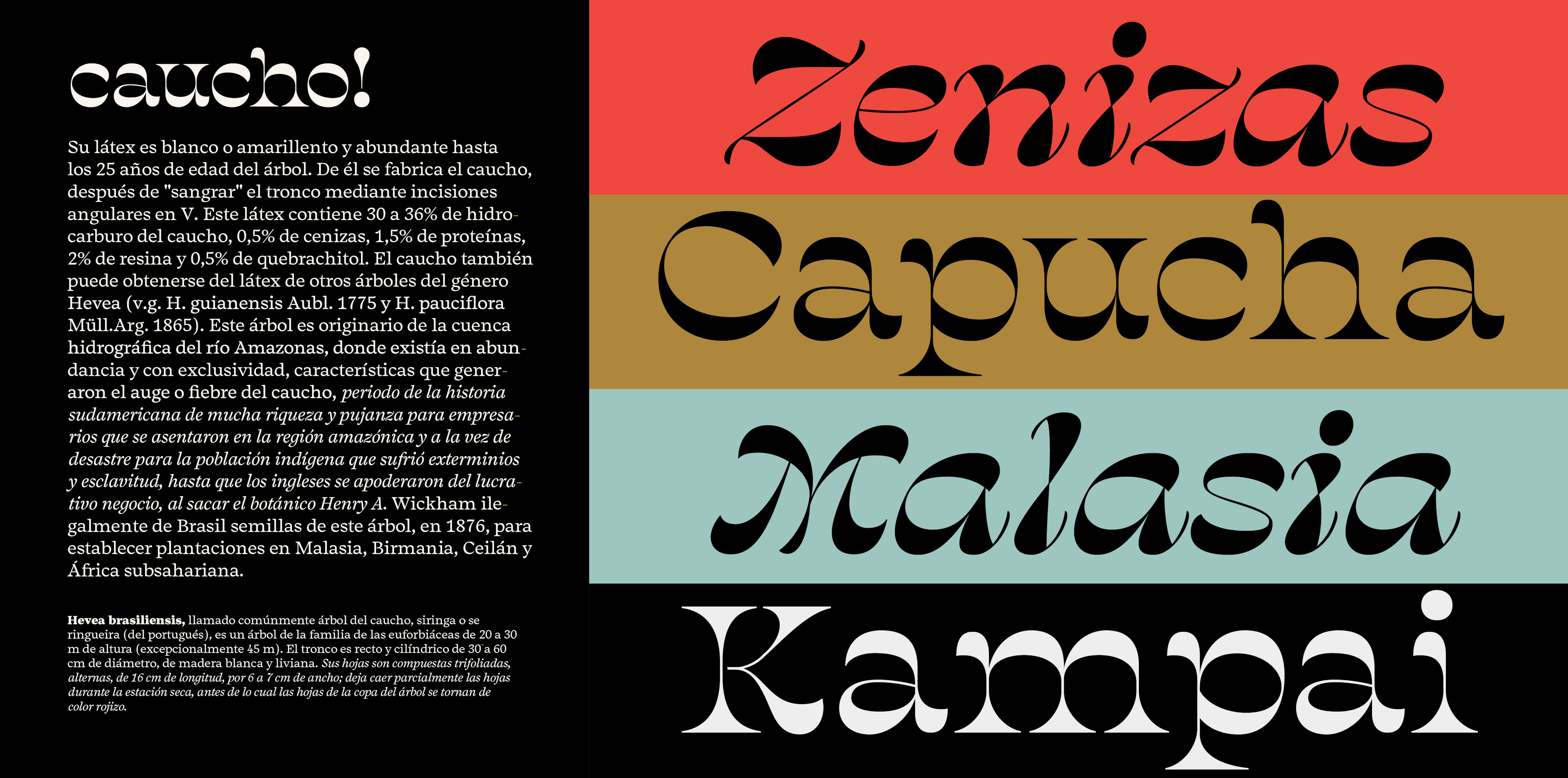
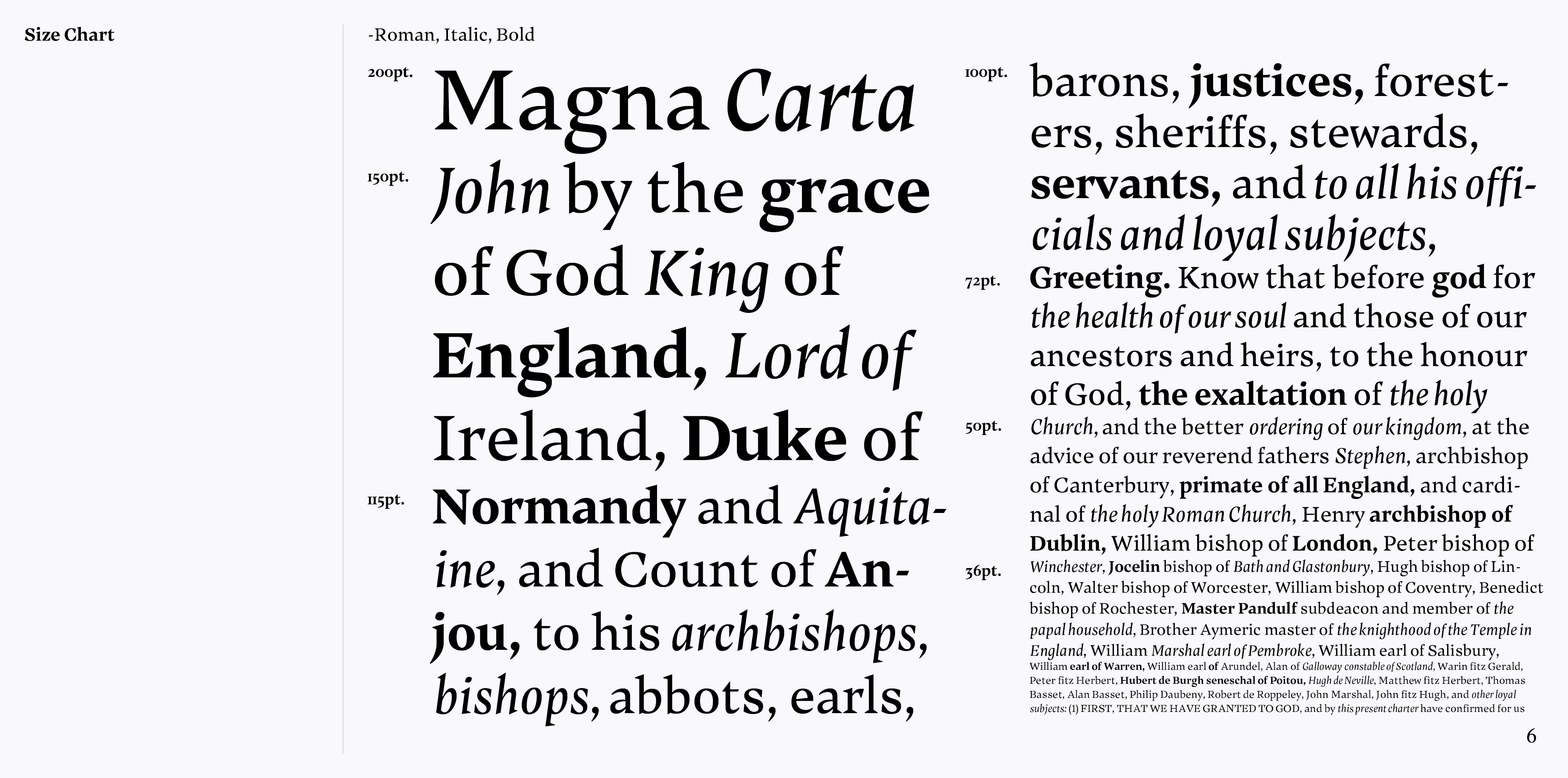
Tajrish is designed for running text set in Arabic with Latin mixed inside. Usage of Latin is getting more frequent inside Arabic and Persian articles nowadays and having a typeface that makes the task of setting a text inside these contents a cakewalk is a great advantage. Tajrish is designed to give same impression to the native readers in both scripts which is a modern text typeface with some calligraphic touch. It also has heavy weights for titling and display usage. The contrast and weight of the two scripts are carefully tuned to create a seamless continuous flow while it’s set in text and heavy titles. In Latin script, low contrast typefaces have longer history than in Arabic. In spite of the fact that many text typeface in Latin are derived form calligraphy like broad nib pen, you can’t see sharp corners and angle of pen in bottom of letters. So details of broad nib pen are not visible in the Latin part of this typeface because bringing those details would cause distractions in text. Although these details are visible in the italic style, because the style is cursive and it’s suppose to be more expressive and also this details connects the Latin part more to the Arabic part of the typeface. But in Arabic script, even in the most common text typefaces these details are visible, even the angle of pen is evident in terminals of some letters. So these details are also brought into the Arabic part to make sure the two typeface create same impression on native readers. The typeface could be used for many settings which has modern connotations also with traditional background like scientific articles, weblogs and advertising.
Bahman Eslami is a Graphic Designer specialized in Motion Design born 1985. Before TypeMedia he worked mostly with advertising agencies to create TV commercials and Identities. He has also designed the award wining typeface “Harir” which has been published through Typotheque since 2013.
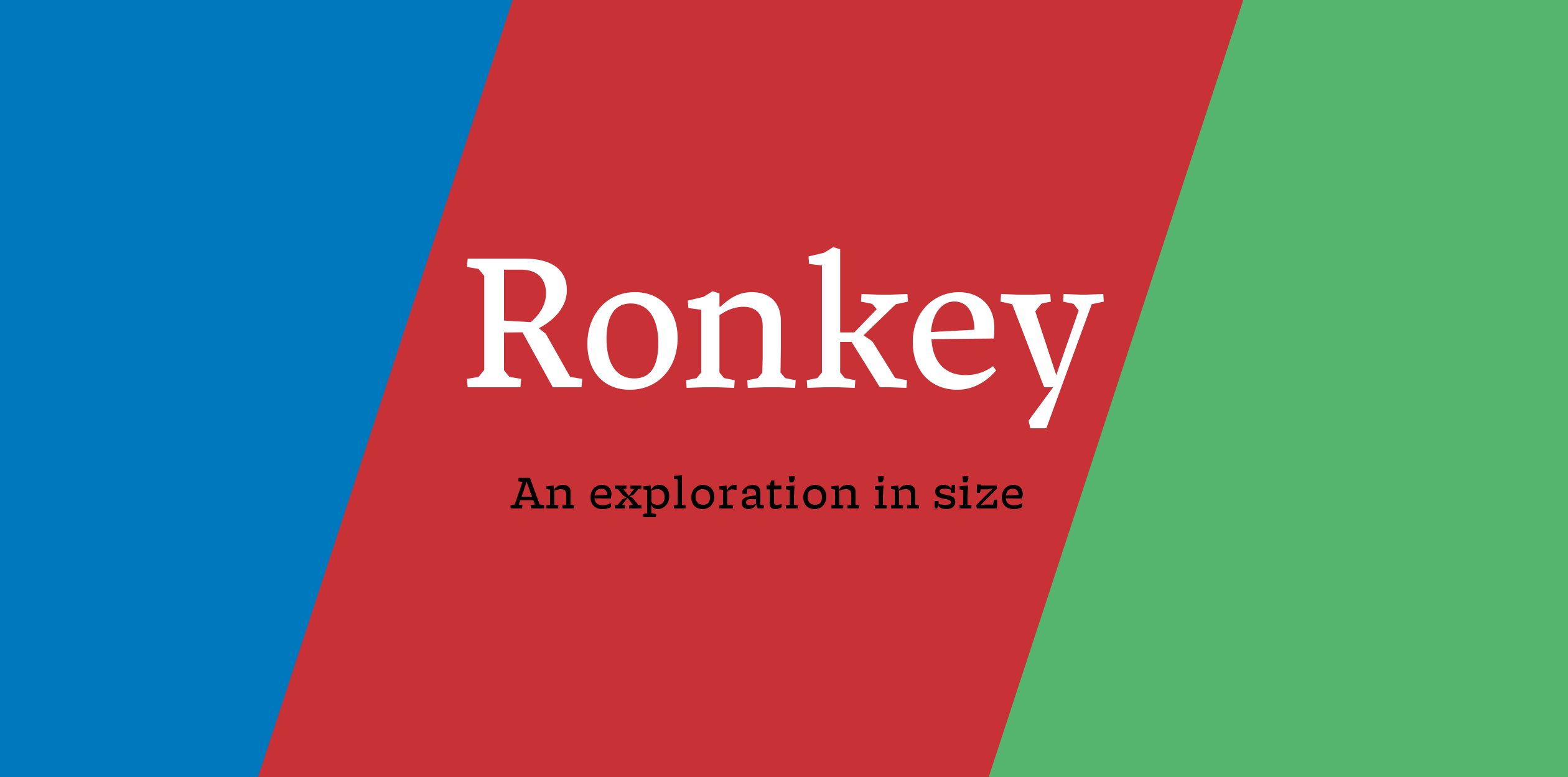
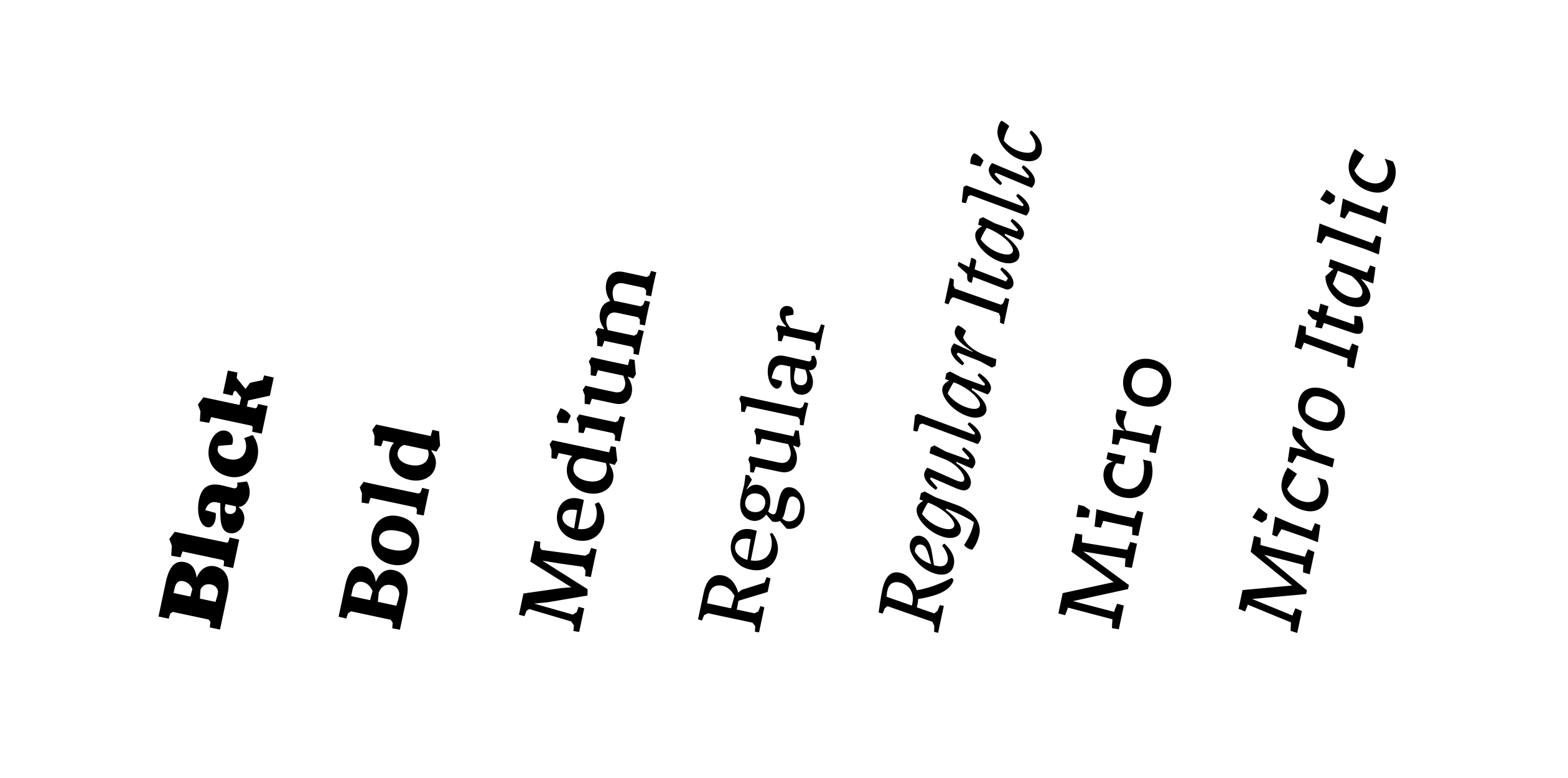
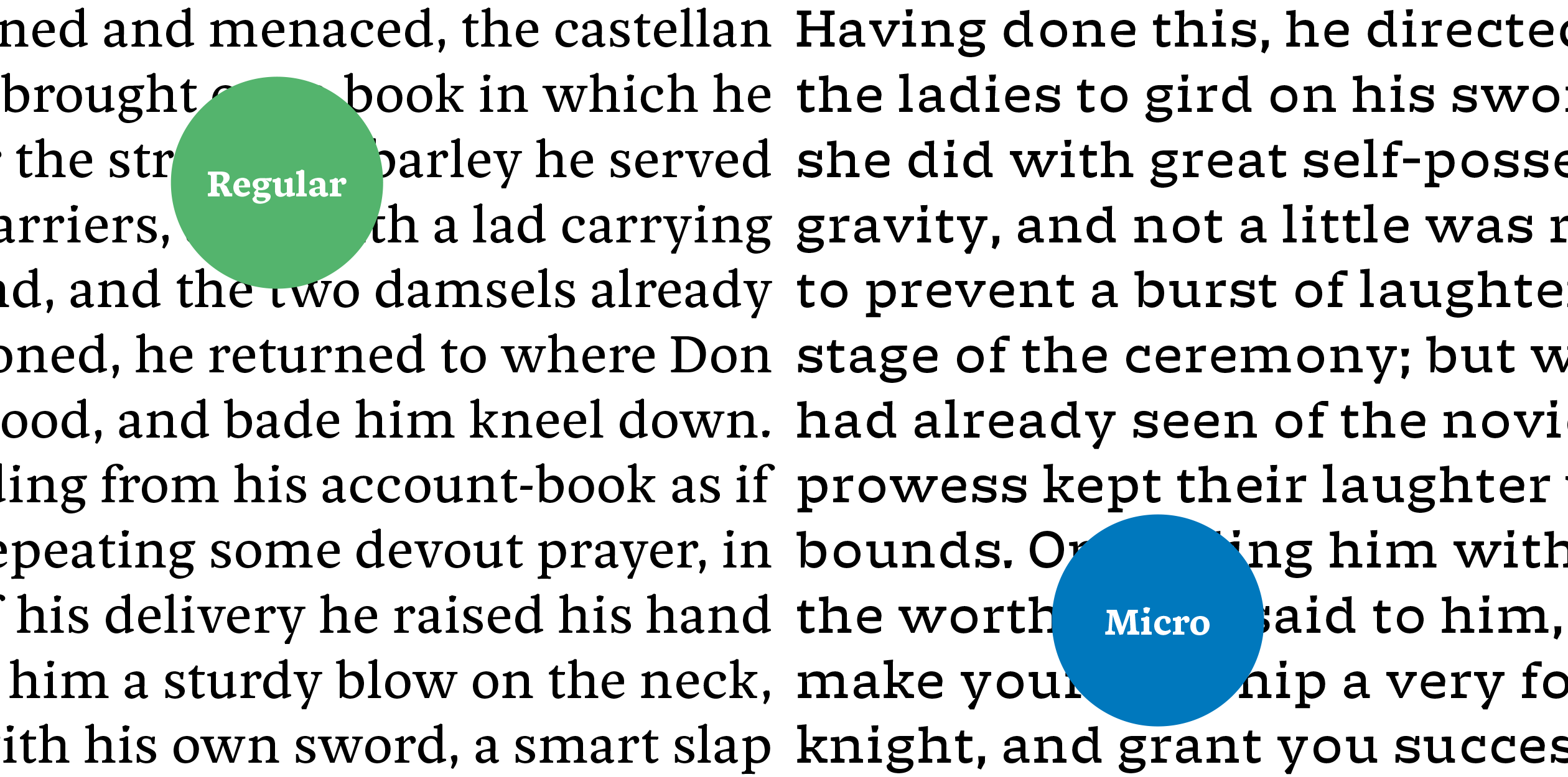

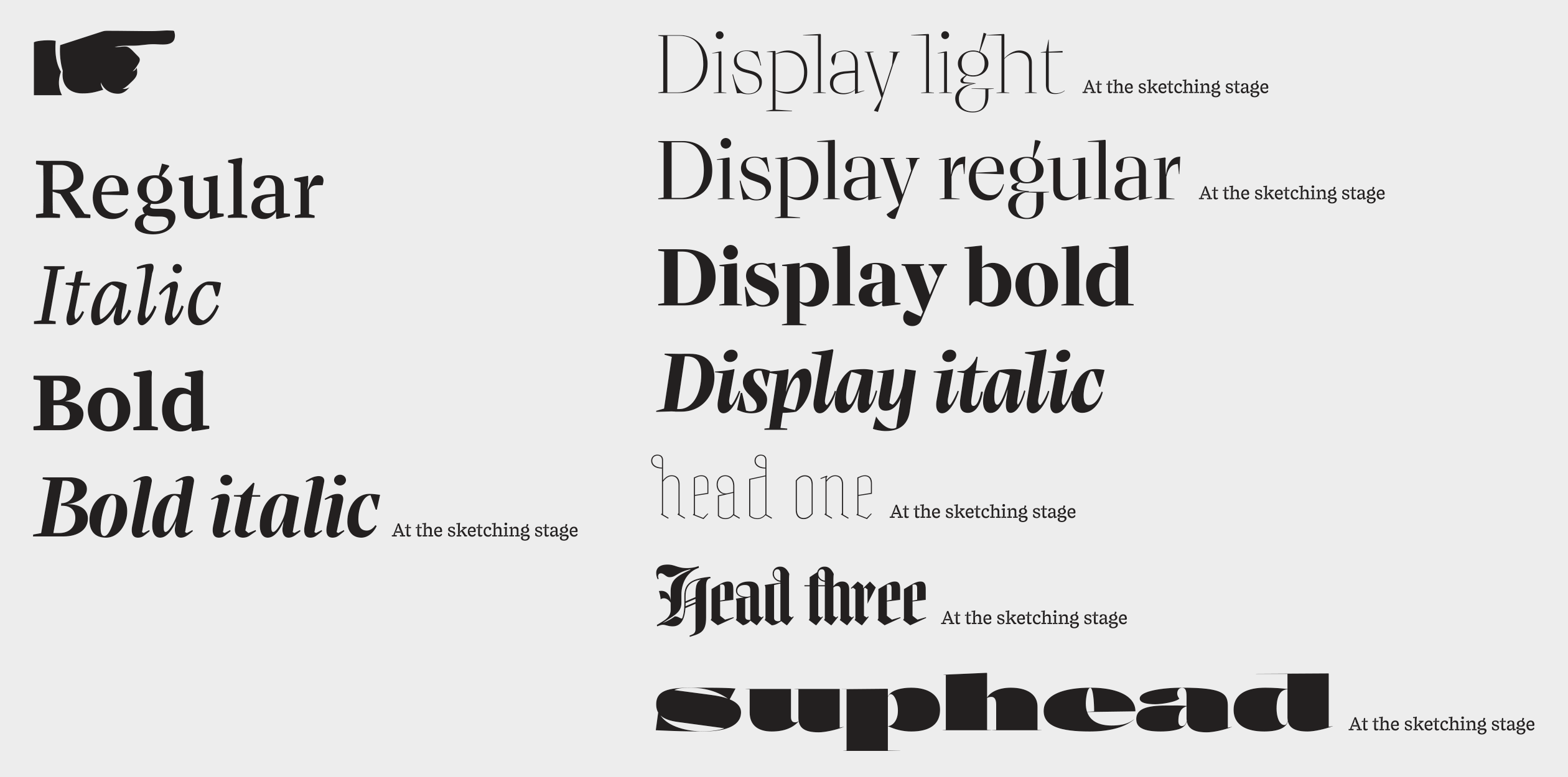
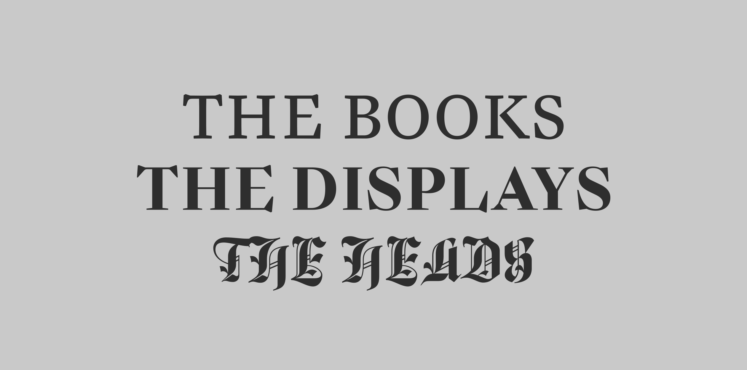
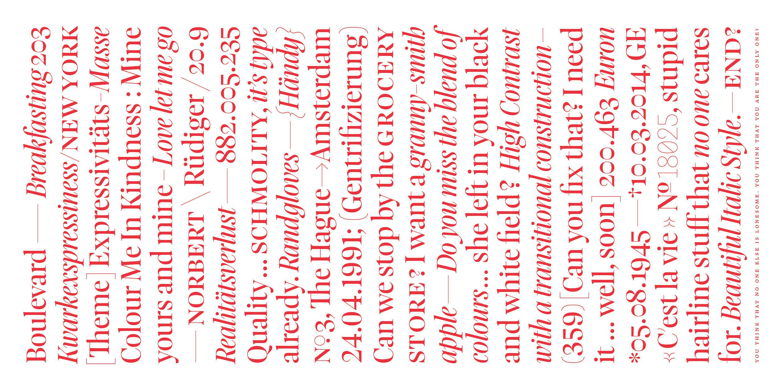
Departing from the classic family structure, Ronkey is an exploration into form, abstraction and size. The design’s hub is the Regular, a modest and versatile serif with angular details, suitable for longer pieces of text, which — if required — can be accompanied by a slightly flamboyant Italic. The Black finds its own voice by embarking on a journey into the more slab serifed fields of type, and also opens up the spectrum for 2 additional interpolated weights. Wide letterforms, rough shapes and generous spacing are the most striking features of the Micro, tailored primarily to perform well below 7 points or 25 arcminutes, for everyone familiar with Size Calculator. These shapes, along with an experimental proposal for a Micro Italic, are the result of wide-ranging experiments using varying distances and media, constantly questioning the conventions of how to design and set small type. The Micro is not only an abstracted version of the Regular (while still sharing the same x-height and vertical stem width), it is also its supportive companion when being juxtaposed in a design, adding another layer of flexibility and character.
Benedikt’s interest for type sparkled while studying Visual Communication in Dornbirn, Austria and Lucerne, Switzerland. After graduating in 2011, he moved to Berlin to work in the fields of exhibition design, graphic design and type. Besides working independently, he also spent 18 months at Fontshop International, taking good care of the FontFont library. To immerse further into the craft of designing type himself, he moved to The Hague for the TypeMedia master program.
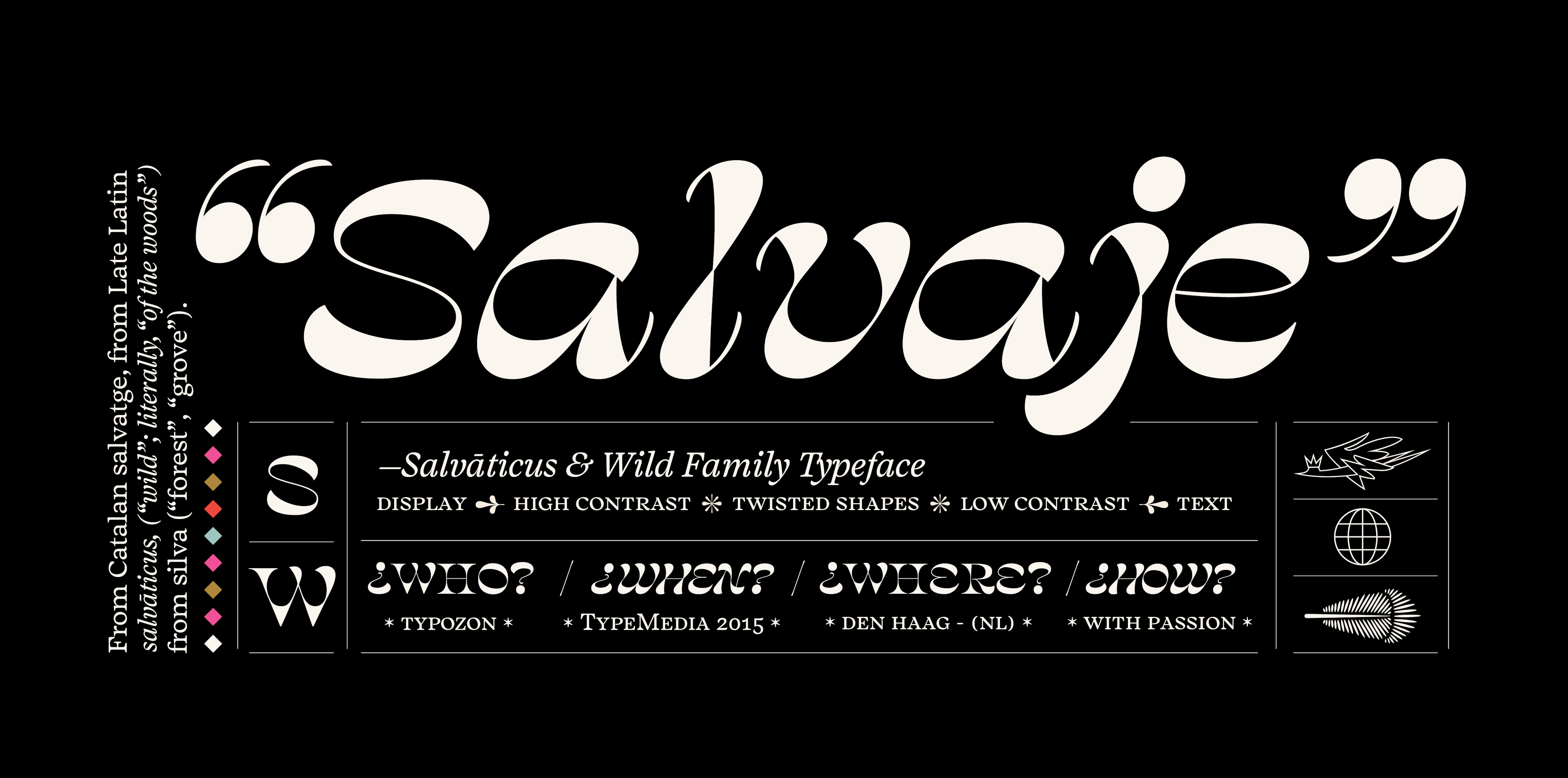
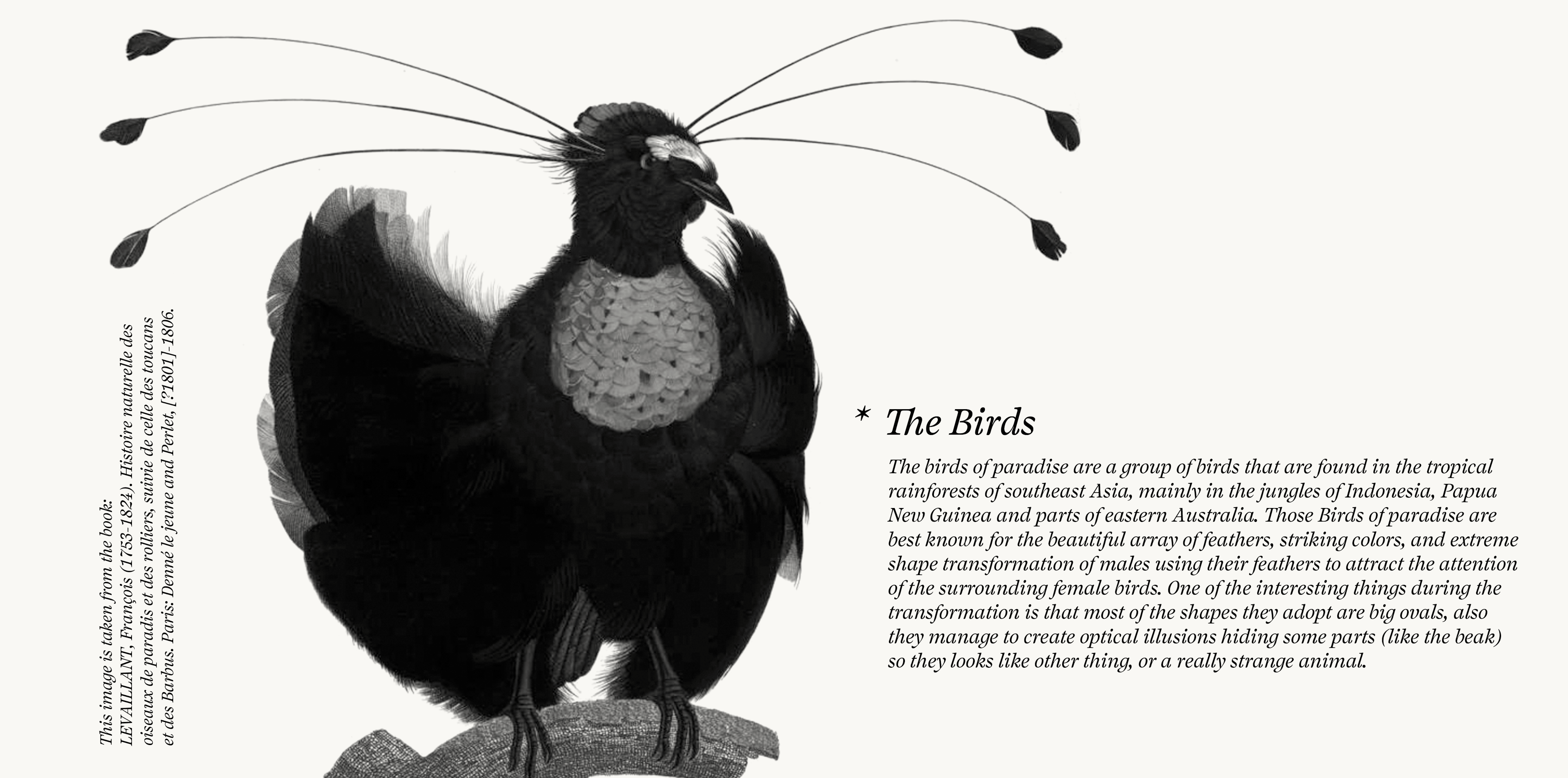
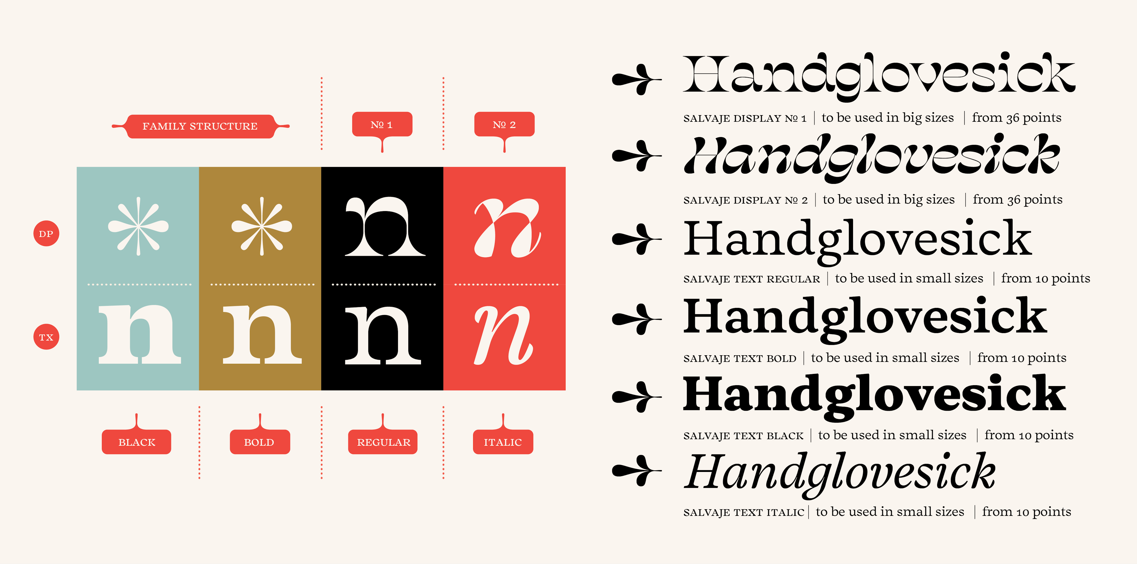
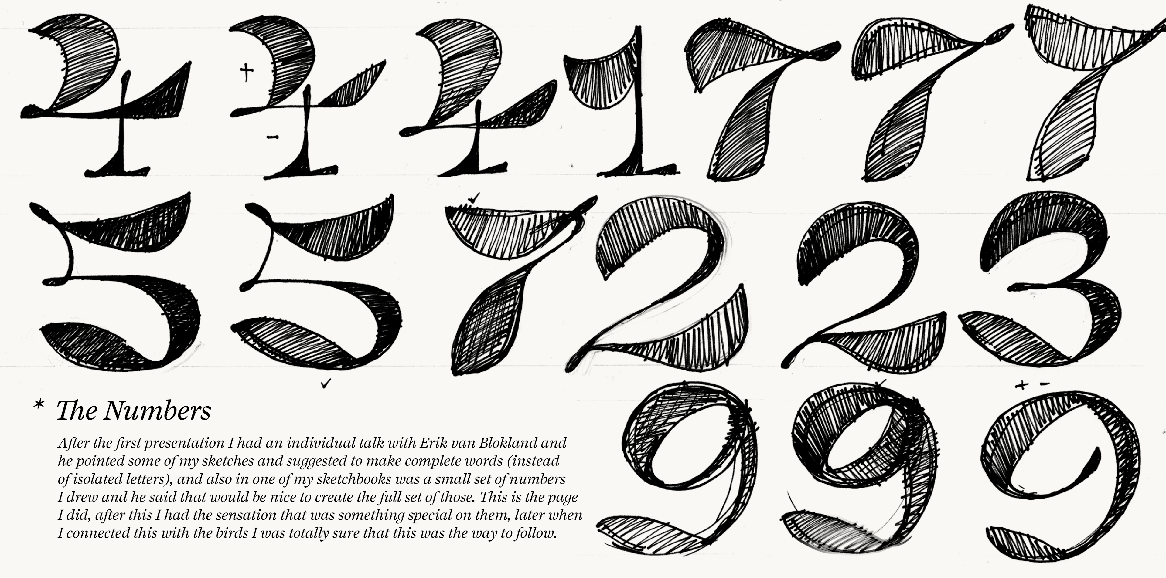
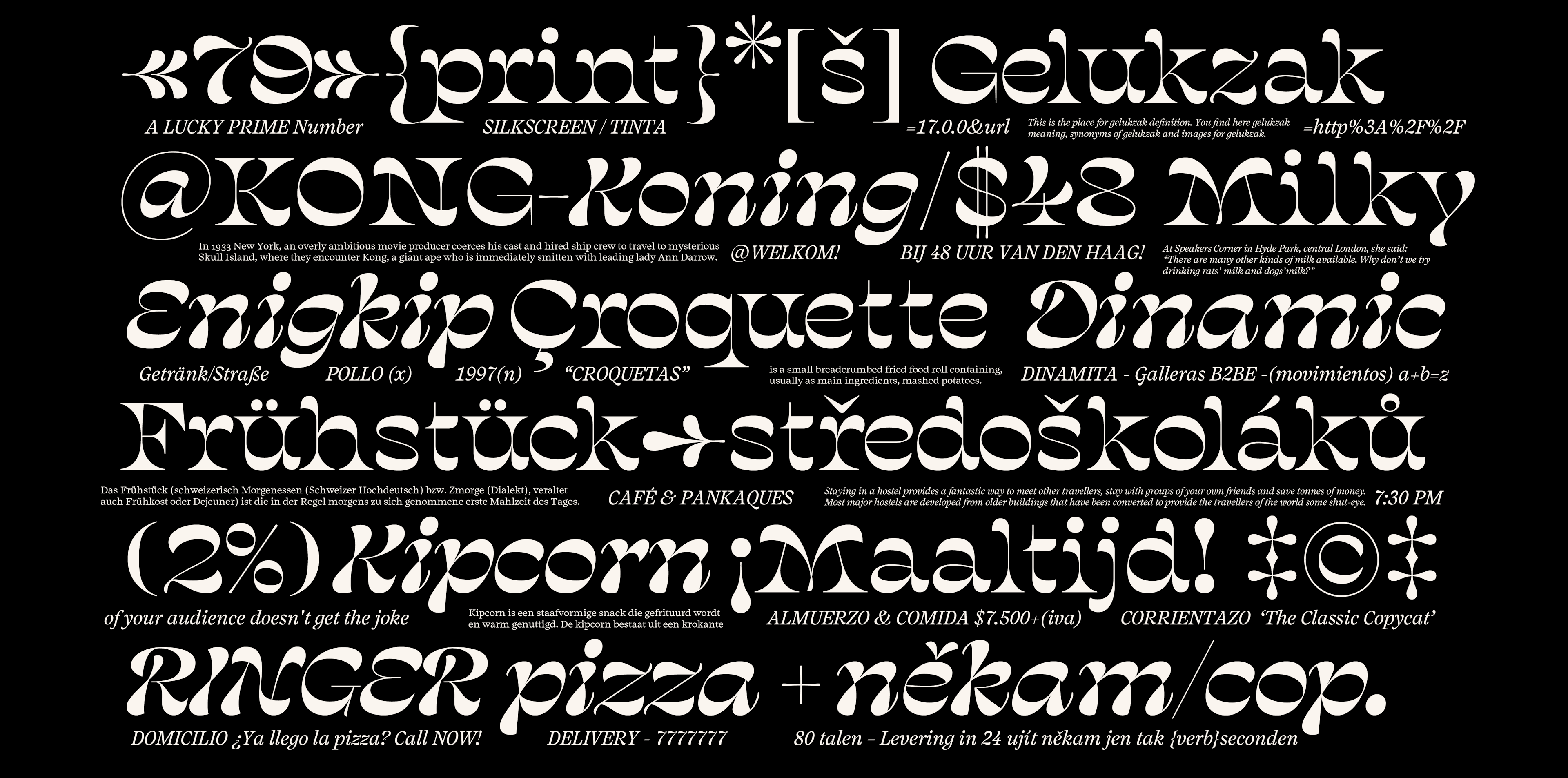
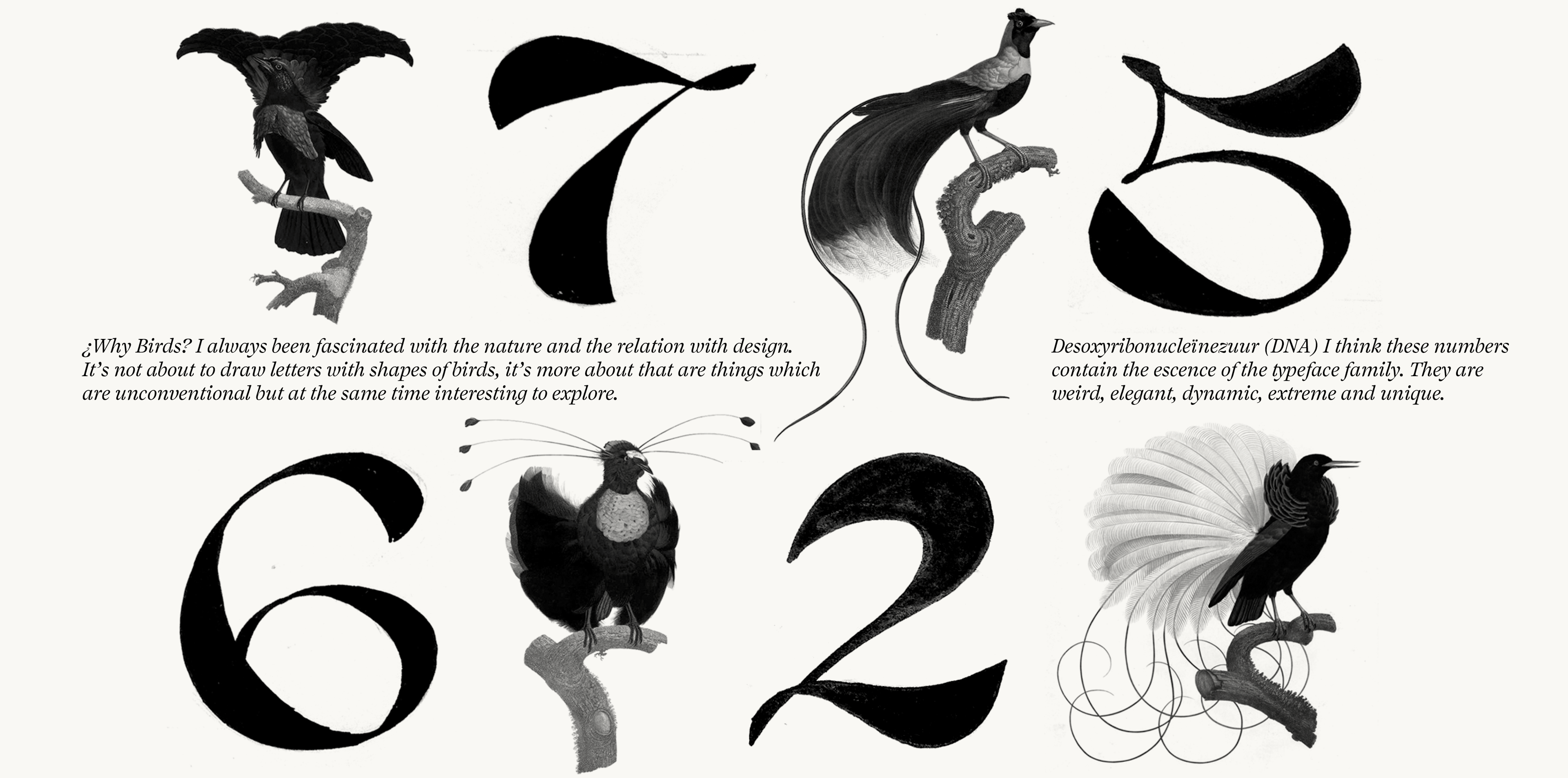


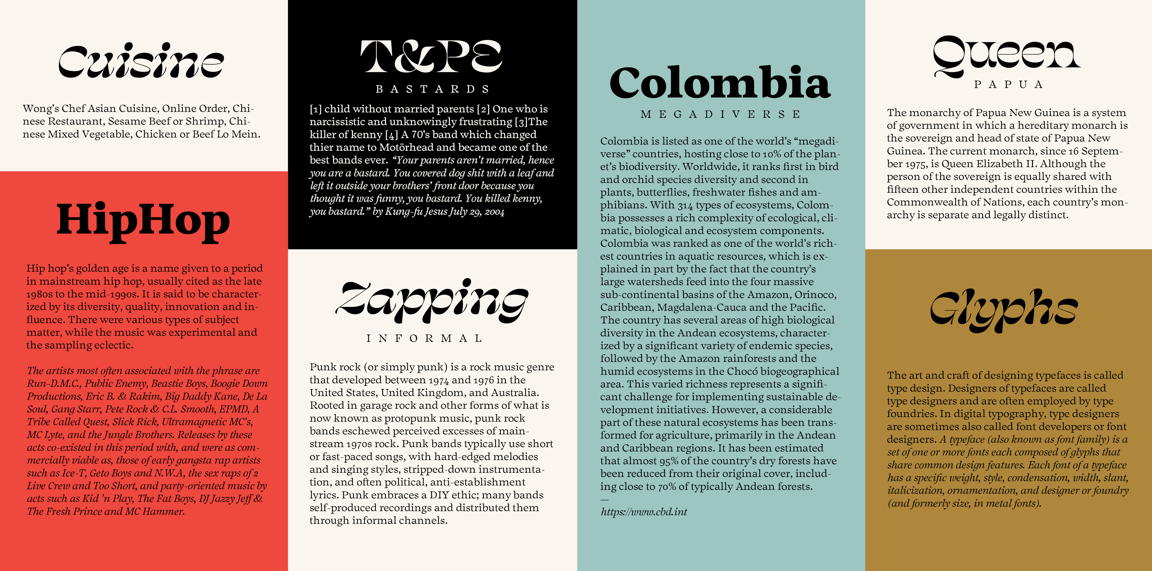
Salvaje (silvāticus “wild”; literally, “of the woods”) is a typeface family with four styles, two of them display and two more for text purposes, mainly designed to be used in posters, books, brochures and magazines. The inspiration for this typeface comes from the “Birds of Paradise” which are birds who only live in one part of the world (New Guinea-Australia). These birds are very particular in their appearance because they evolved in a more visual way; with big feathers, bright colors and extreme shape transformation. (If you are interested and want to know more about the process of this project, feel free to contact me)
Cristian Vargas (1981) is a graphic designer and illustrator from Bogotá, Colombia. Since 2004 he has been working on brand and identity projects for companies in Latin America and United States with his design studio Typozon. Before coming to TypeMedia, Cristian went to New York to participated in the Type@Cooper Condensed program (2013). His experience there motivated him to leave his design studio and continue his studies in type design at the Koninklijke Academie van Beeldende Kunsten, KABK in the Netherlands.
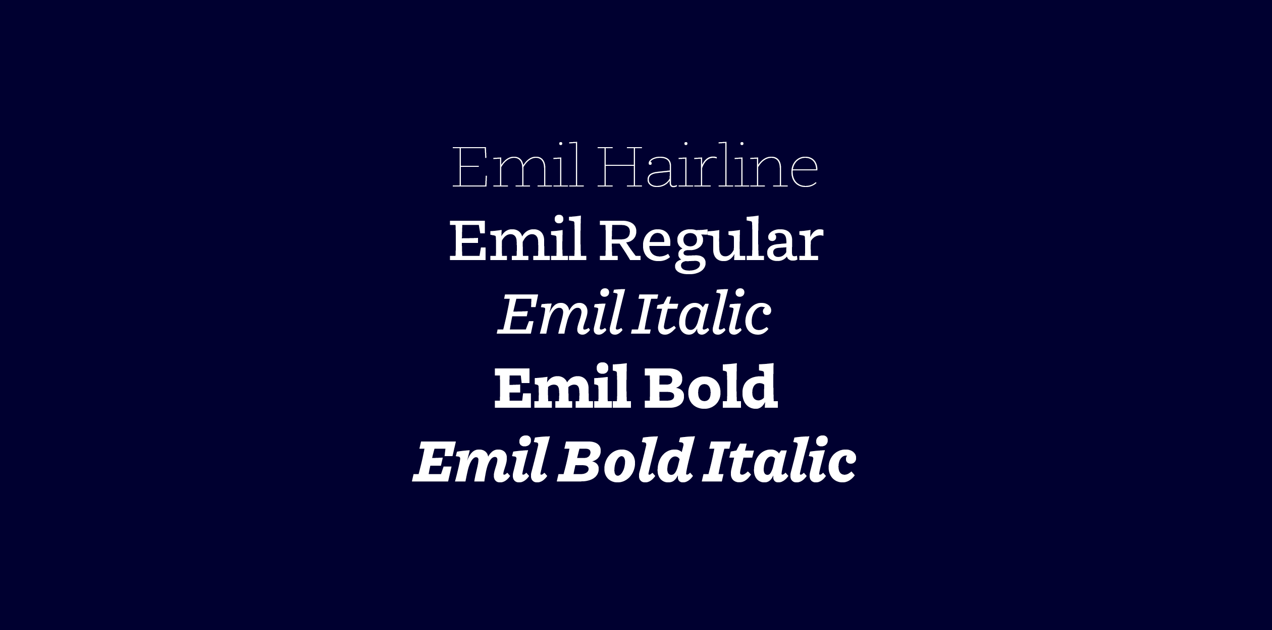
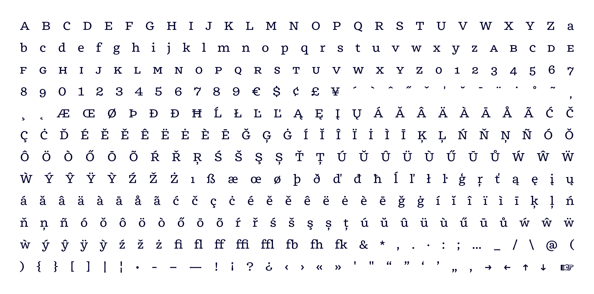
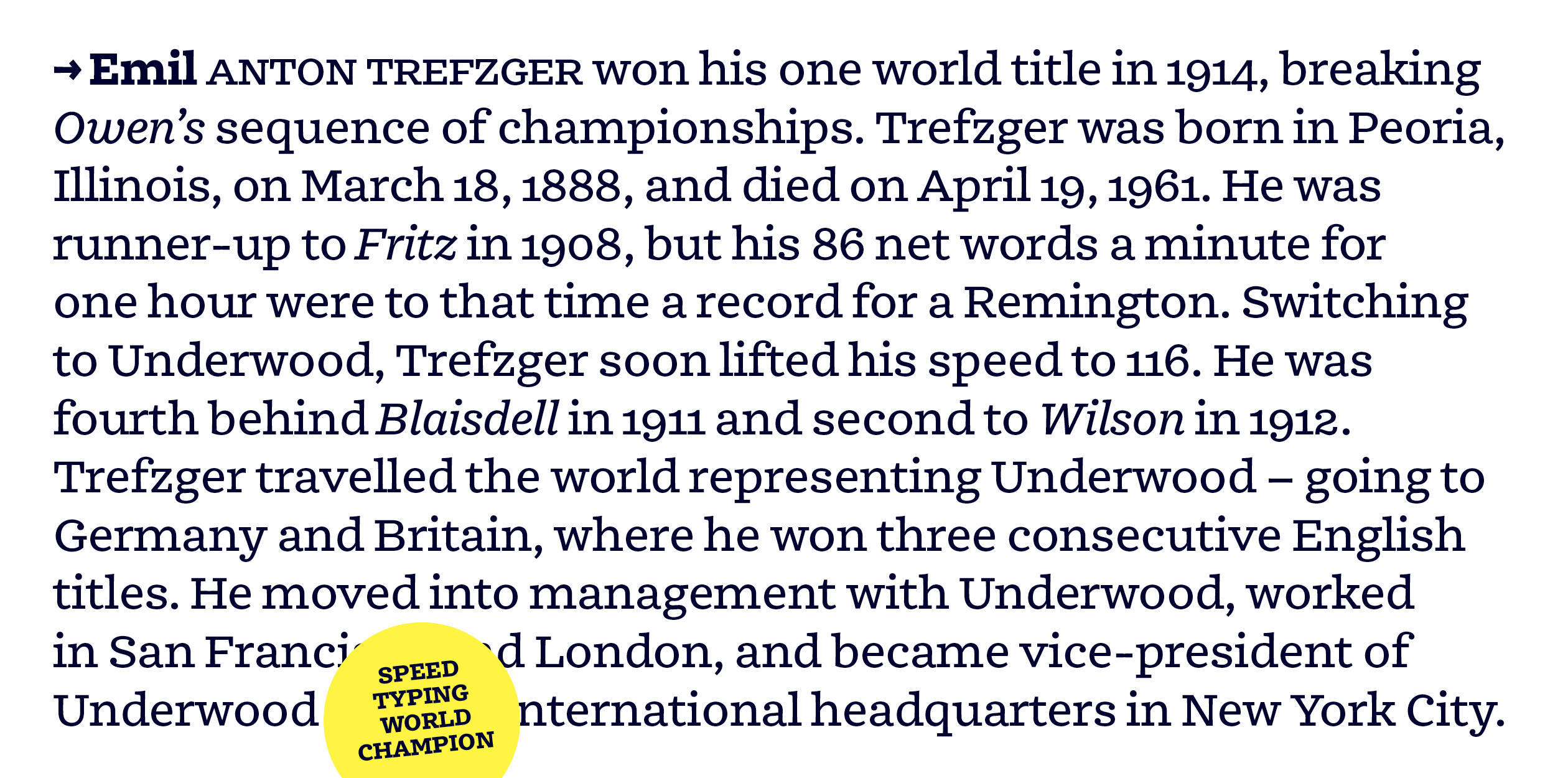


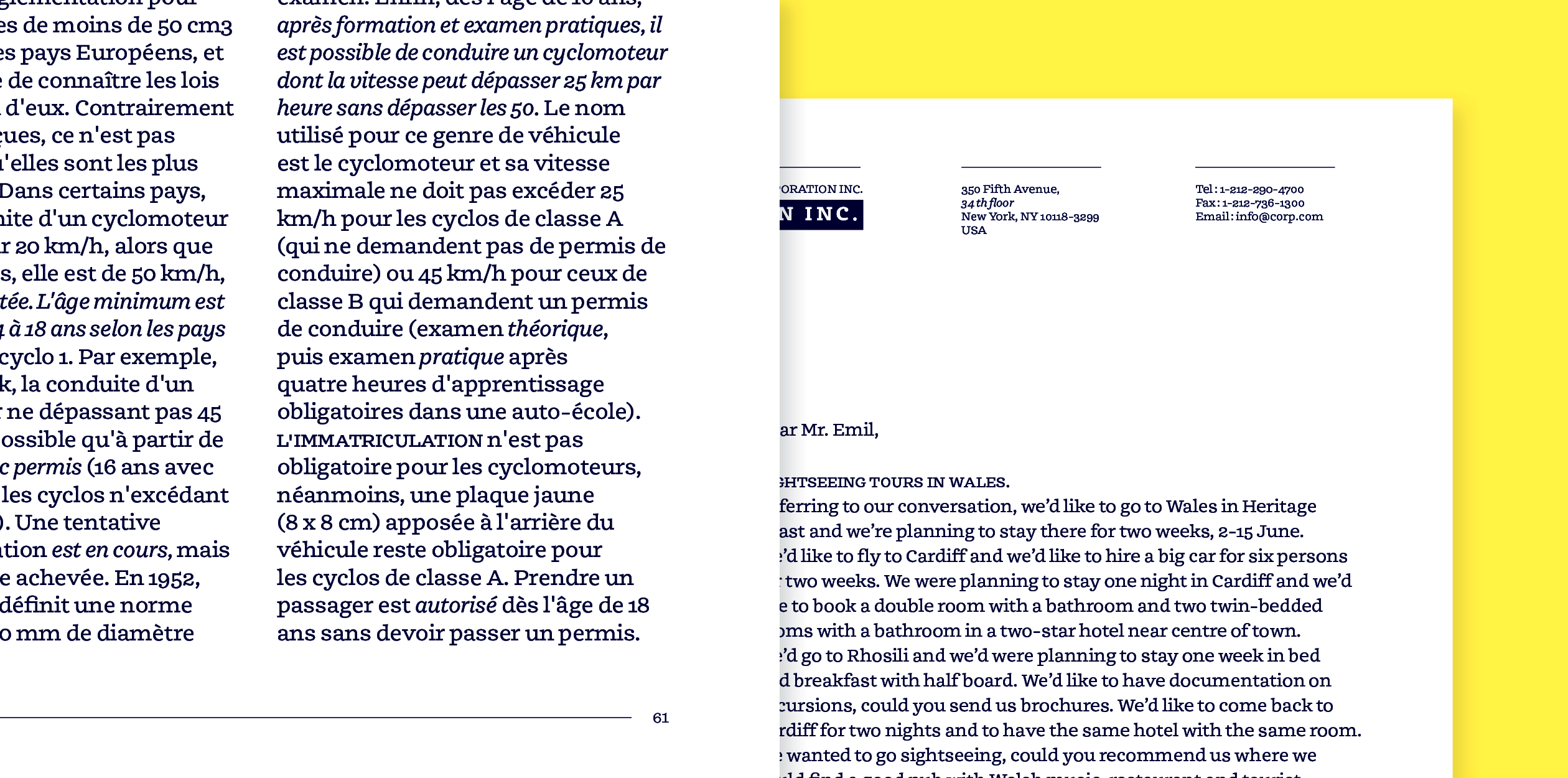
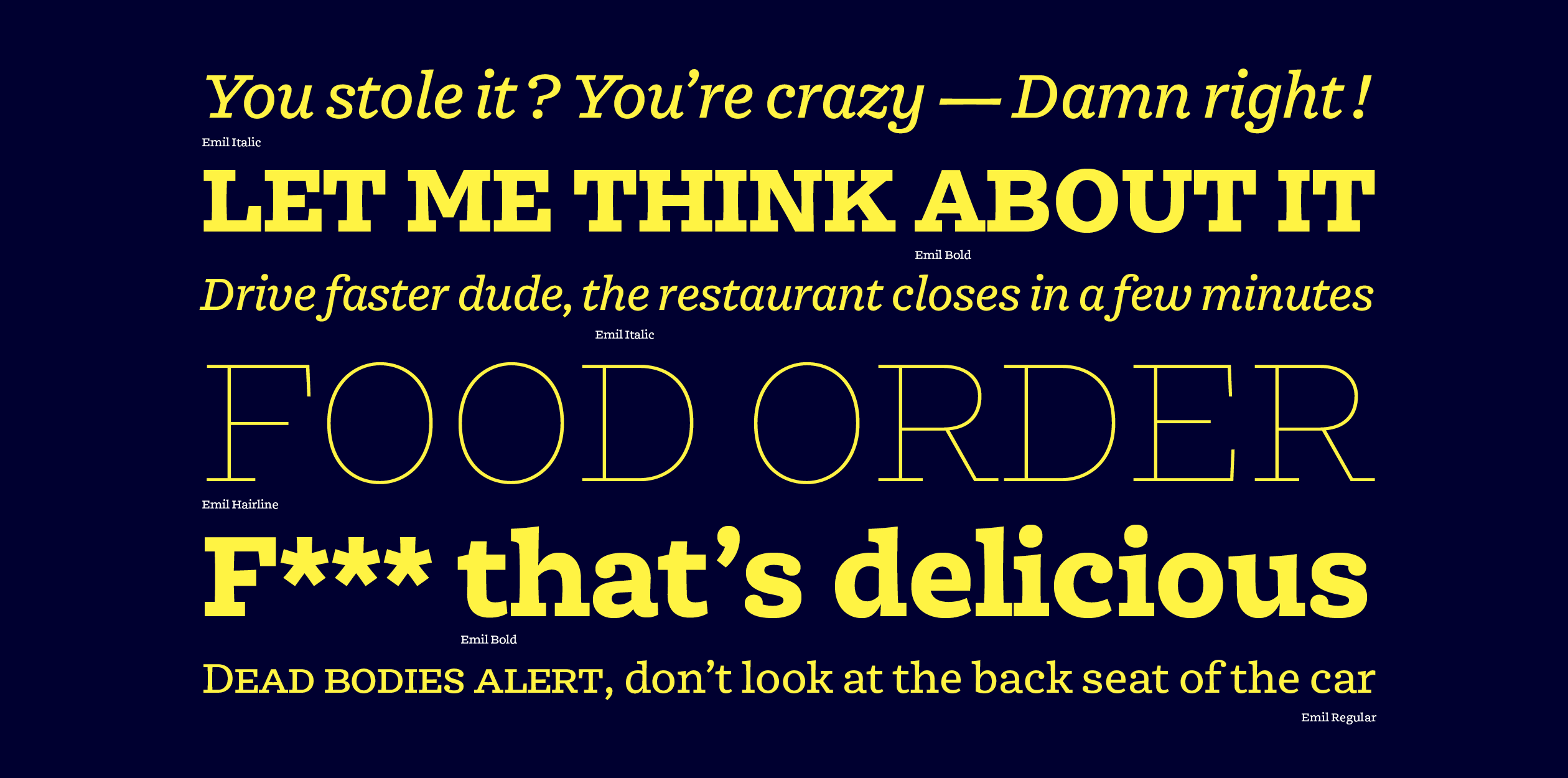
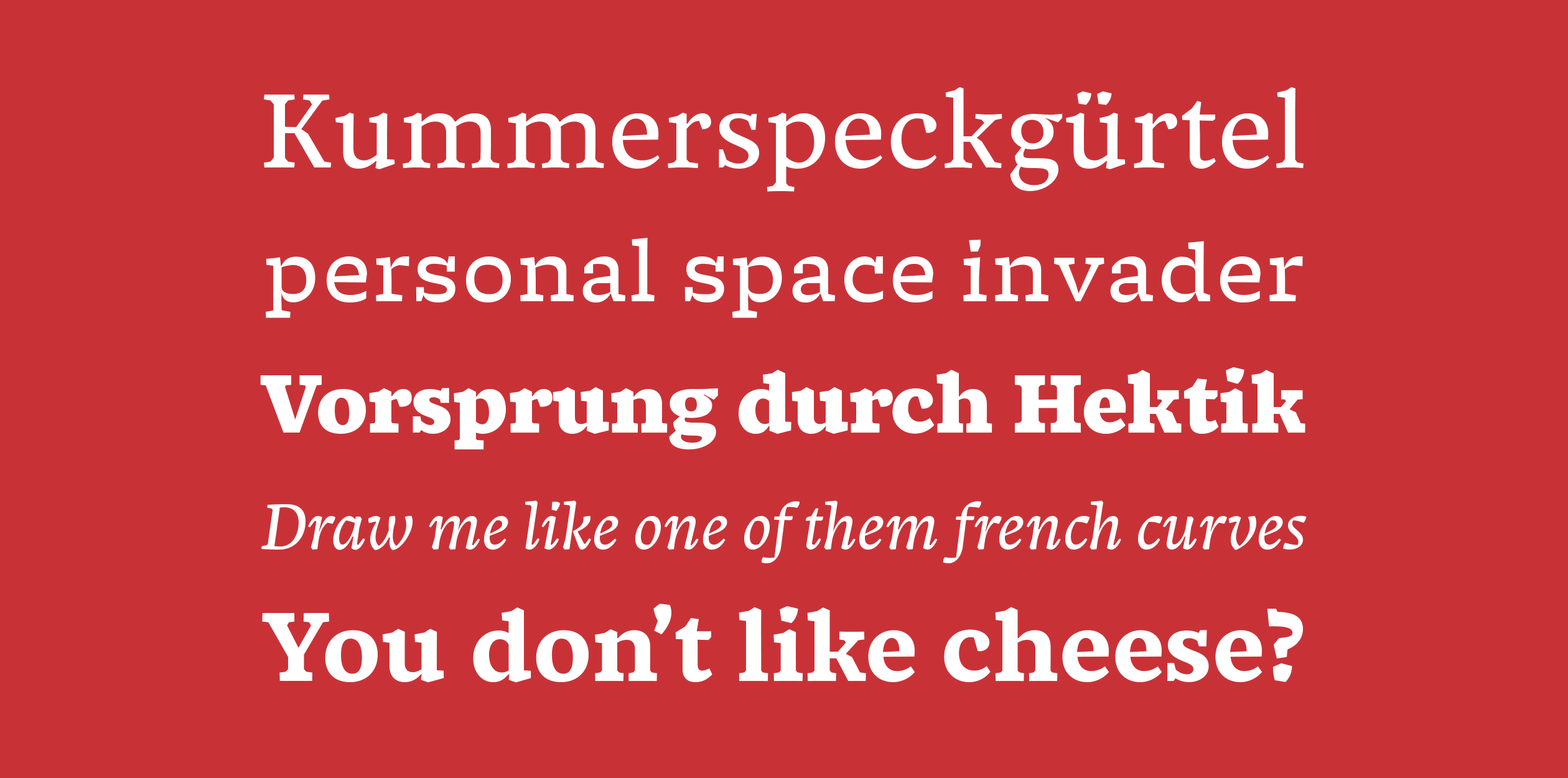
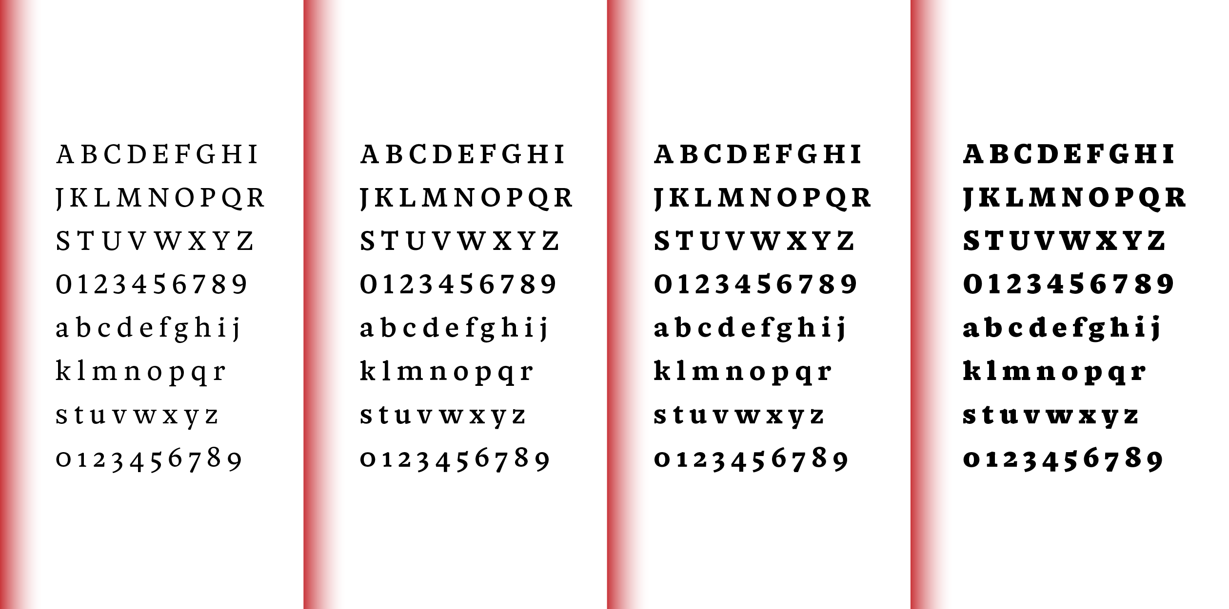
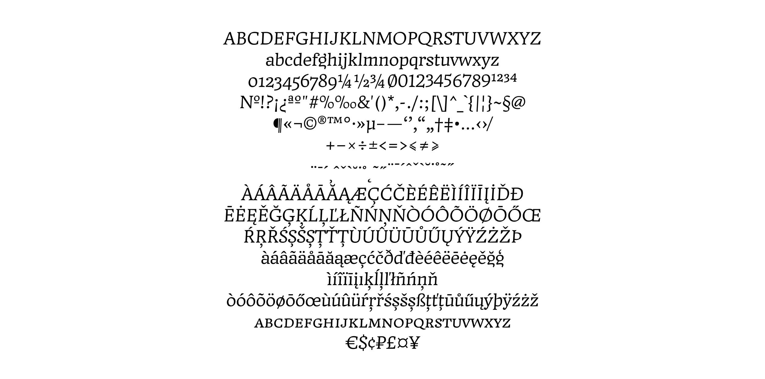
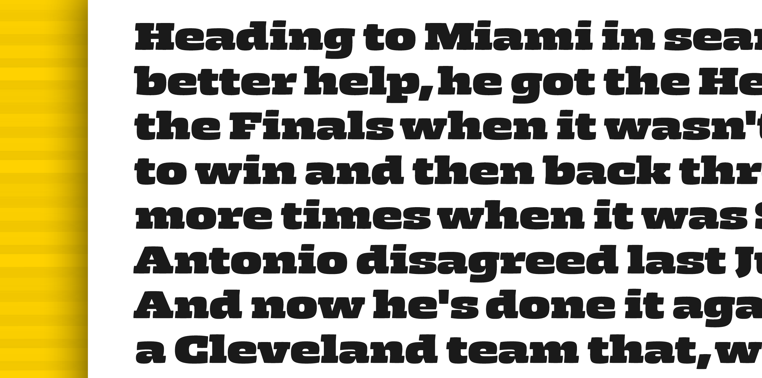
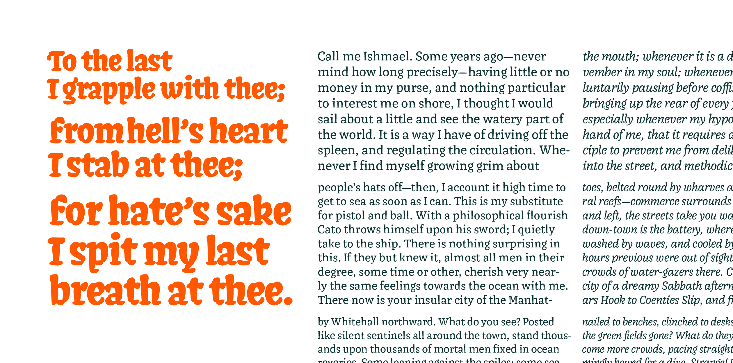
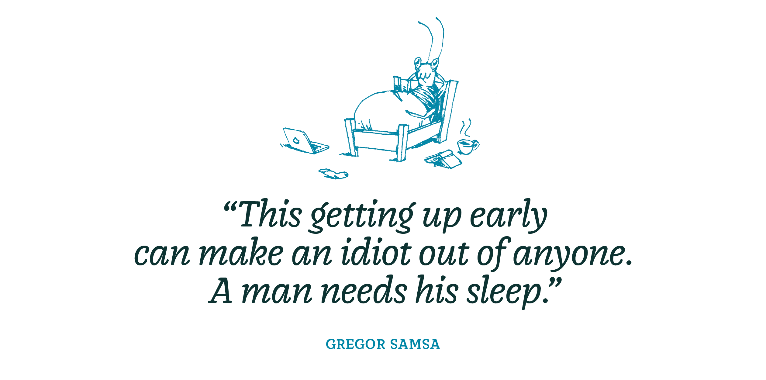
Emil is a text typeface meant for various printed matter such as books, magazines, office or tax related documents. It draws influence from slab serif and typewriter fonts, without being limited by mechanical issues. The Emil family is comprised of five styles. The Regular, Italic and Bold are designed for body text, but could well be used in larger sizes and paired with the delicate Hairline version. The Bold is strong and chunky, while the Italics look softer. Shaped with concave stems and a tiny bit of contrast, Emil is somewhere halfway between a typical text typeface (slightly slanted upper serifs) and a slab (straight bottom serifs, low contrast). Its squarish proportions also somewhat contribute to make the reading easy and enjoyable.
Elliott graduated in graphic design at EPSAA (École Professionnelle Supérieure d’Arts Graphiques et d’Architecture de la ville de Paris, France) in 2012 with a strong passion for identities, type and signs. Before joining t]m, he worked as a freelancer for two years while learning type design with Malou Verlomme at Long-Type foundry, within the framework of various projects. He is now back to freelancing in Paris.
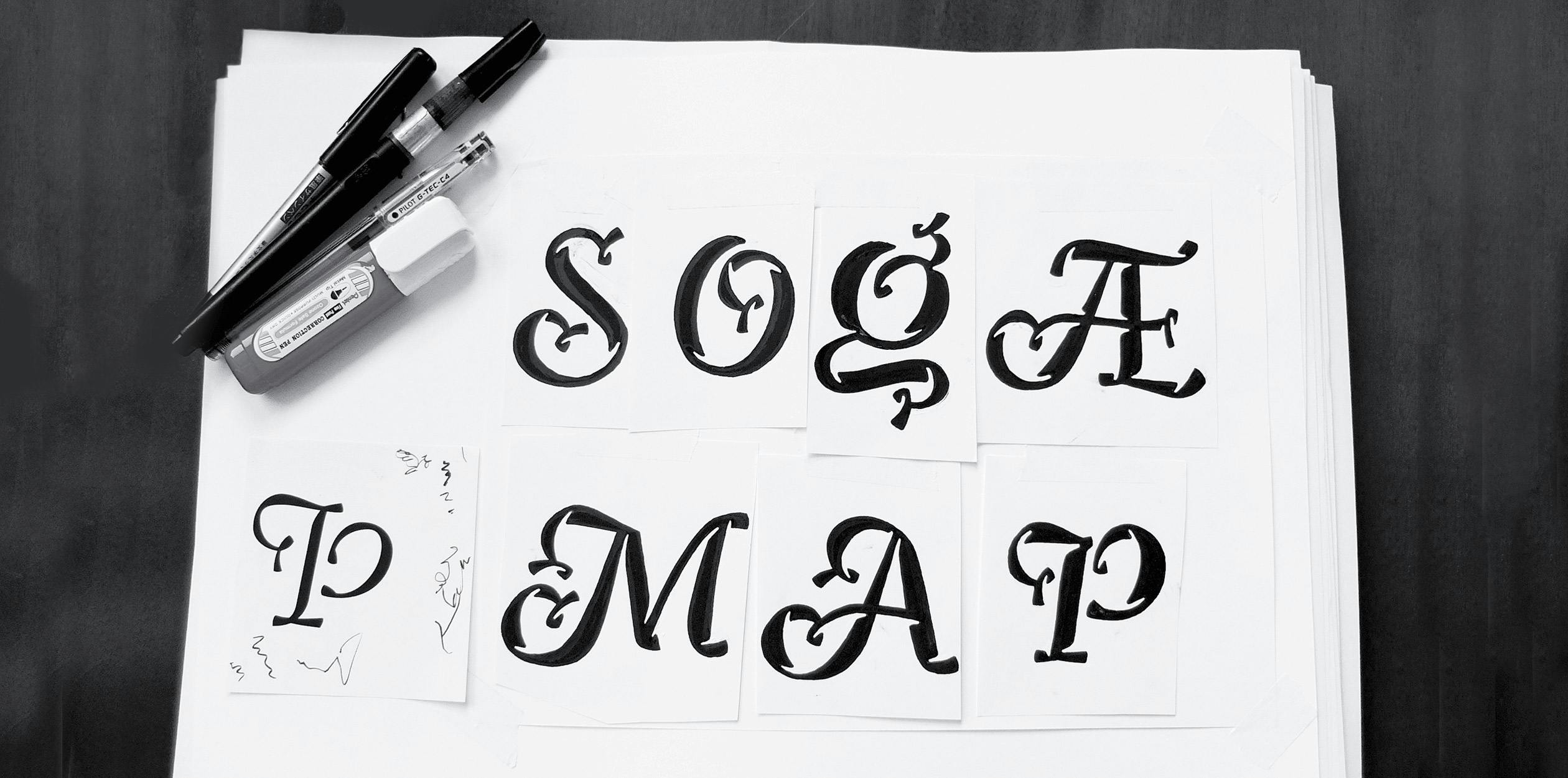
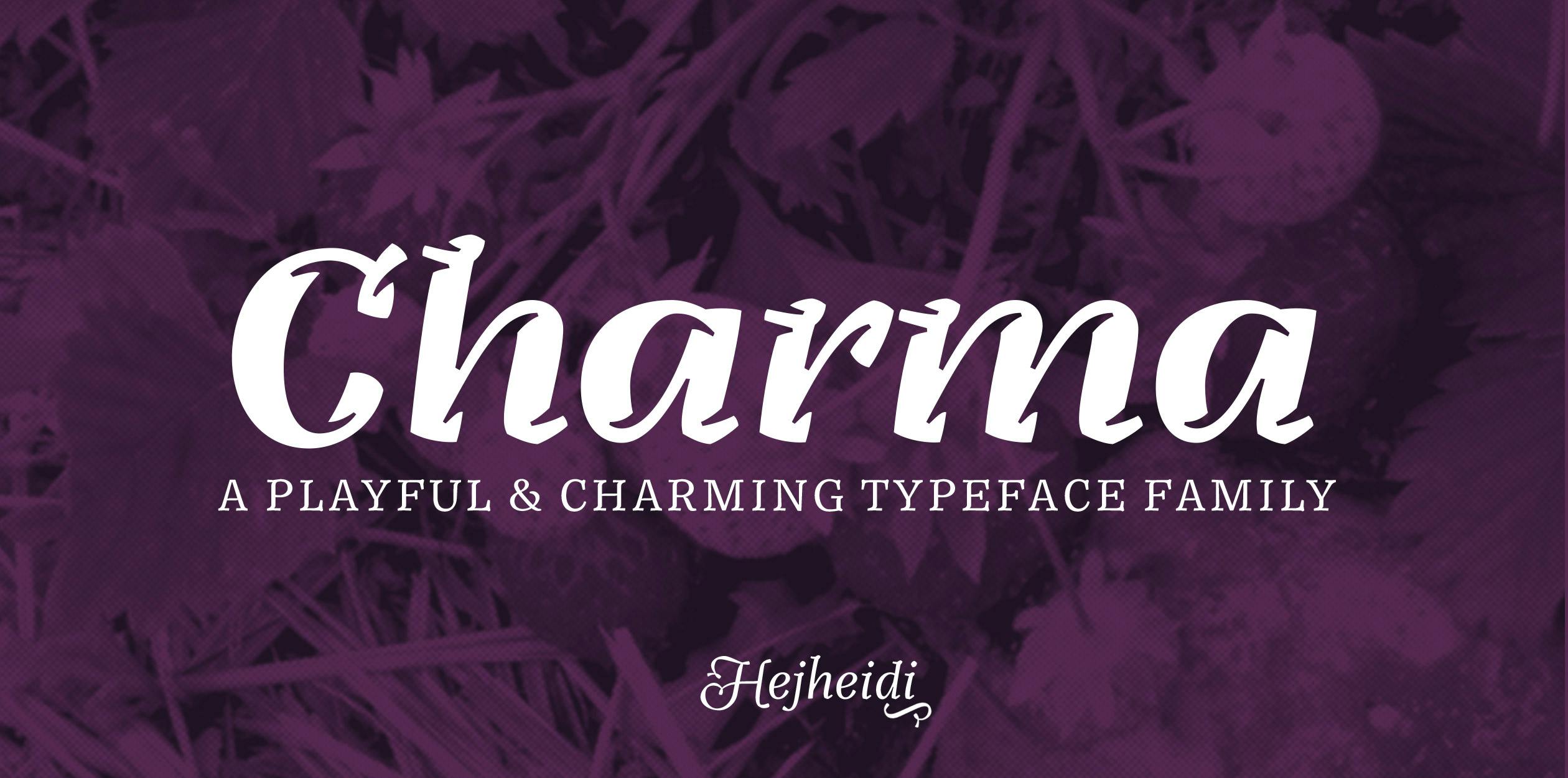
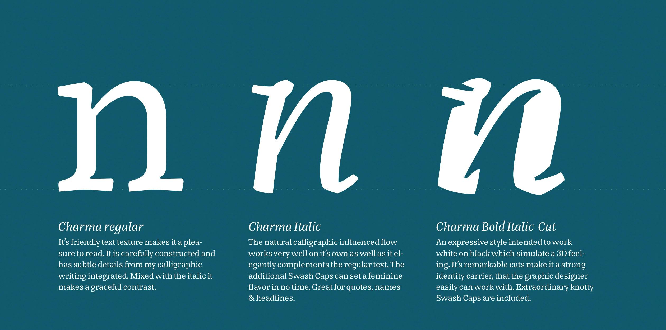
In the Hague Heidi regularly shopped in an organic grocery store. One day she went there and the visual identity had changed. The new fonts had a great human and personal feel to them, but unfortunately they where poorly constructed, hard to read and the feel was more naive and childish than appropriate for a high quality grocery store. Heidi took on the task to design a personal and playful yet serious well constructed typeface, that would work perfect for selling products and establish a store identity for food and personal care products Charma is based on Heidi’s experimental calligraphy that often has curly and flowy characteristics. Heidi created a method to look at the text pattern before making decisions about individual letters details. Right now it the family consists of 3 members and more styles has all ready been sketched ex. a style perfect for store signage and a whole subhead family planned to accompany the display styles. Winner of the TypeMedia Department Award 2015
Heidi Rand Sørensen aka Hejheidi loves to practice calligraphy, investigate letter constructions and make beautiful text patterns. When she first visited TypeMedia she had no doubt that that was the place to really nurture and take her skills to the next level. Before her TypeMedia adventure she studied a BA in Graphic Design & Illustration from Kolding School of Design, Denmark. She currently lives in Aarhus, Denmark. Heidi works with various calligraphy, lettering and type design freelance jobs. She also enjoys to teach calligraphy, drawing & type design. She’s looking out for a type foundry to collaborate with and sell her fonts through.
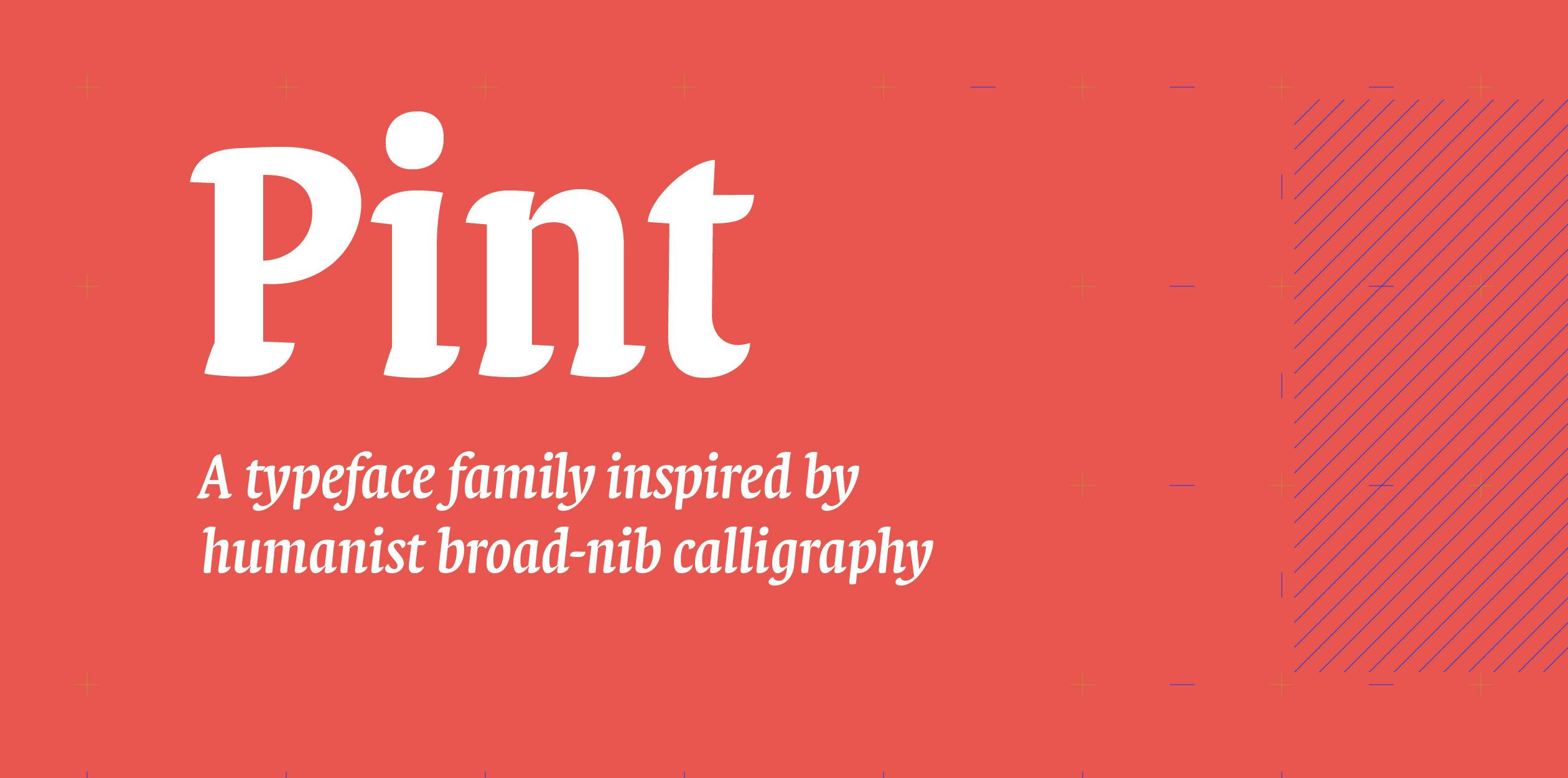
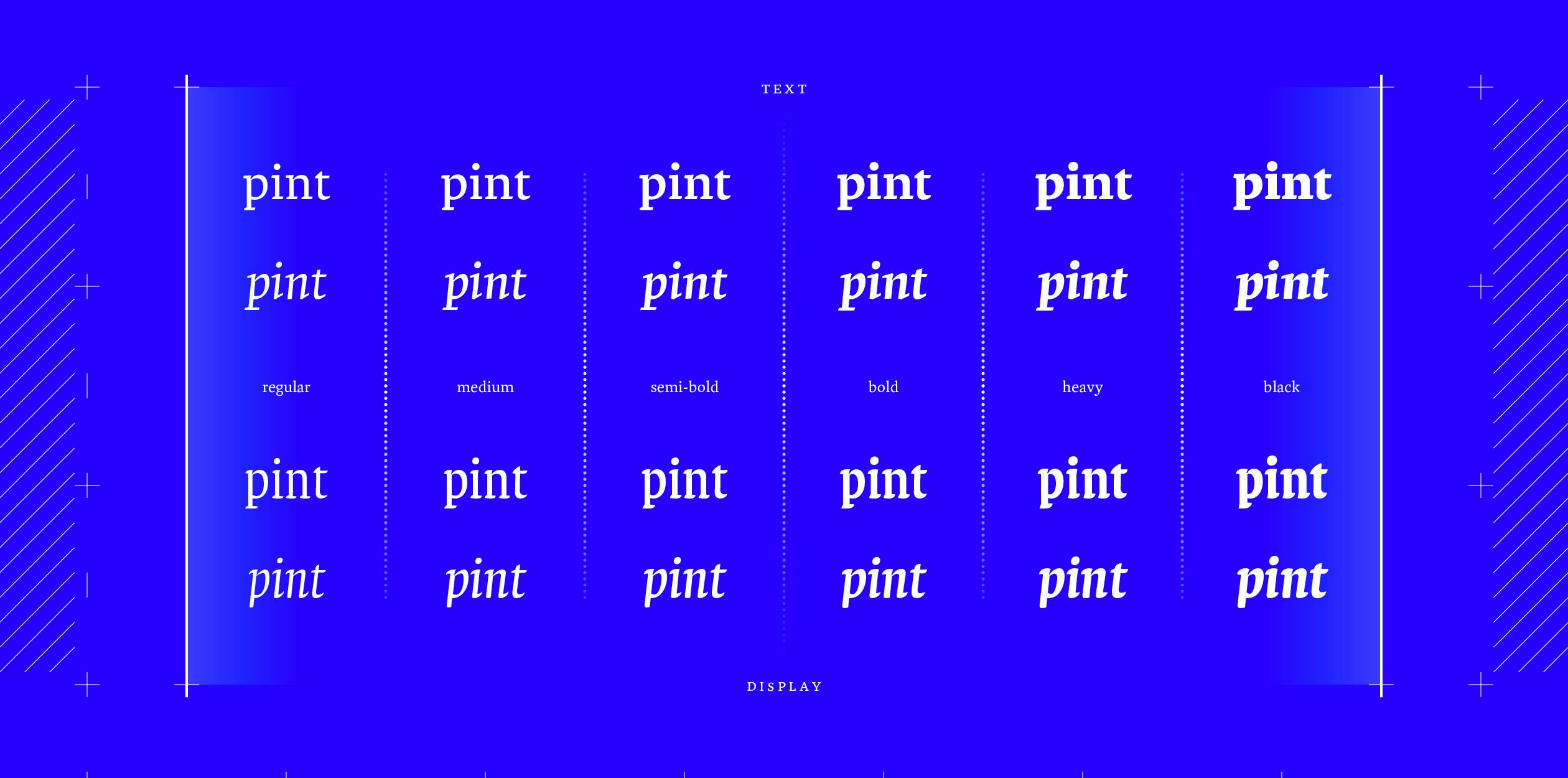
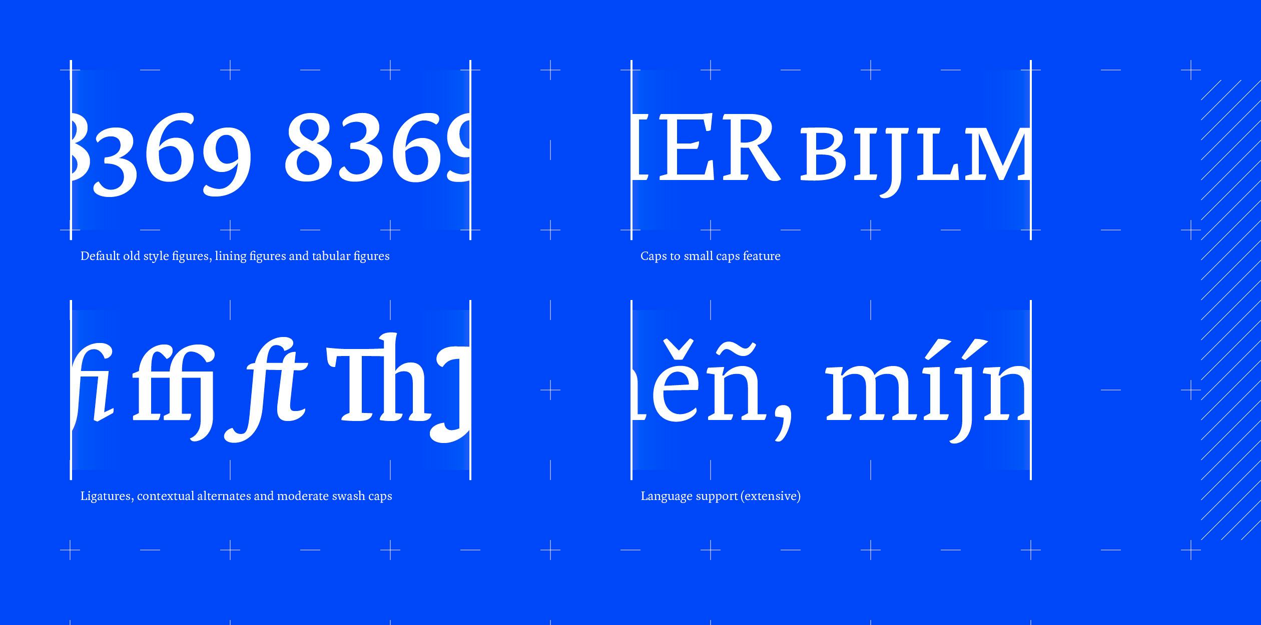
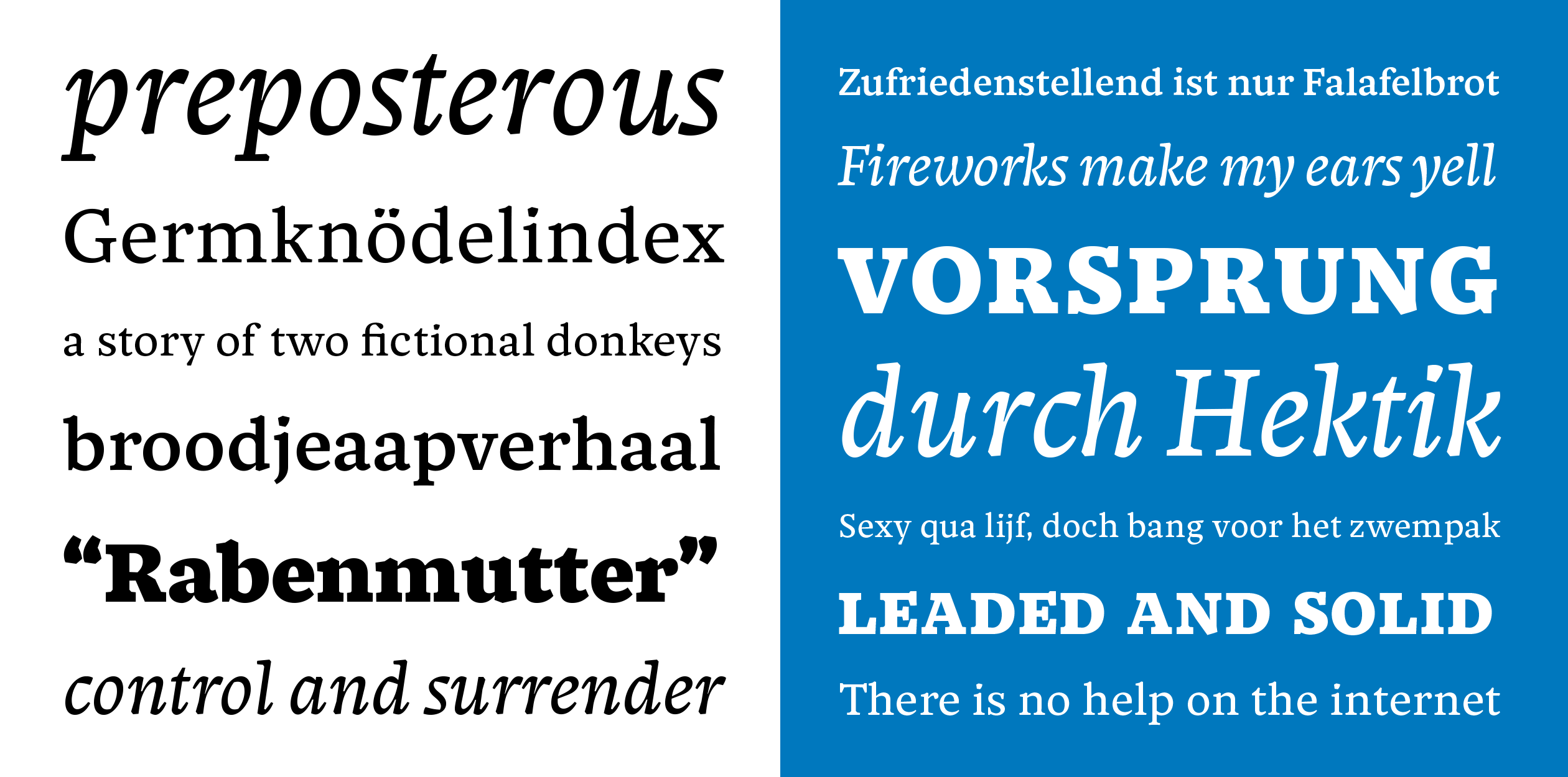
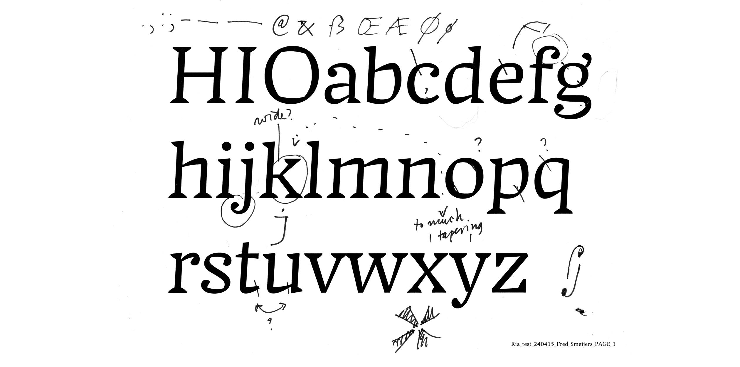
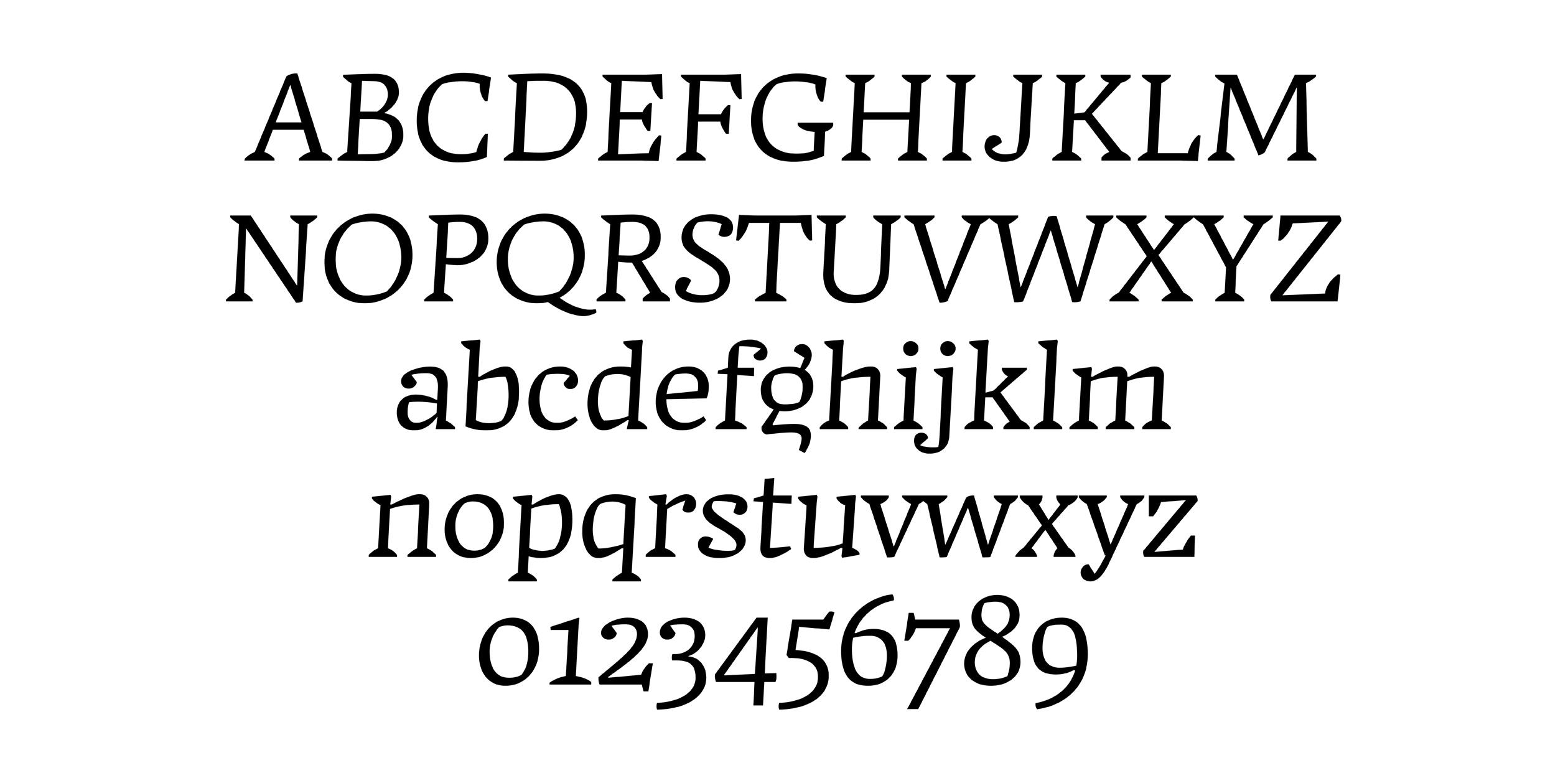
Pint is a serif typeface family with a clear influence of humanist broad-nib calligraphy. The family consists of two parts: its primary half designed and spaced for setting body text—think 8 to 12 point stuff—like books, magazines and other publications intended for longer reading, while its secondary half is able to match larger applications—like headings, titling, covers, flyers and posters—in both style and flavour, but with a more playful approach to proportion and detail. The family comes in a range of six text and display weights serving differing tastes in design and differing paper and printing techniques. Its moderate contrast gives it a clear and crispy texture in the regular and medium text weights with a more solid and sturdy character becoming visible in the heavier weights.
Jasper Terra is a graphic designer from the Netherlands. During his bachelor study Graphic Design at the Royal Academy of Art (2010–2014) a strong interest in type and typography developed rapidly and ultimately led to his application for the TypeMedia master course. Next to working as a graphic designer—designing type, logos, lettering, books, posters and other printed matter—he’s exploring game design and game technology and is currently working on a prototype for a videogame (and something humanist sans-serif).
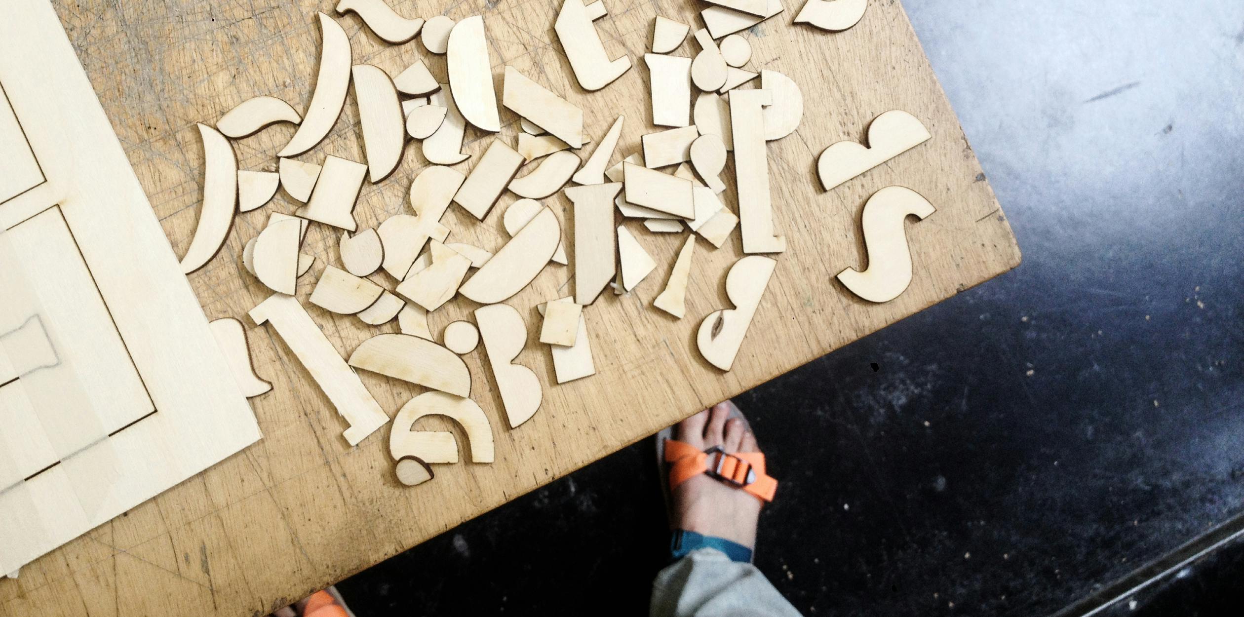
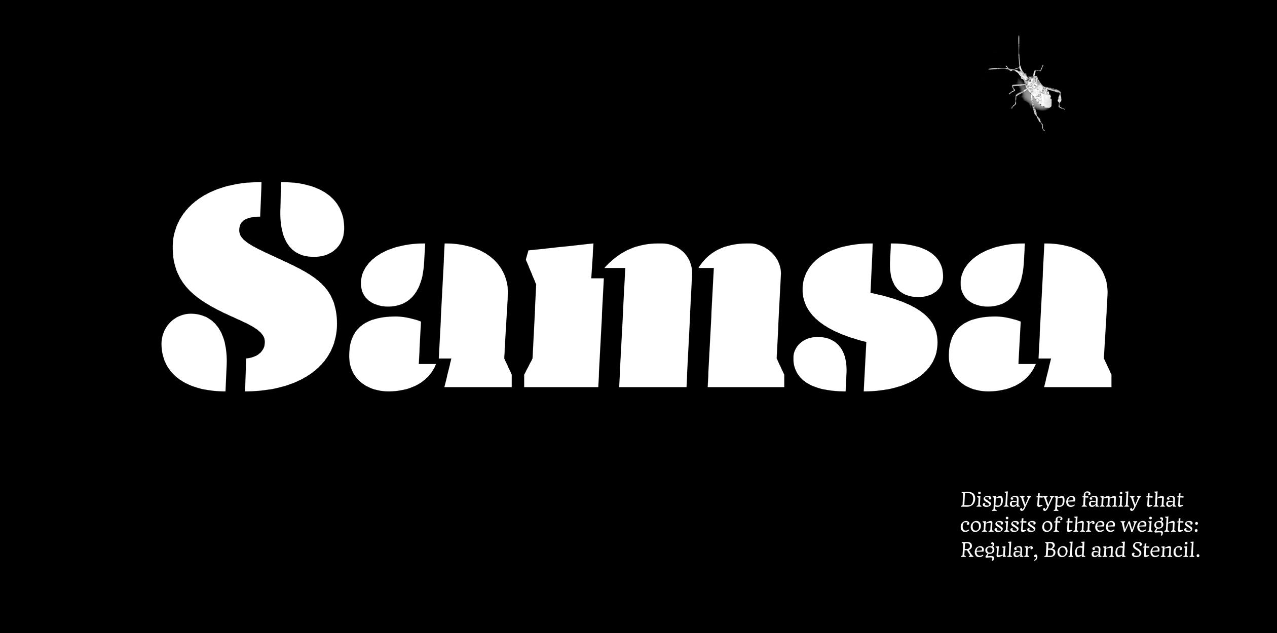
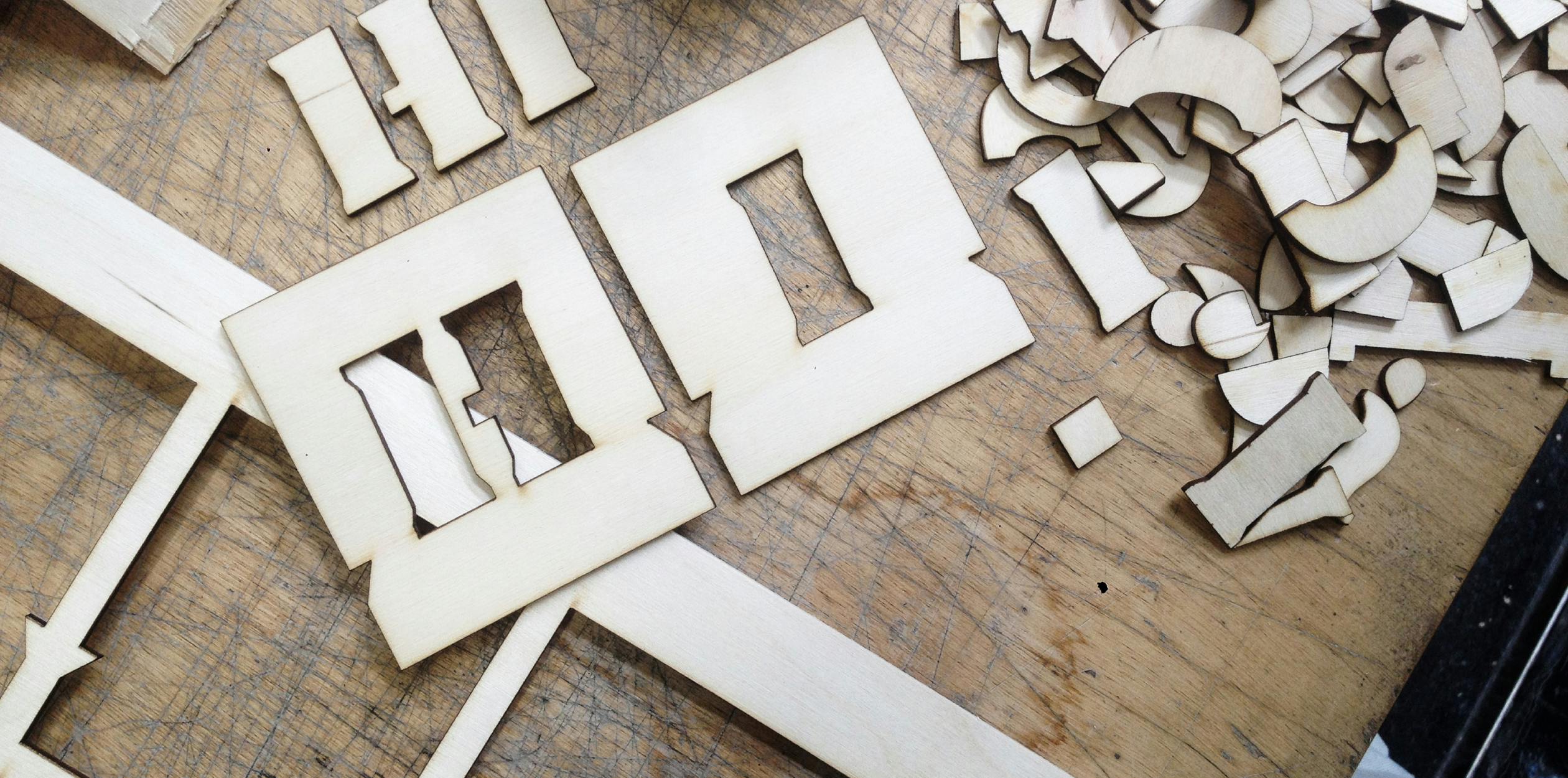
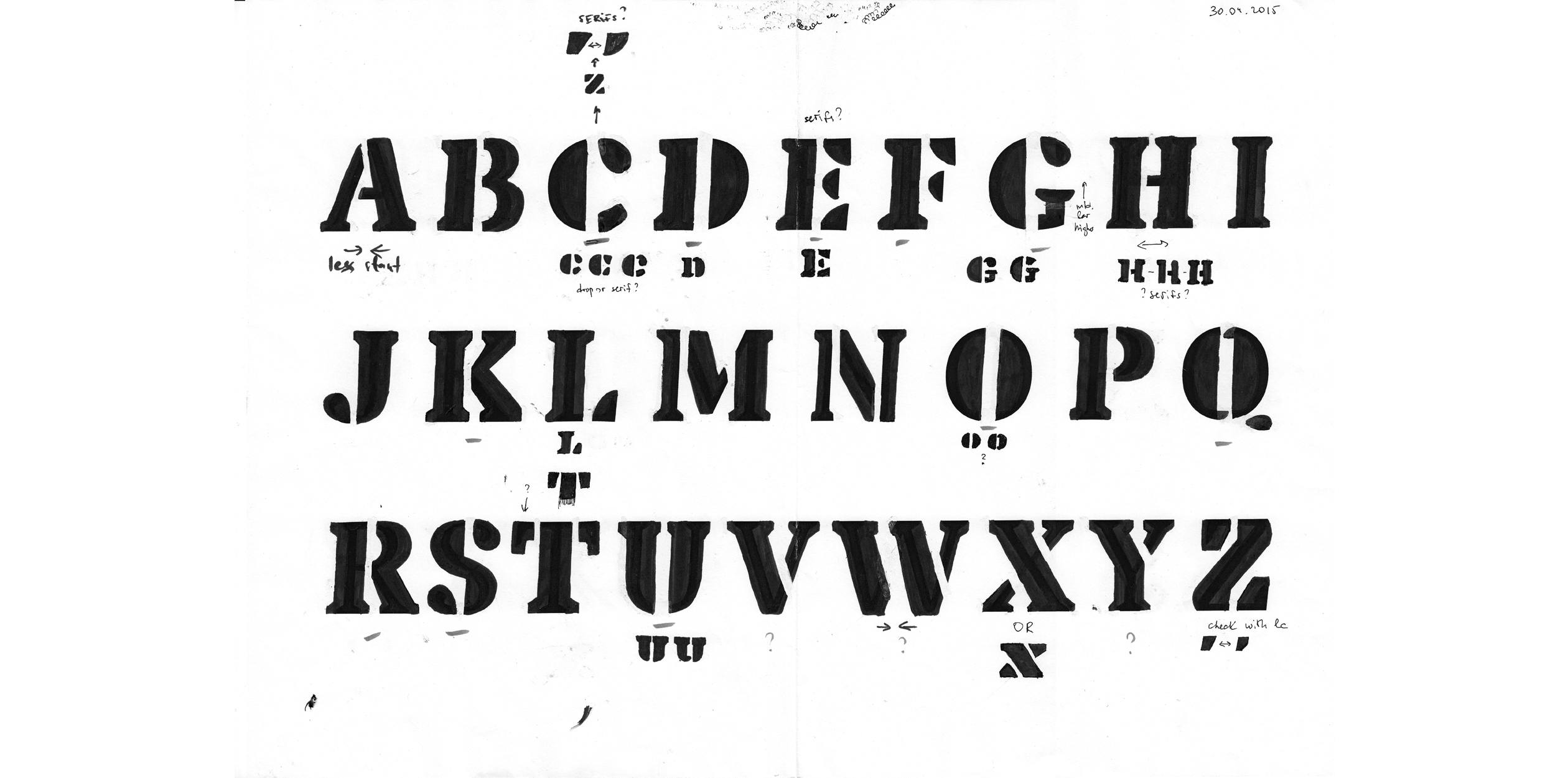
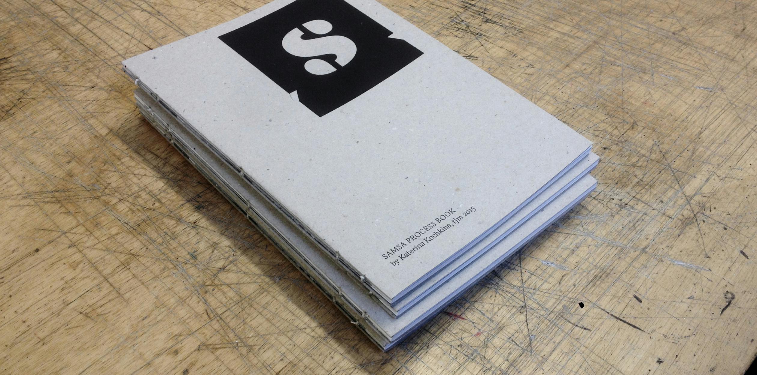
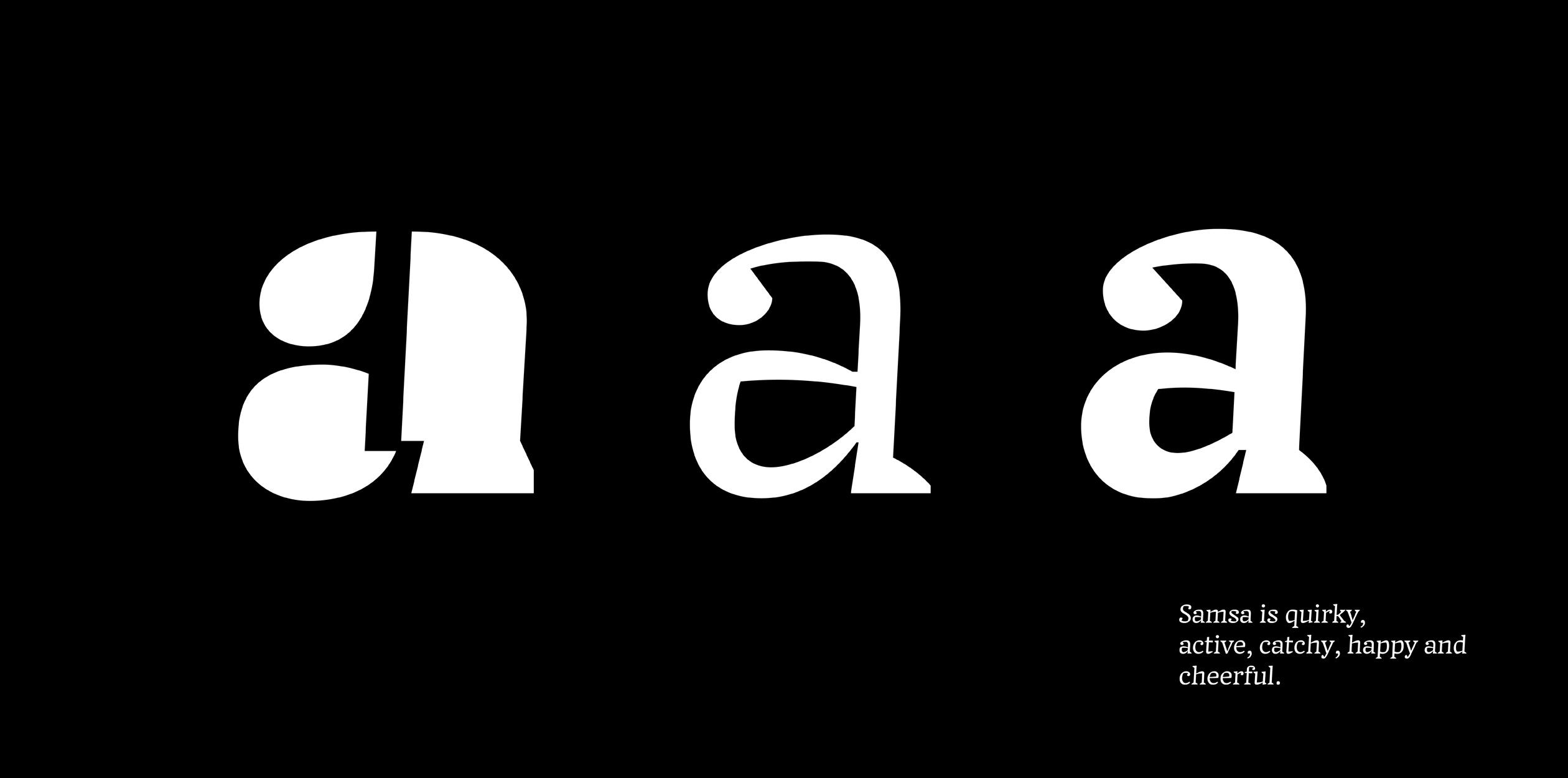
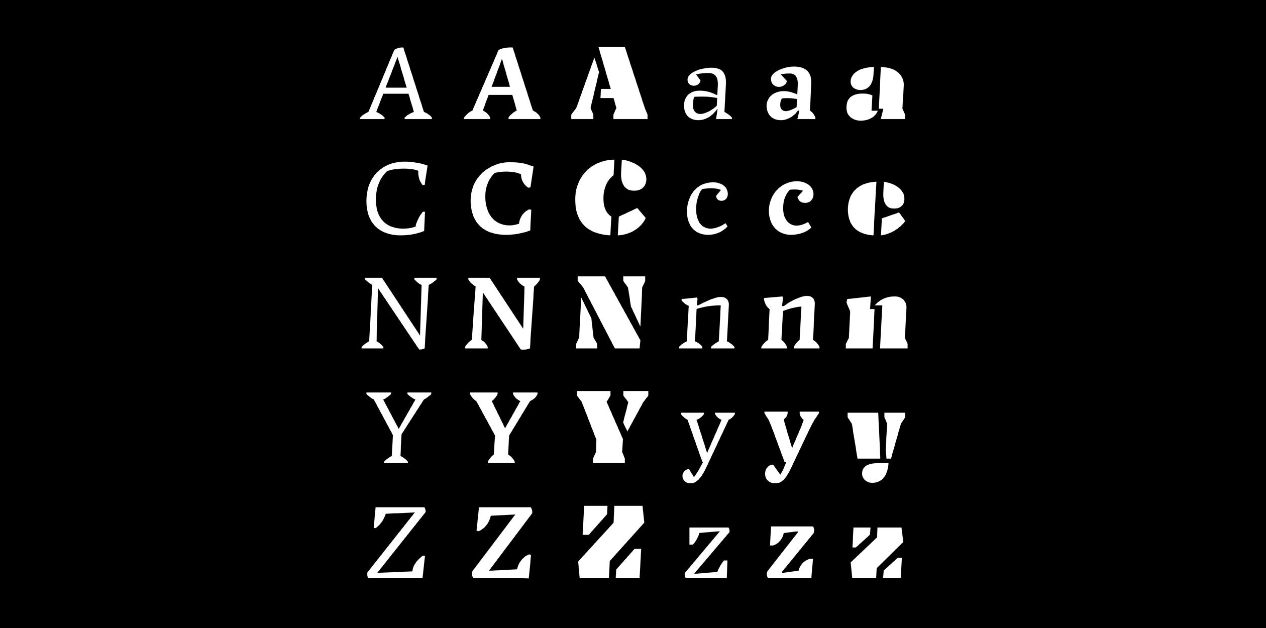
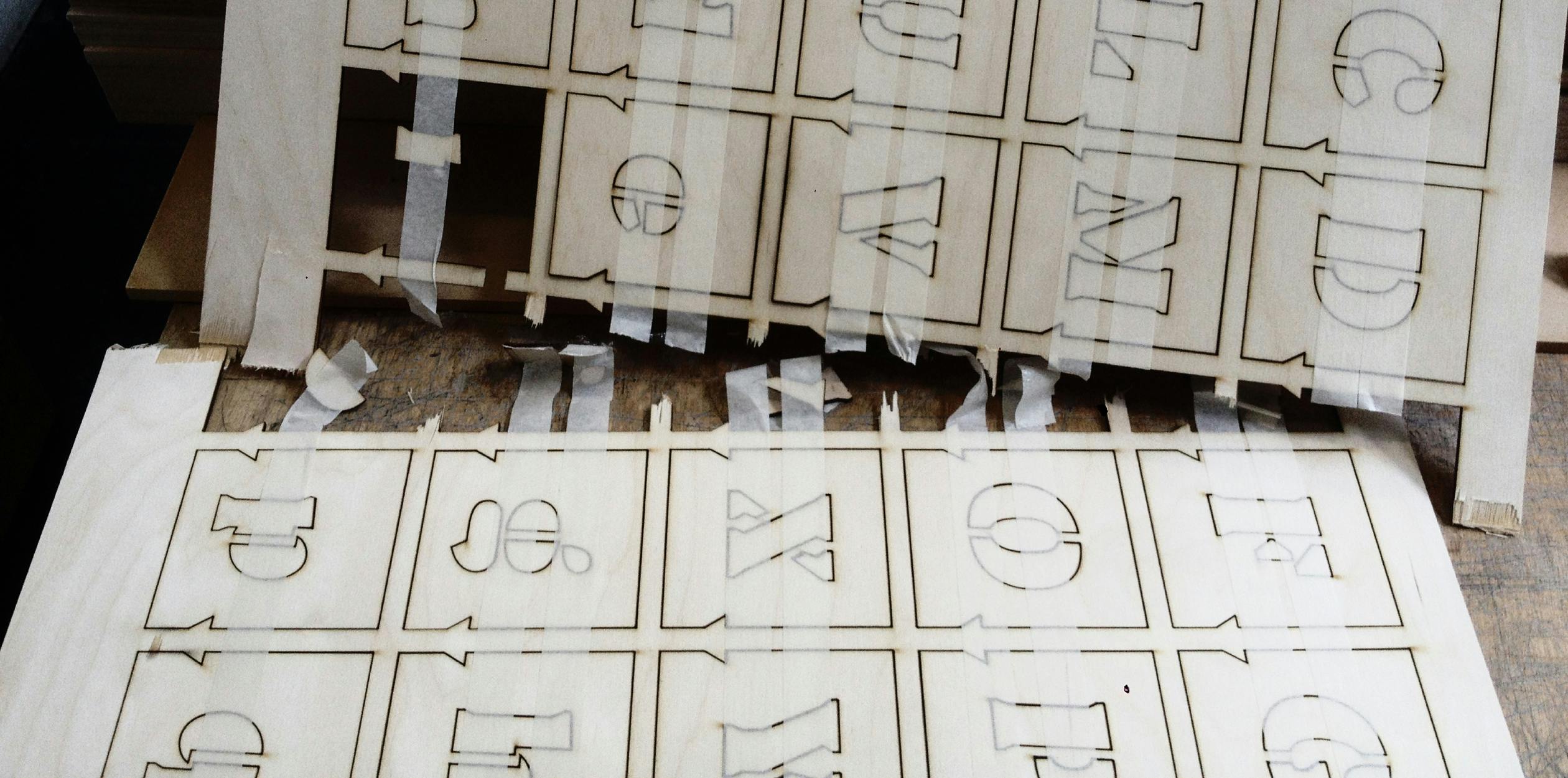
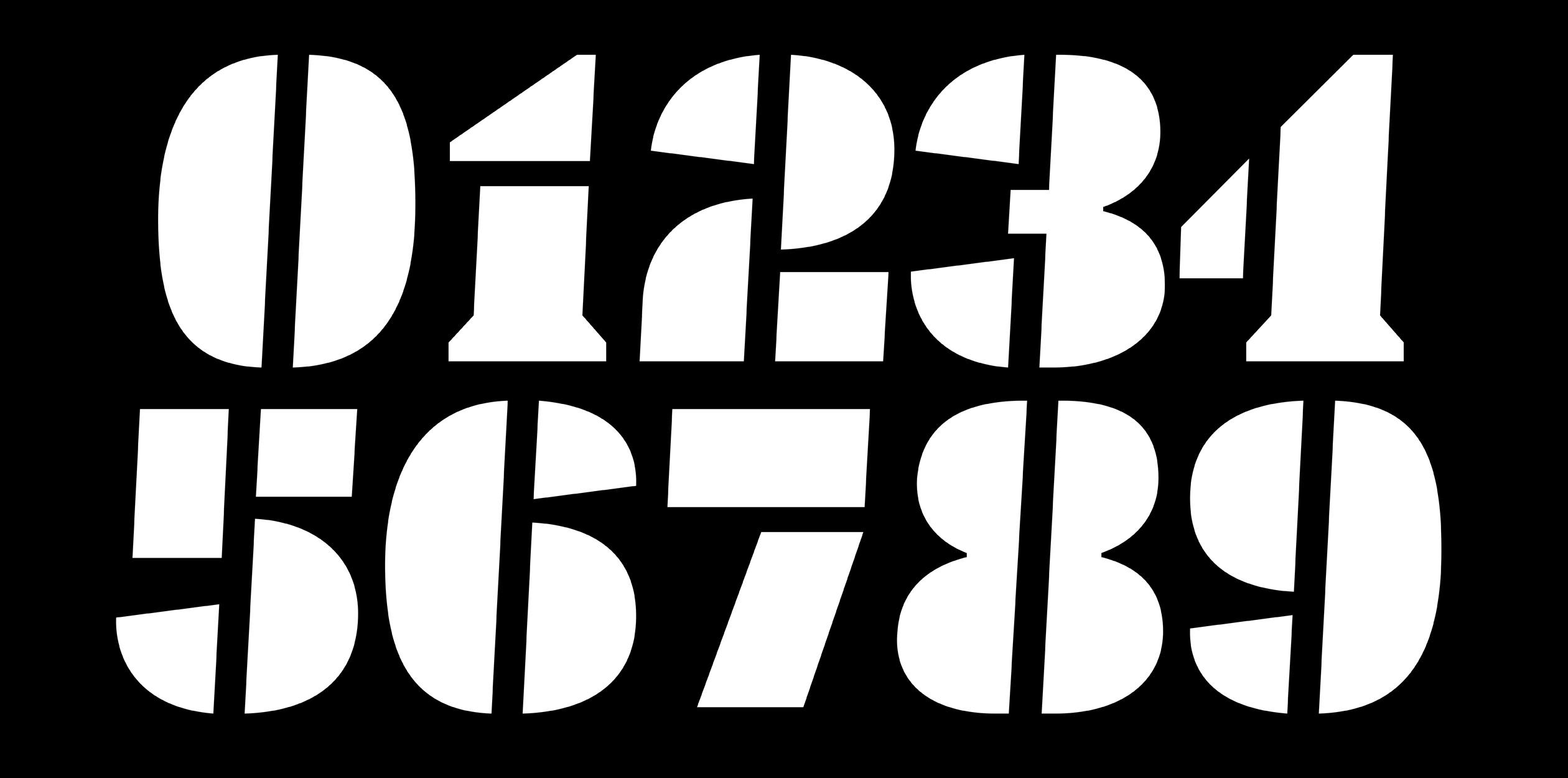
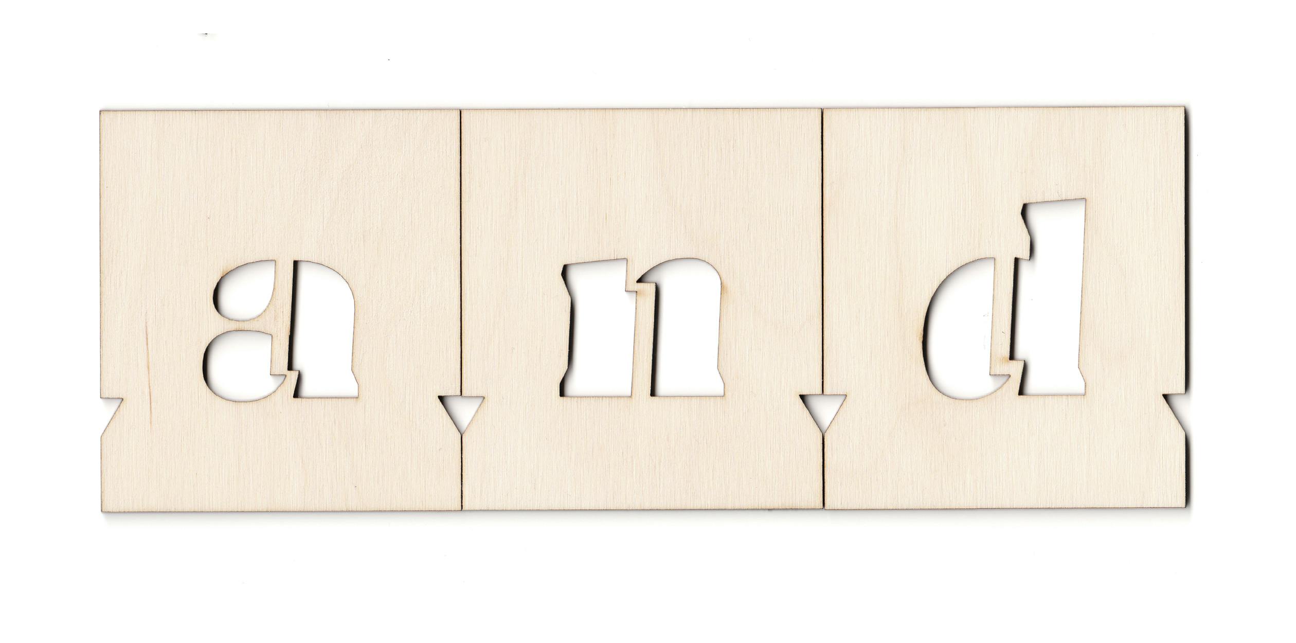
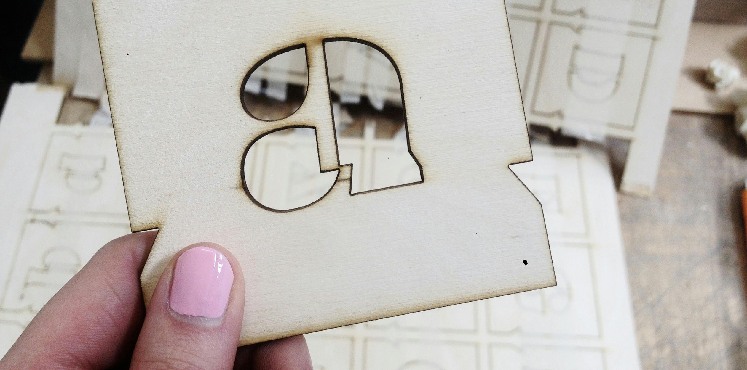
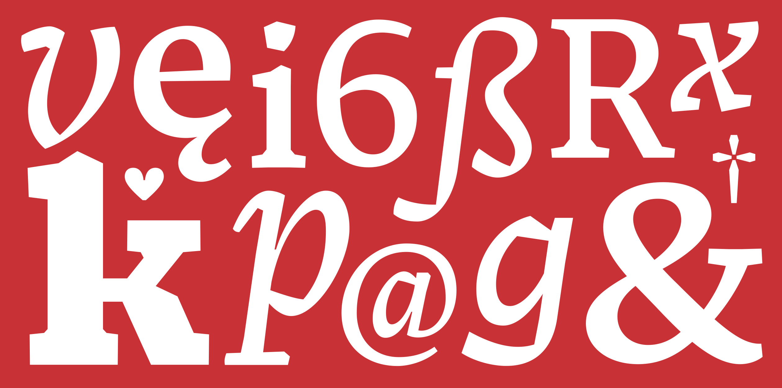
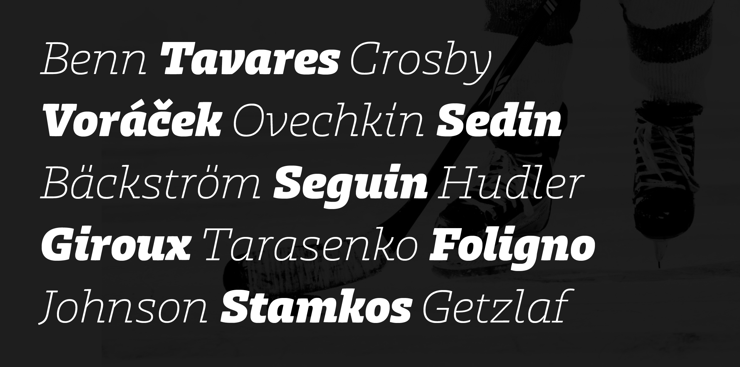
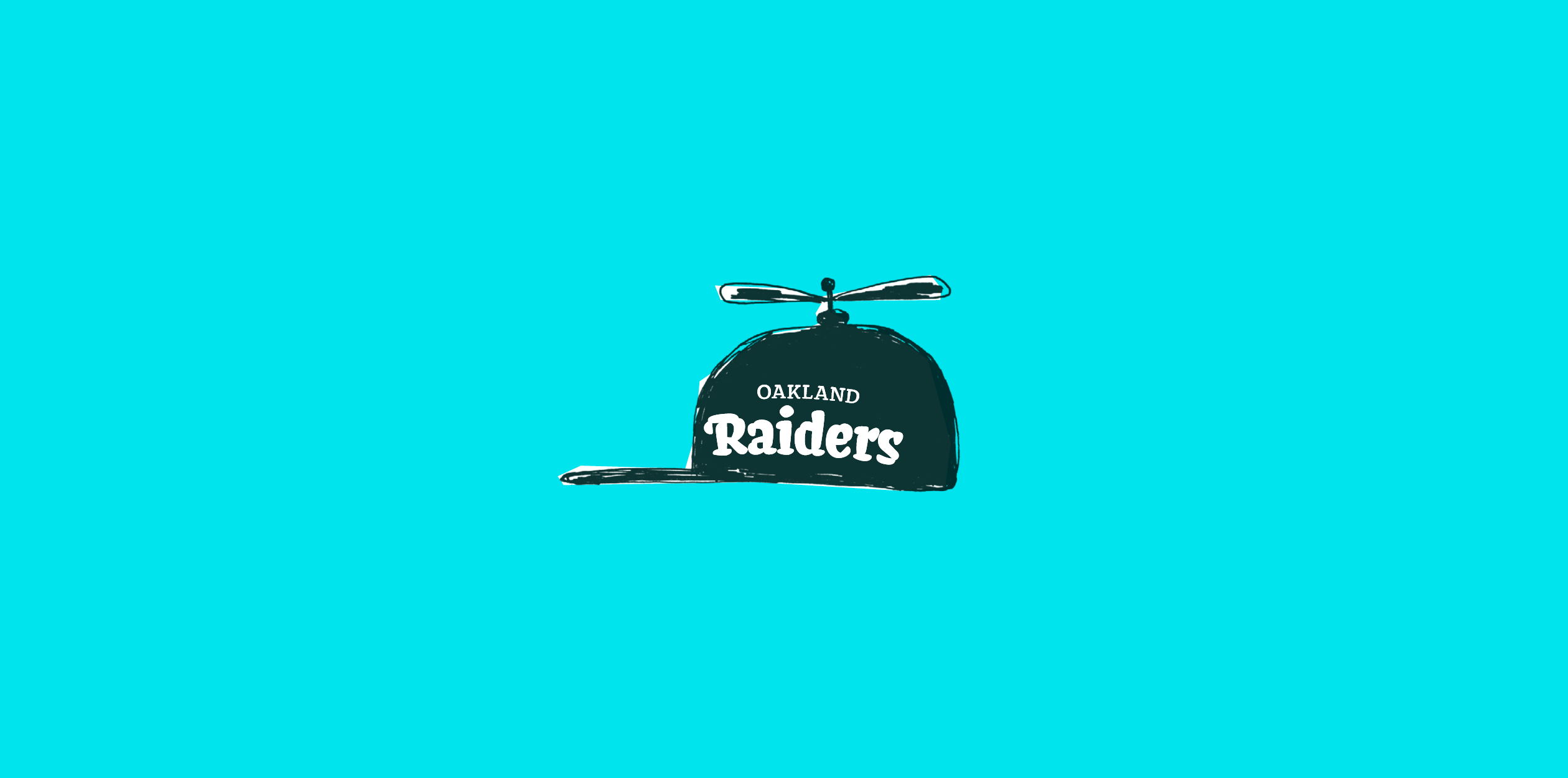
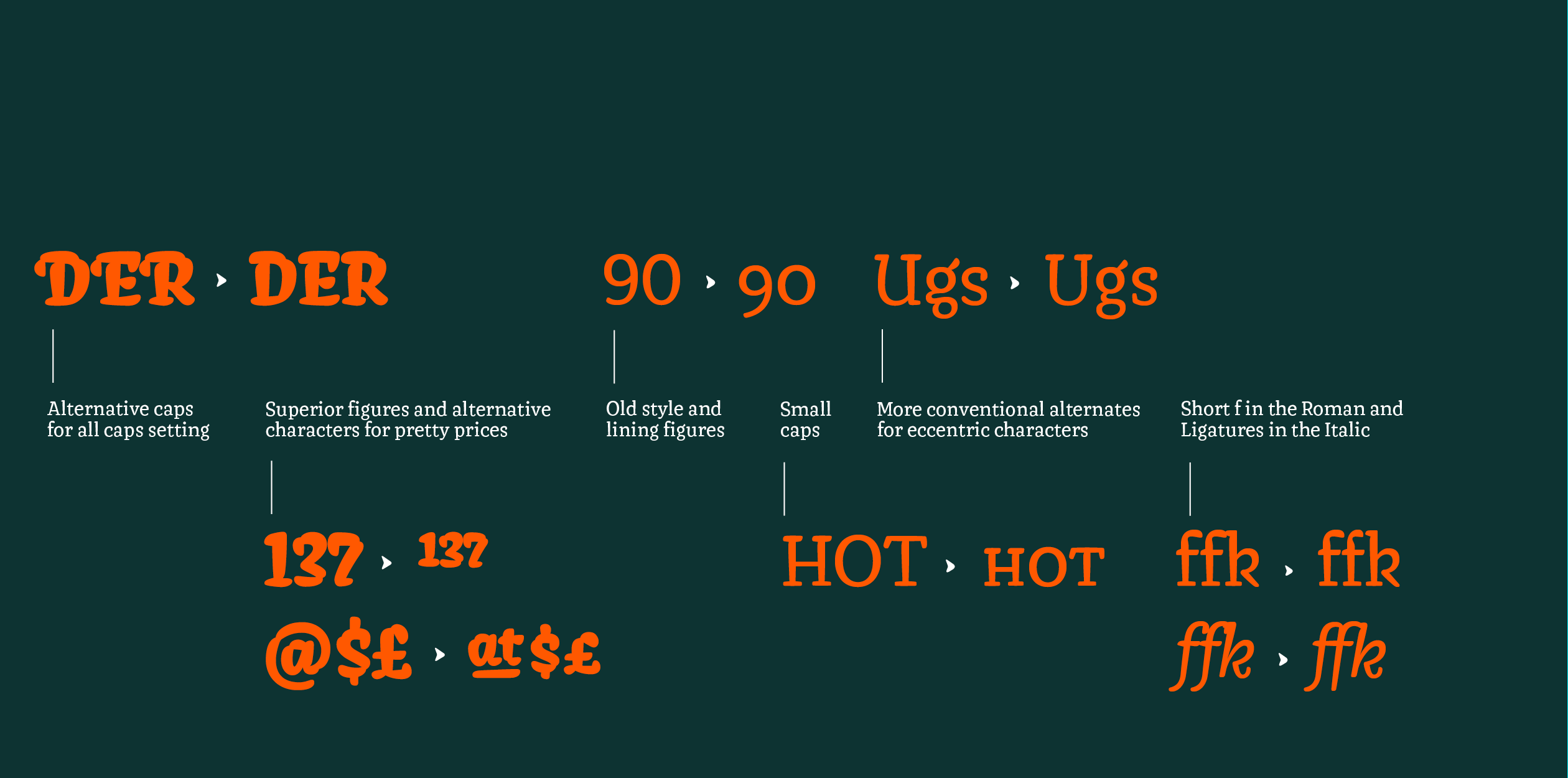
Katerina’s graduation project started with the fascination for counter shapes and extreme weights. Keeping this as the main focus she gradually developed the recipe of the Samsa family. The counters inside the letters became angular as the outer contours became round. Different approaches to developing a stencil version were tried too. This resulted in a typeface with a vivacious character for mostly headline and display applications. Samsa consists of three weights: Regular, Bold and Stencil. All three styles were based on the same concept, but it is not a must to use them all together. Extremely heavy Samsa Stencil exists also in a non-digital plywood version :-) Samsa is good for setting short texts and all kinds of headlines. Great for posters and shop windows. You can print it, you can stencil it. Which can be handy, if you need to put some letters on, for example, a t-shirt. Samsa is a bit quirky, active, catchy, happy and cheerful. Samsa supports most European languages, will have Cyrillics soon. Stay tuned!
Katerina Kochkina is a graphic/lettering/type designer from Moscow, currently based in The Hage, Netherlands. Graduated as a journalist in 2009. Worked as a reporter, illustrator and lettering designer. In 2010 got a position of an intern in DesignDepot, one of the largest design studios in Moscow. After 3 years became an art-director, simultaneously was an art-director of [kAk), one of the first magazines about graphic design in Russia, and teacher in the British Higher School of Art & Design, Moscow. Typography was always her passion, so in 2014 she was enrolled in Type and Media course in Royal Academy of Art, The Hague.
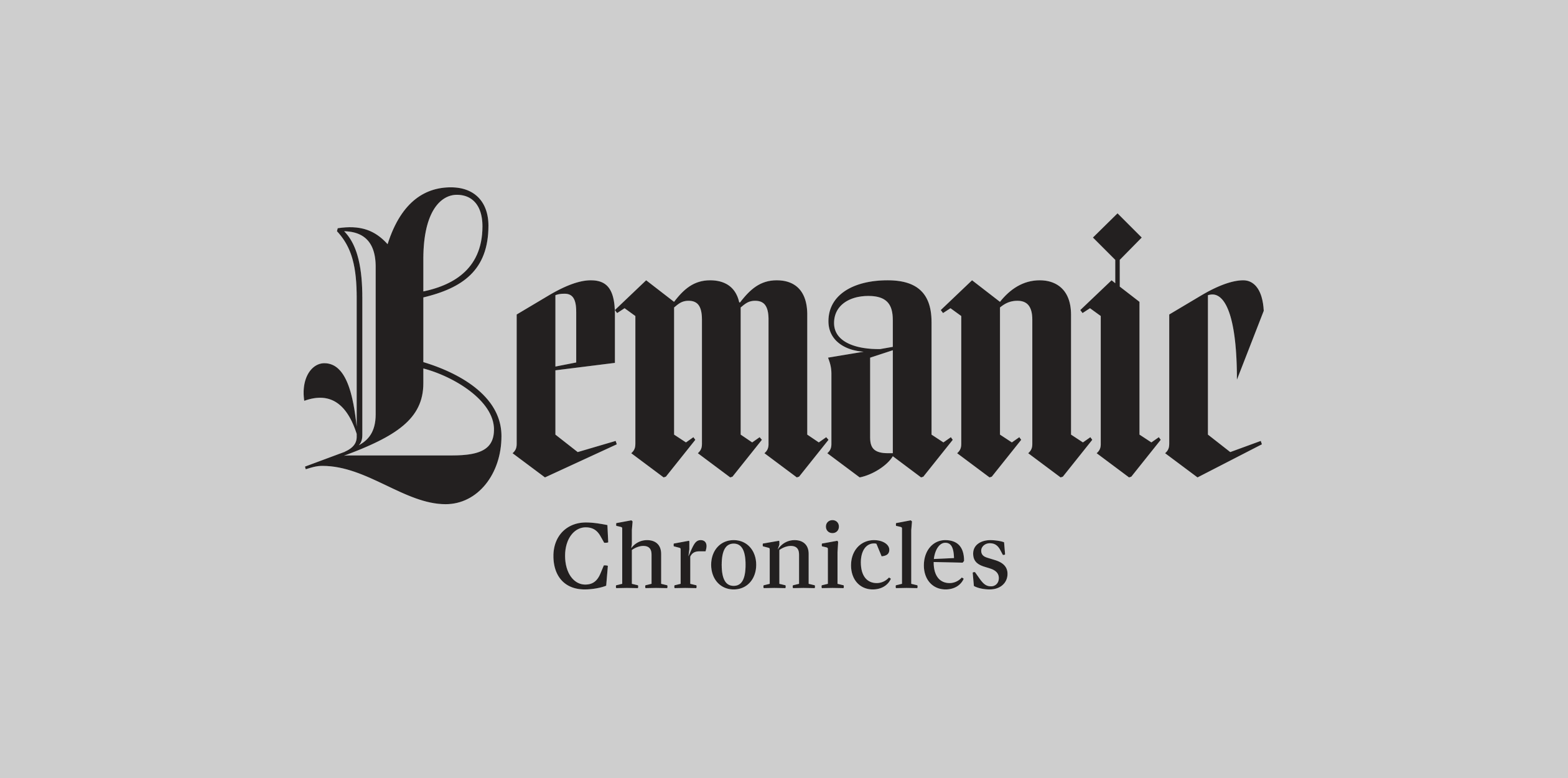
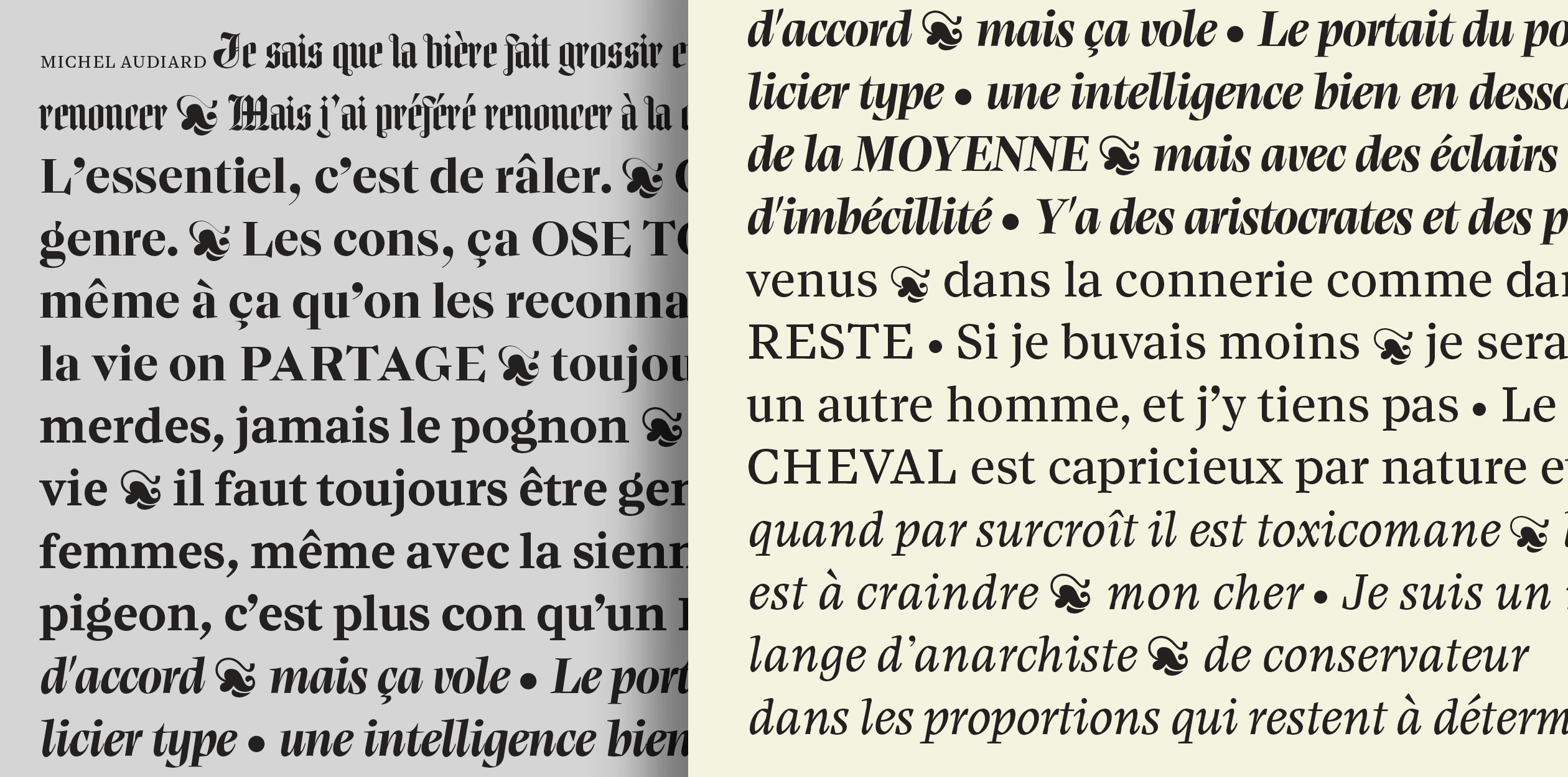
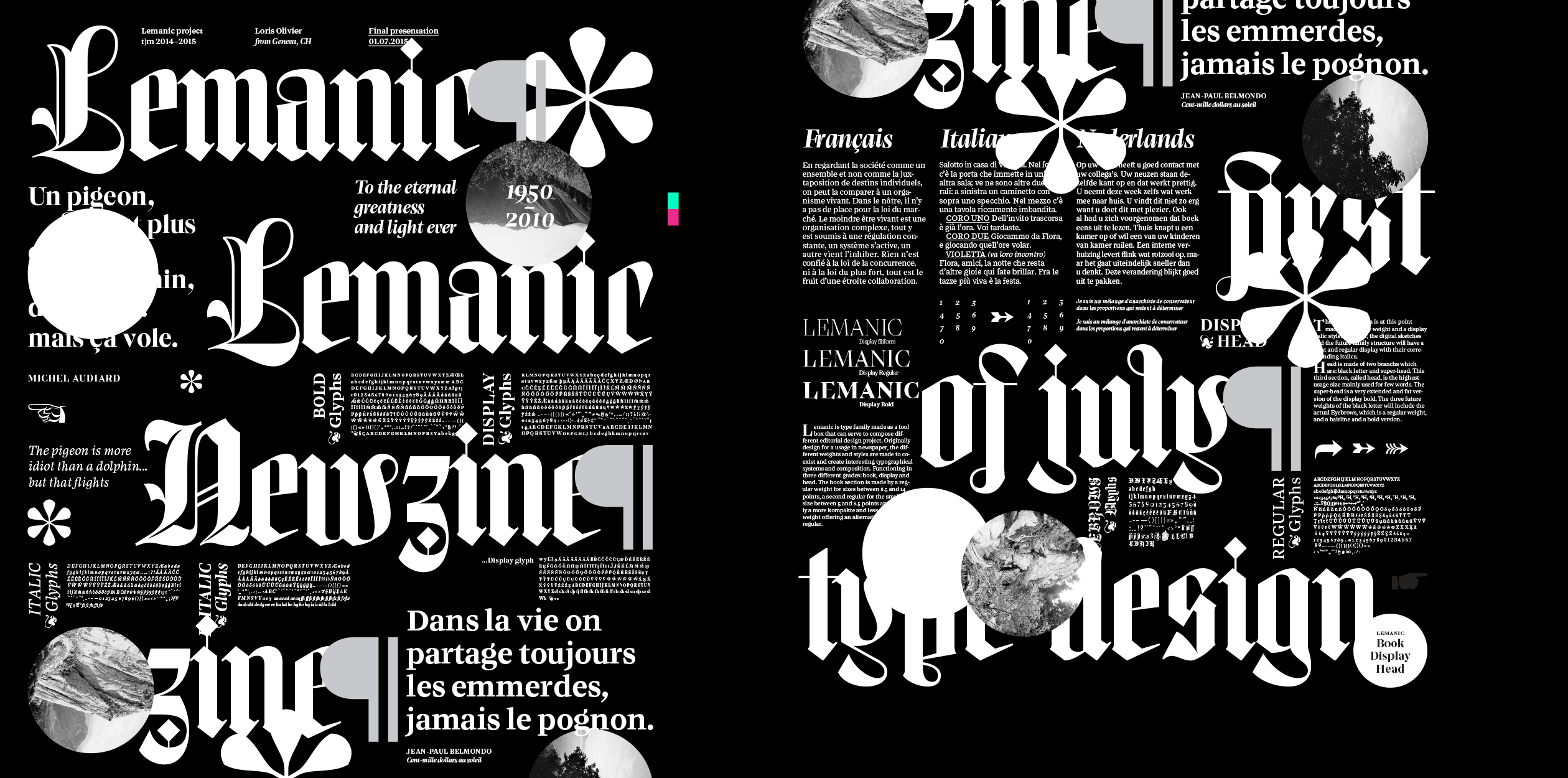
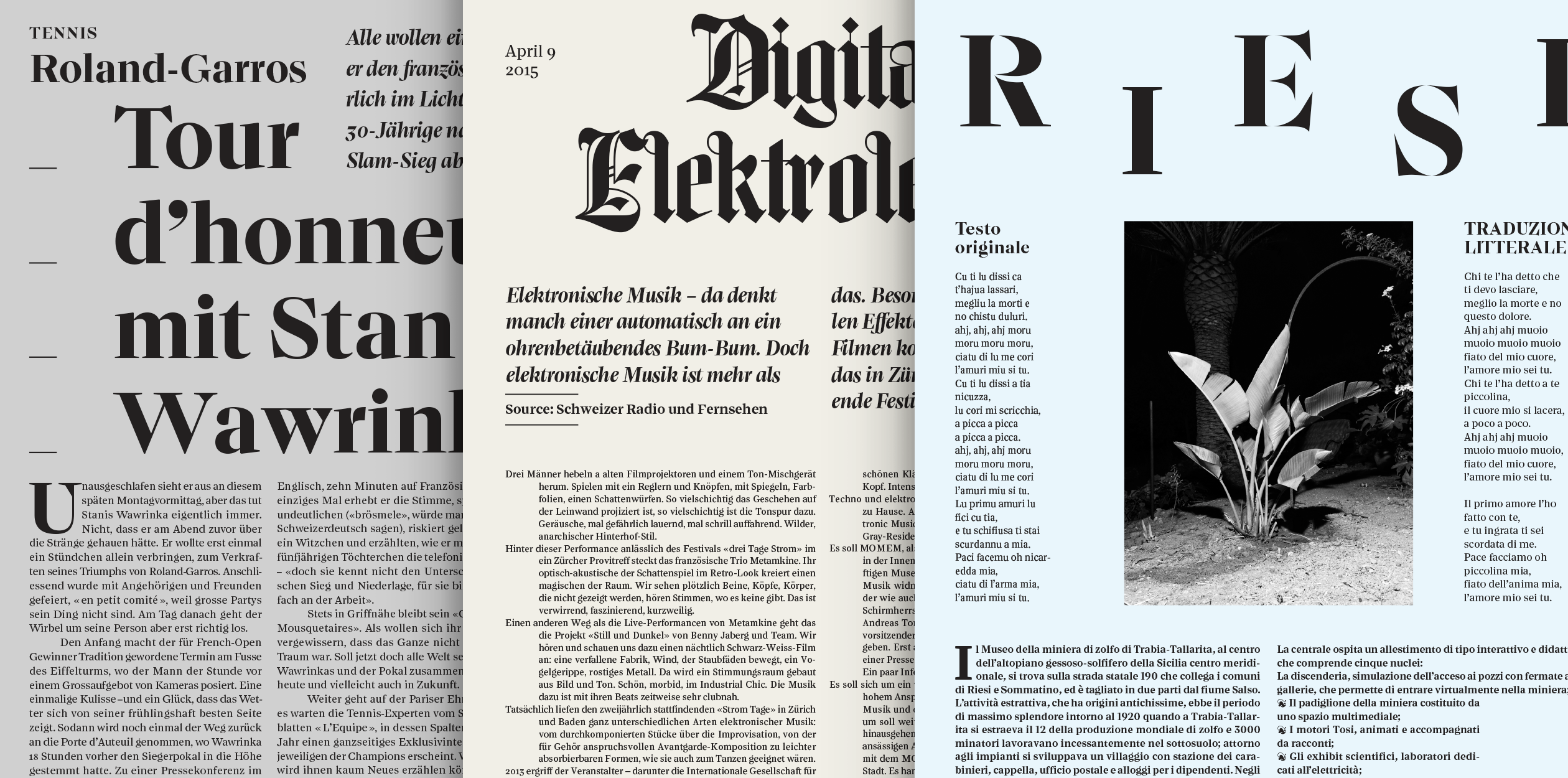
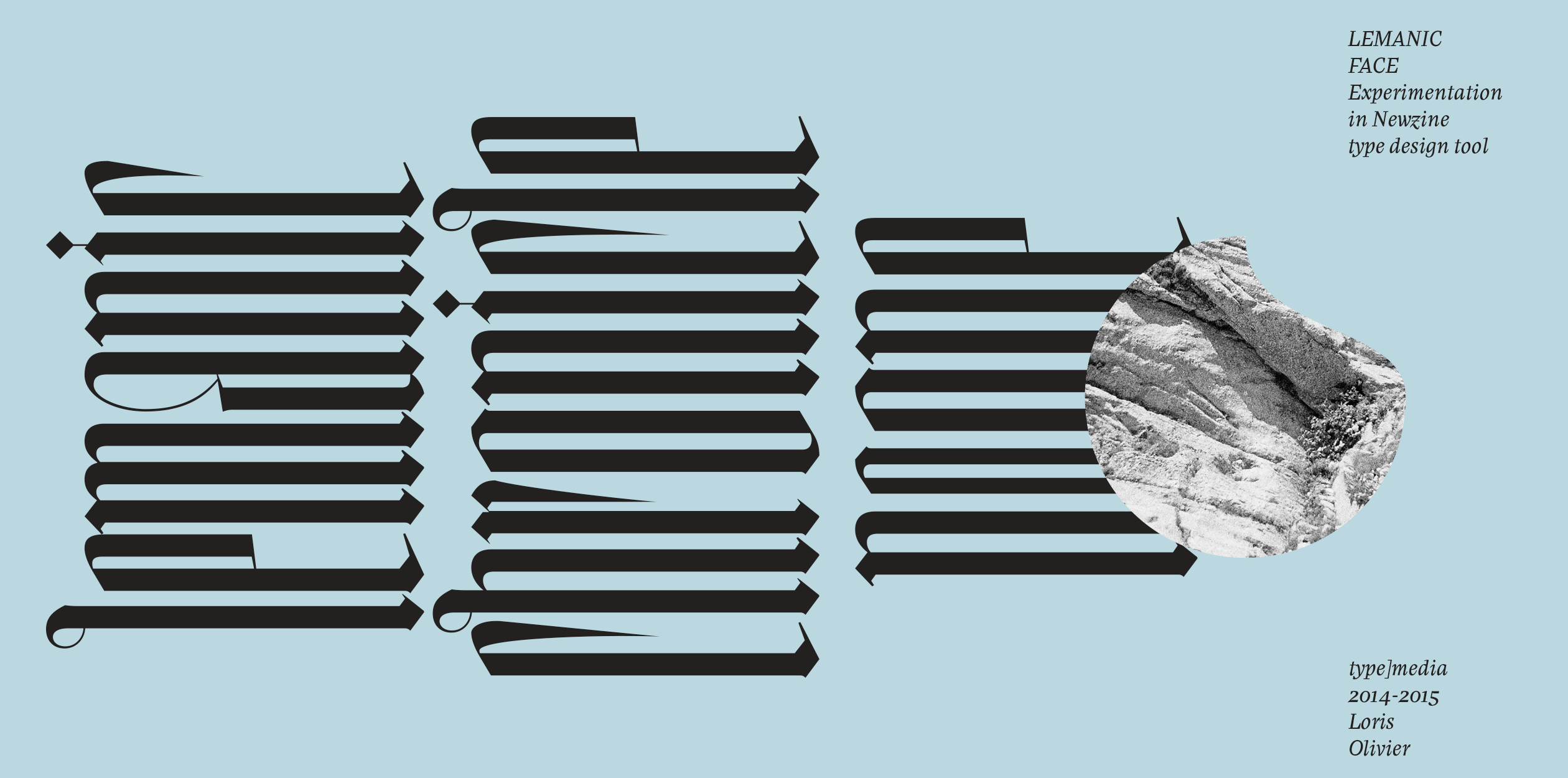
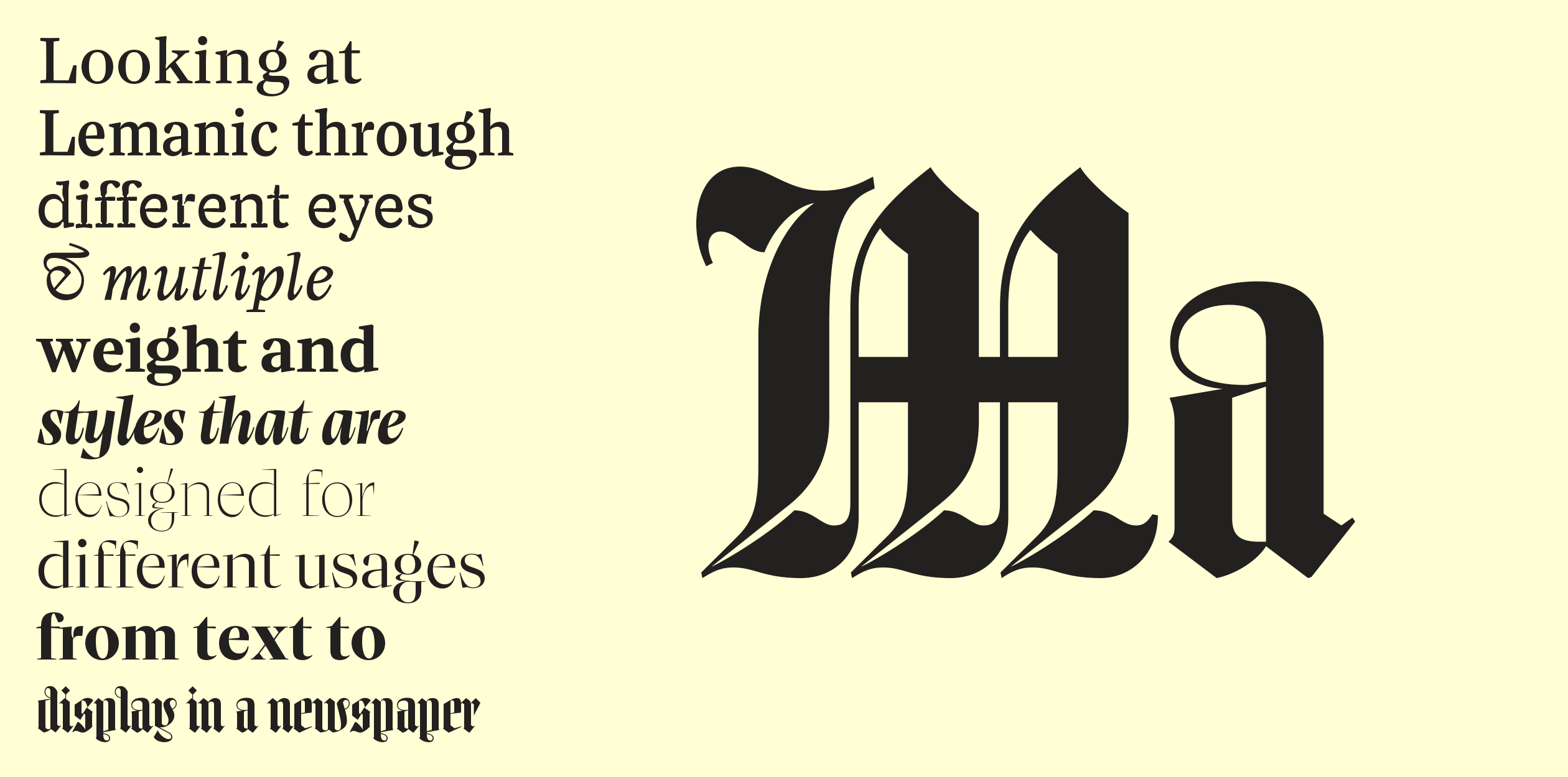
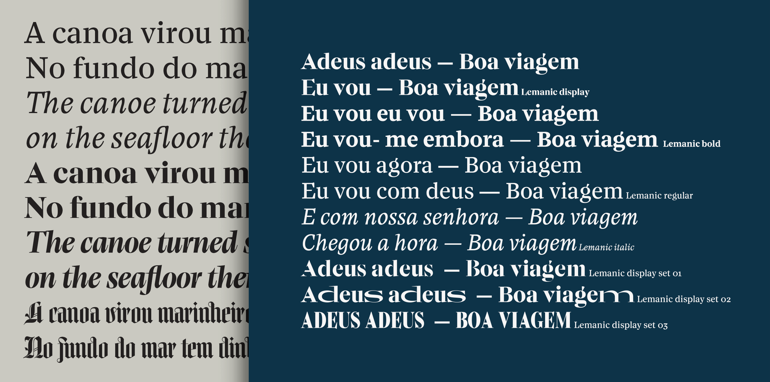
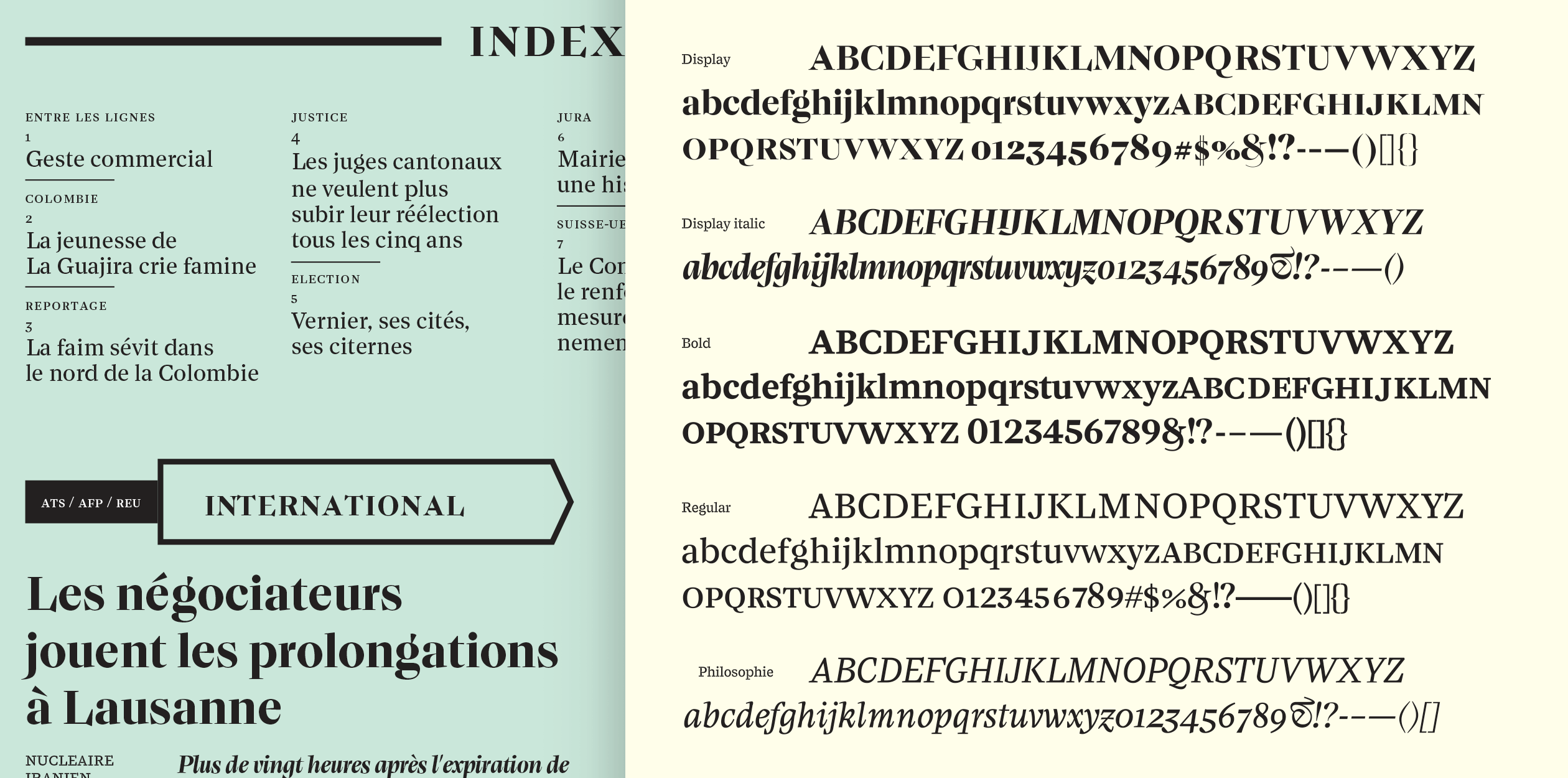
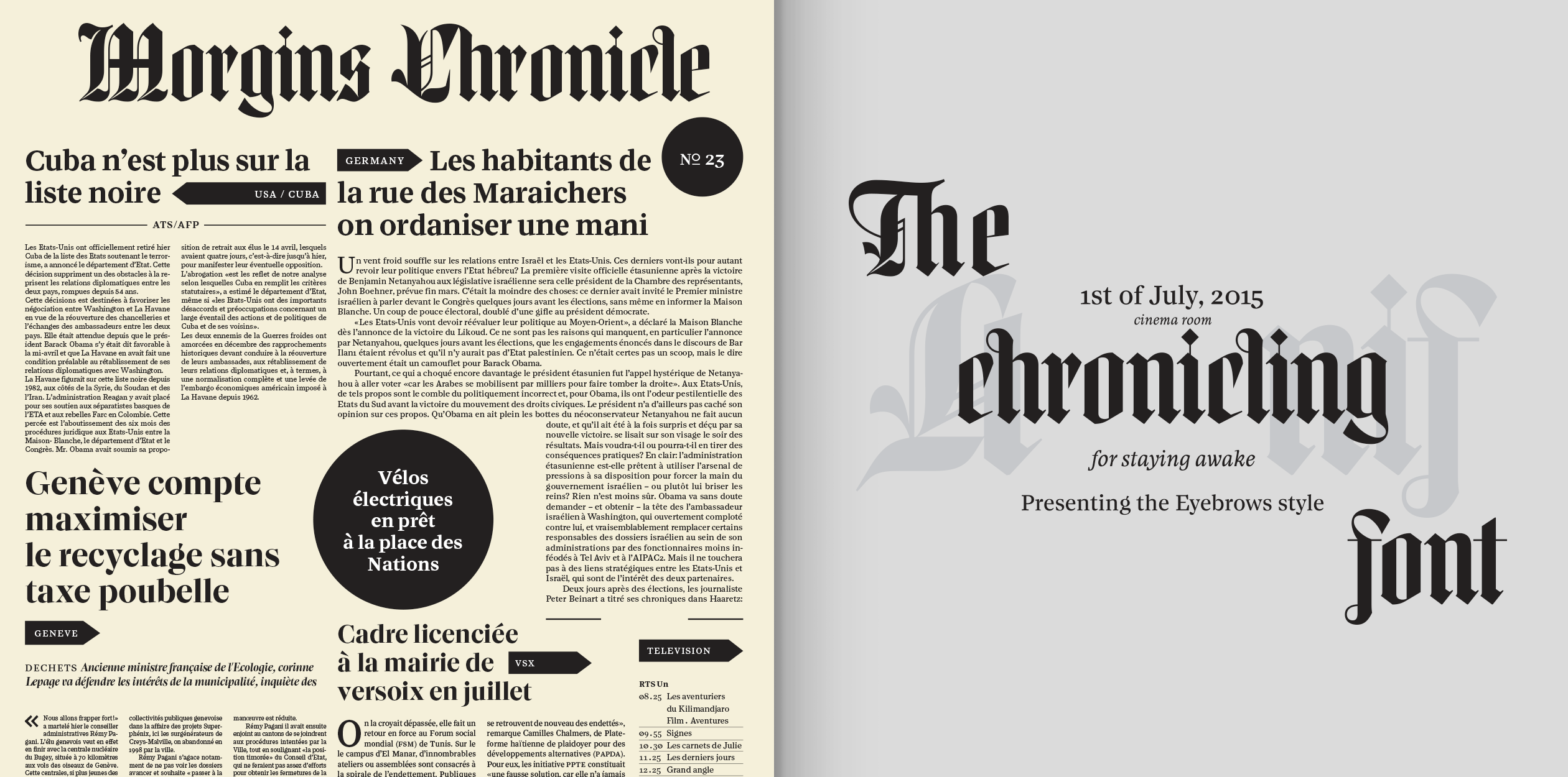
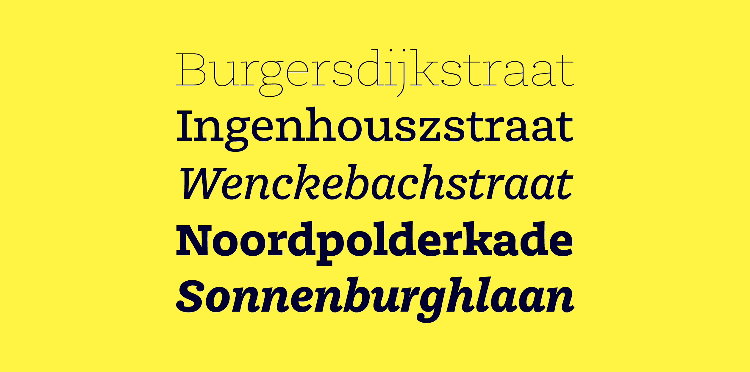
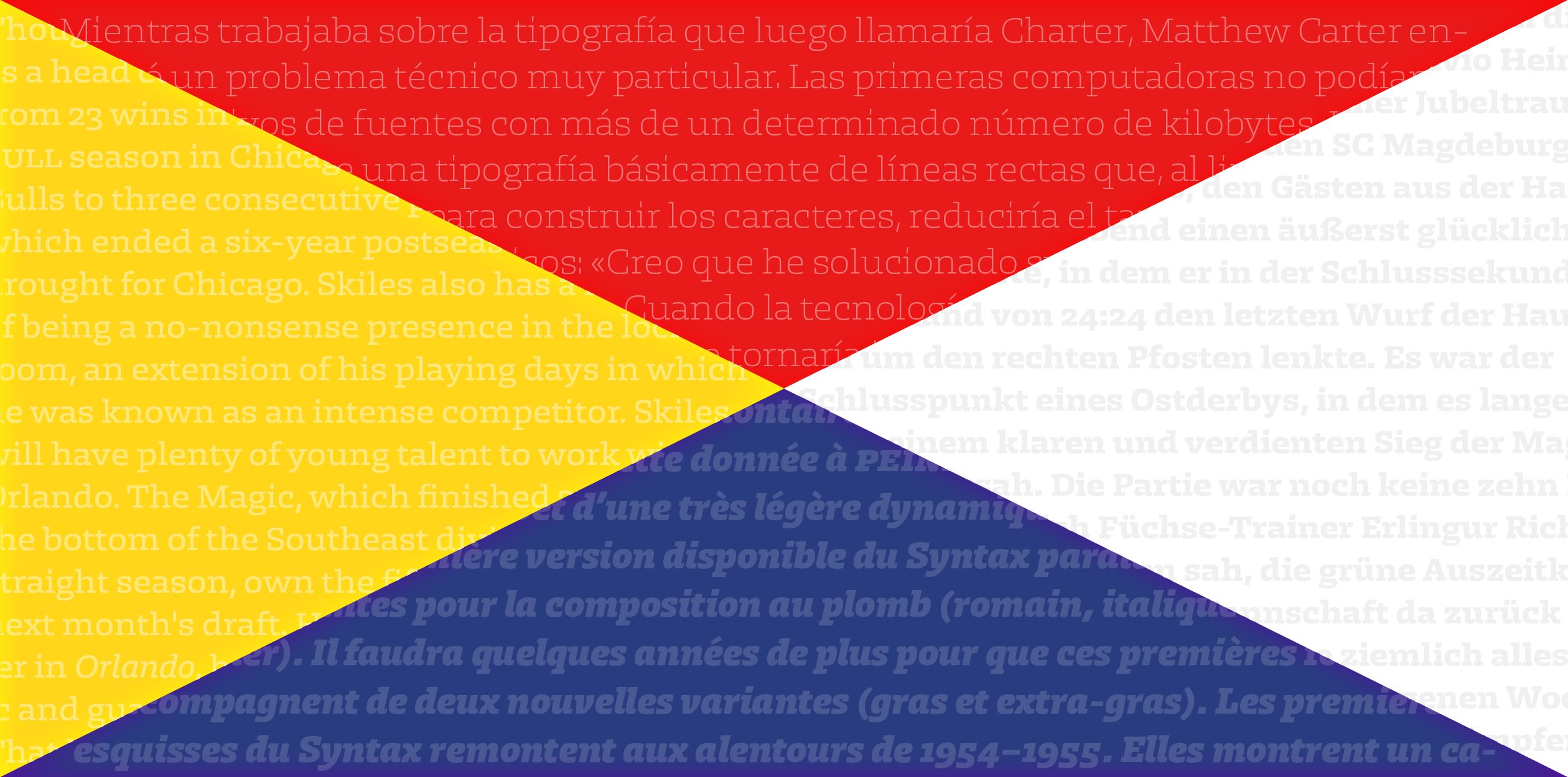
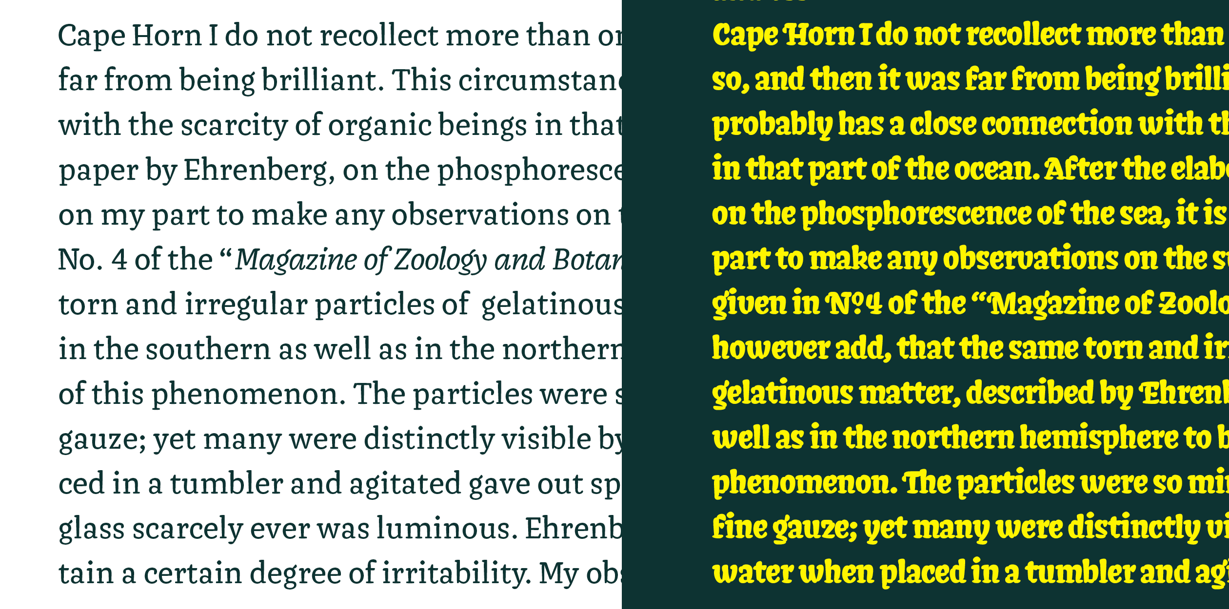
Lemanic is a typeface family planned as a tool box. The different weights and styles are made for newspaper. The entire family is constructed in order to decrease the usage of images next to the text. The shapes and its inspiration are taken from the fluidity and the rhythm of the work of Fournier and certain shapes of the Romain du Roi. Those weren't drawn for newspaper, Lemanic is making a personal synthesis of those two sources.
Coming from a graphic design background after graduating in 2013 with a BFA from the Academy of Art University of San Francisco, I have been interested in type design. Combining the incredible tool of type design into my graphic design practice opened a great amount of new visual languages. In addition to type and graphic design, I am interested and passionated by silkscreen printing. Back from the USA and the Netherlands, I work from Geneva on editorial identity, branding, editorial, graphic and type design.
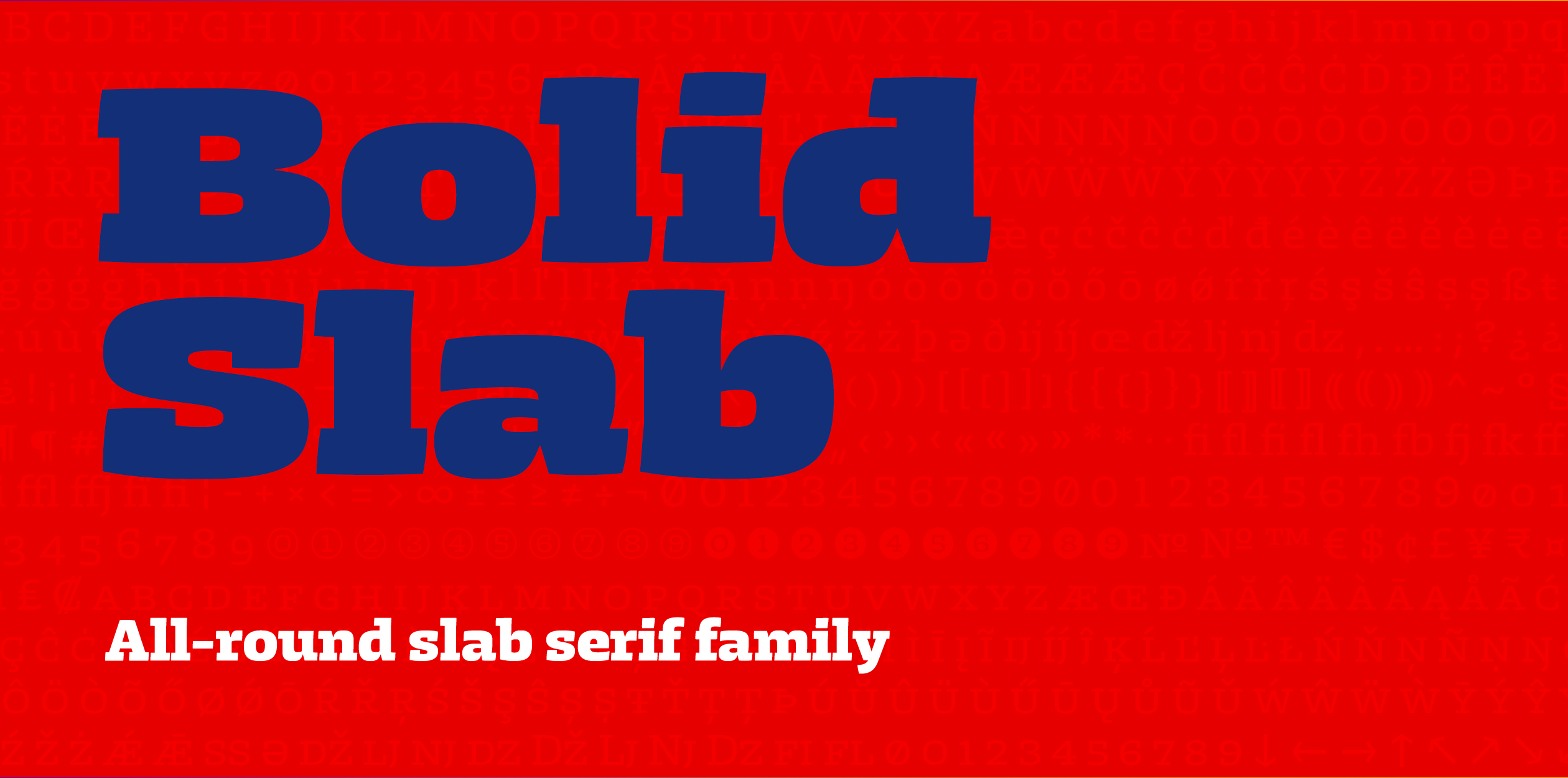
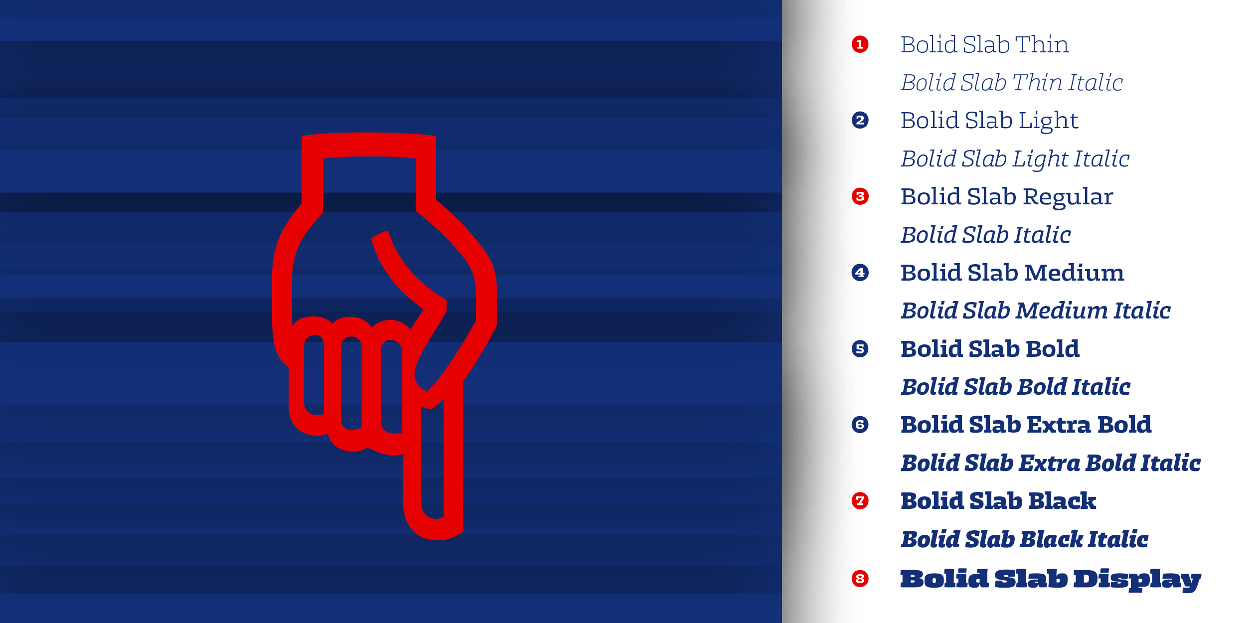
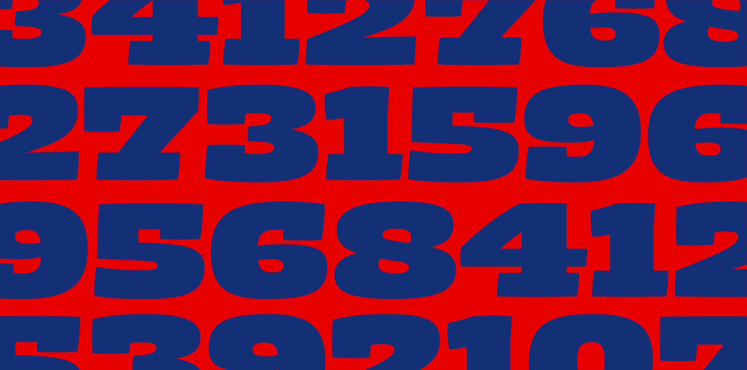
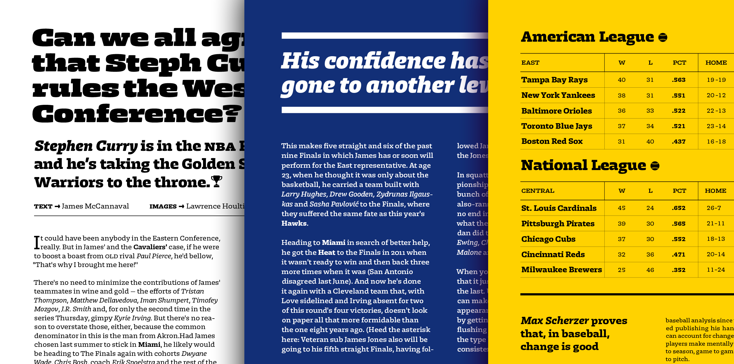
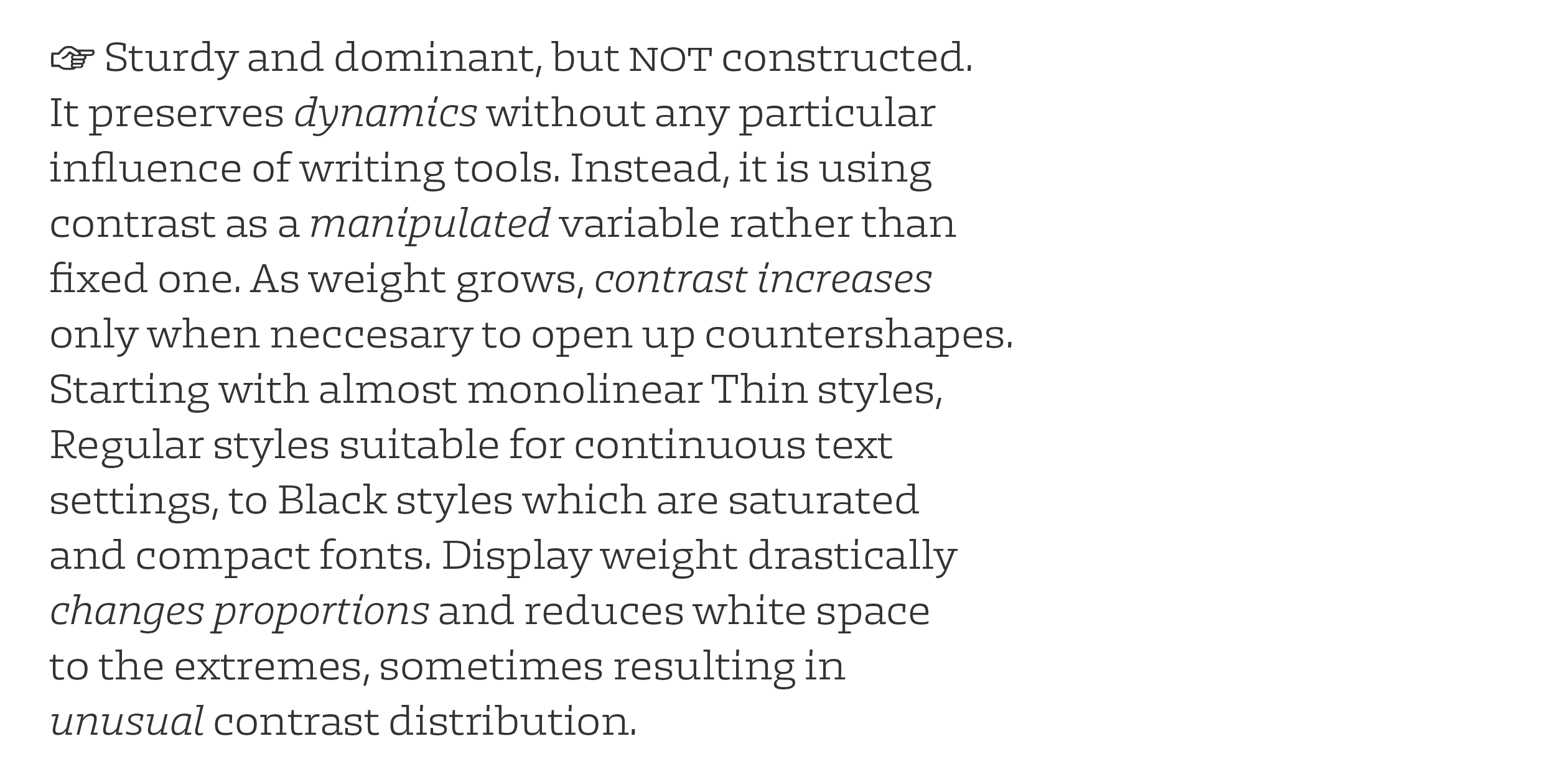
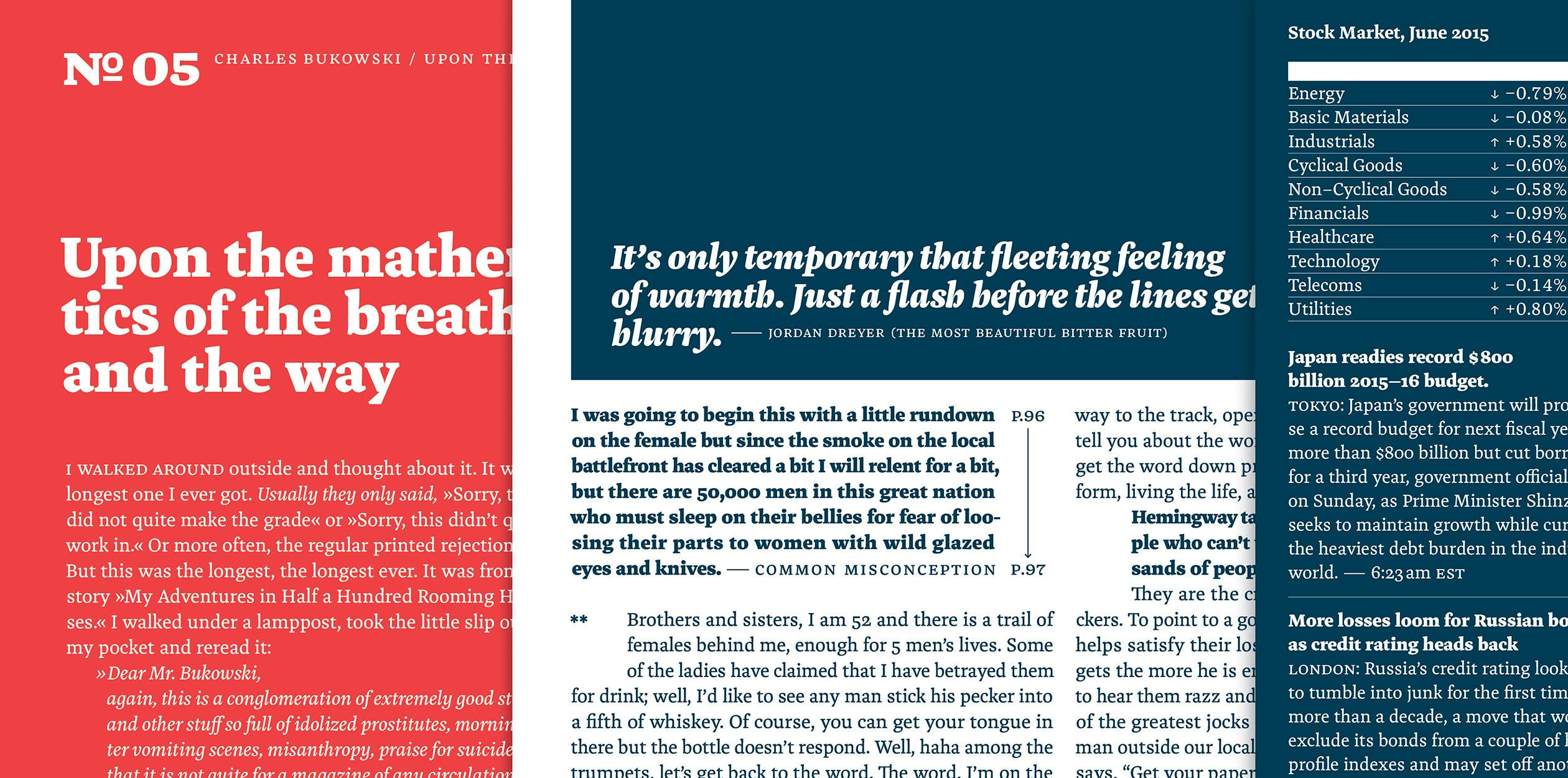
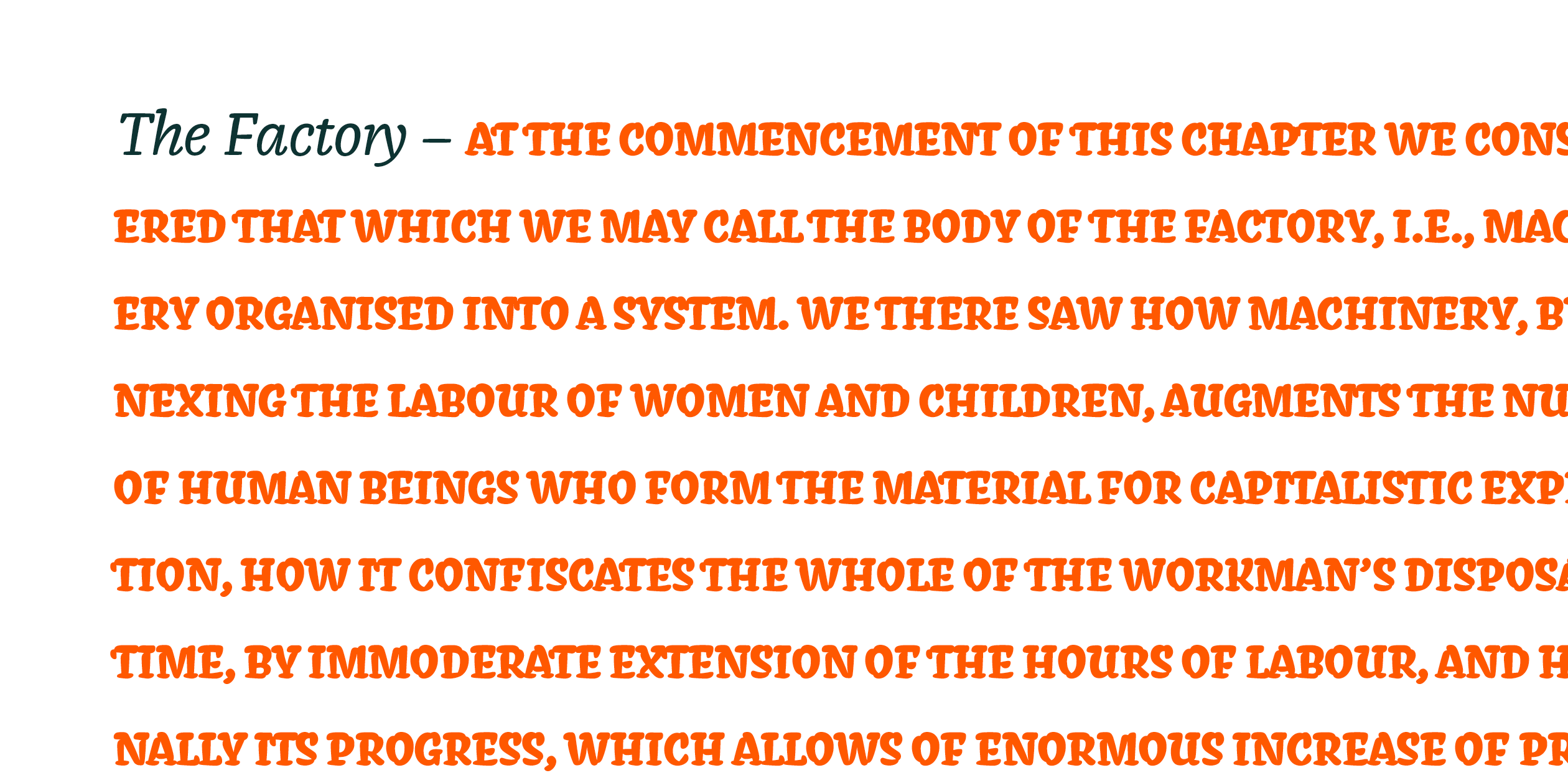
Slab serif family that looks what is there beyond solid in letter shapes. It is sturdy and dominant, but not constructed. It preserves dynamics without any particular influence of writing tools. Instead, it’s using contrast as a manipulated variable rather than fixed one. As weight grows, contrast increases only when neccesary to open up countershapes. Starting with almost monolinear Thin styles, Regular styles suitable for continuous text settings, to Black styles which are saturated and compact fonts. Display weight drastically changes proportions and reduces white space to the extremes, sometimes resulting in unusual contrast distribution. Bolid Slab is a sturdy type family with wider proportions, including broad range of styles that perform equally well in sizes big and small, be it on screen or printed.
Marko Hrastovec is a type, lettering and graphic designer based in Croatia. Important part of his client and self-initiated work is finding right aesthetic way for words to stand out and make sense, which took him to The Hague. Before studying TypeMedia at KABK, Marko graduated with MA in visual communications in 2014 from School of Design in Zagreb. After TypeMedia he is planning to focus his work on type design.
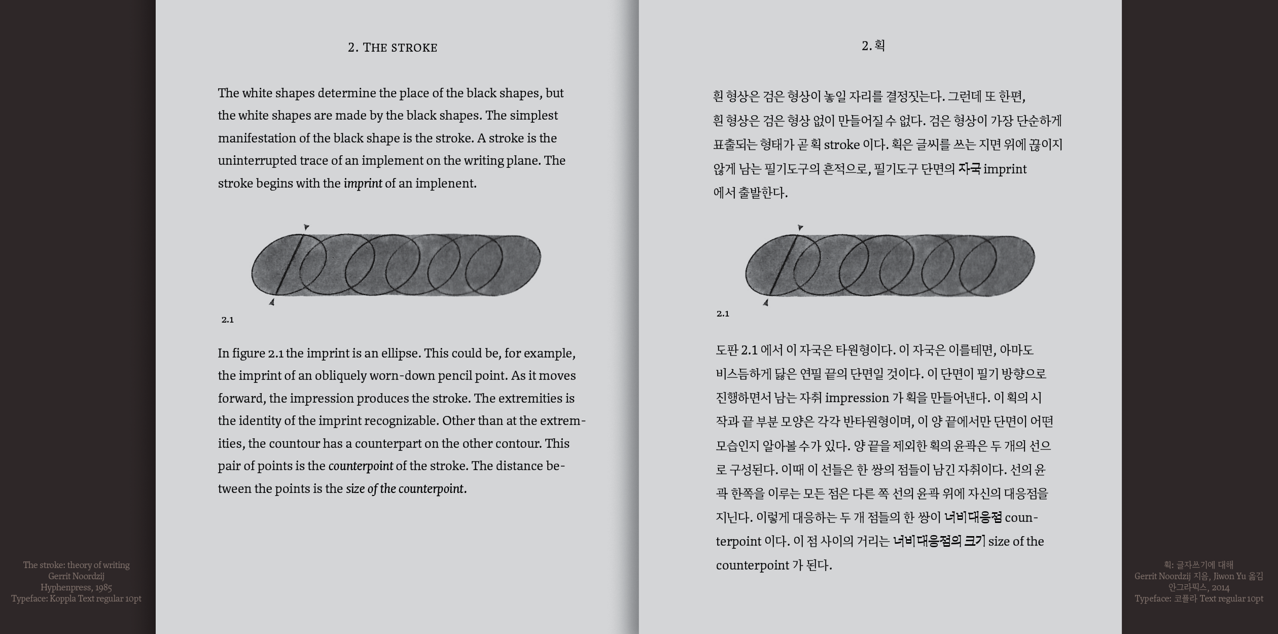
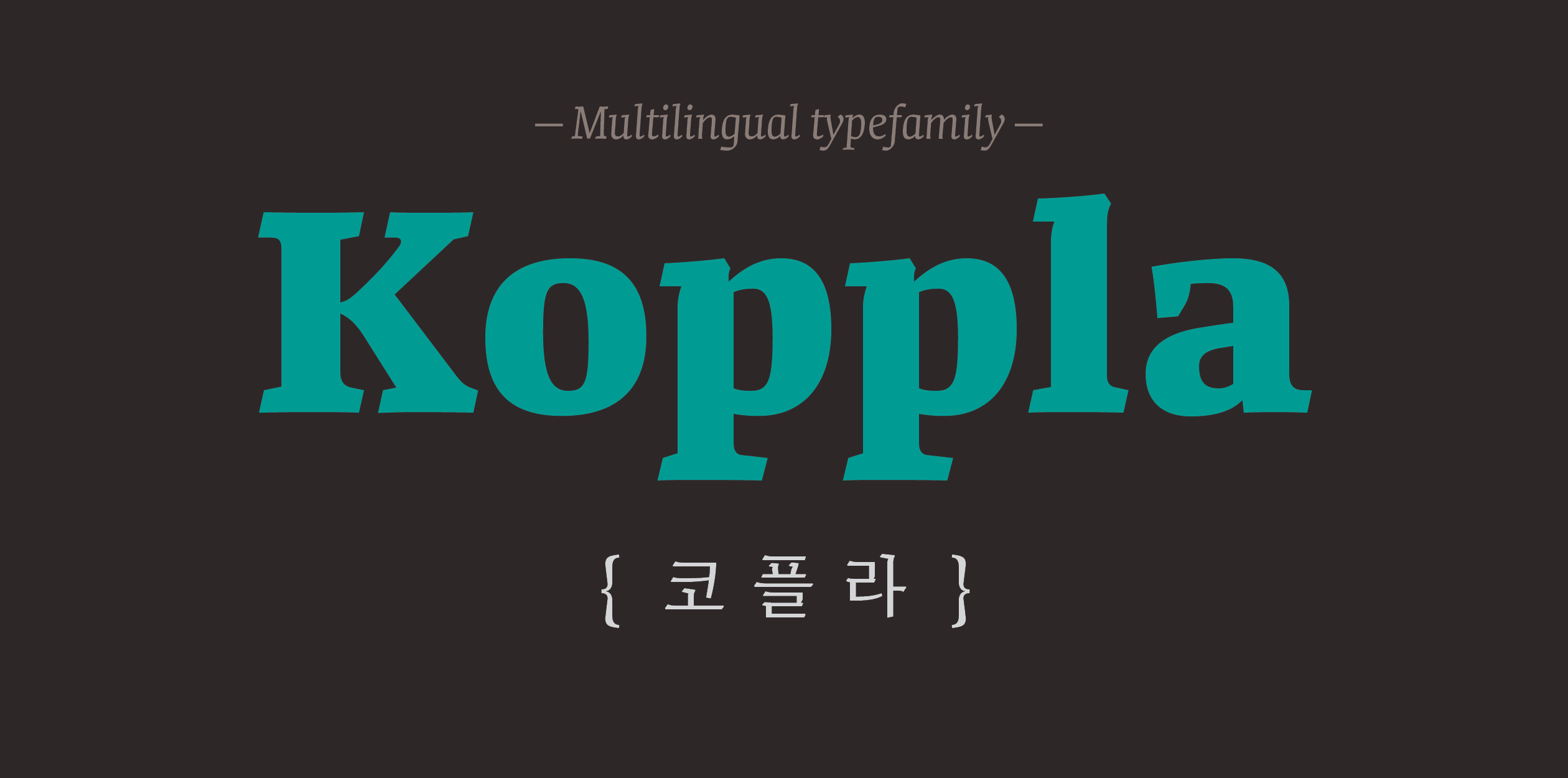
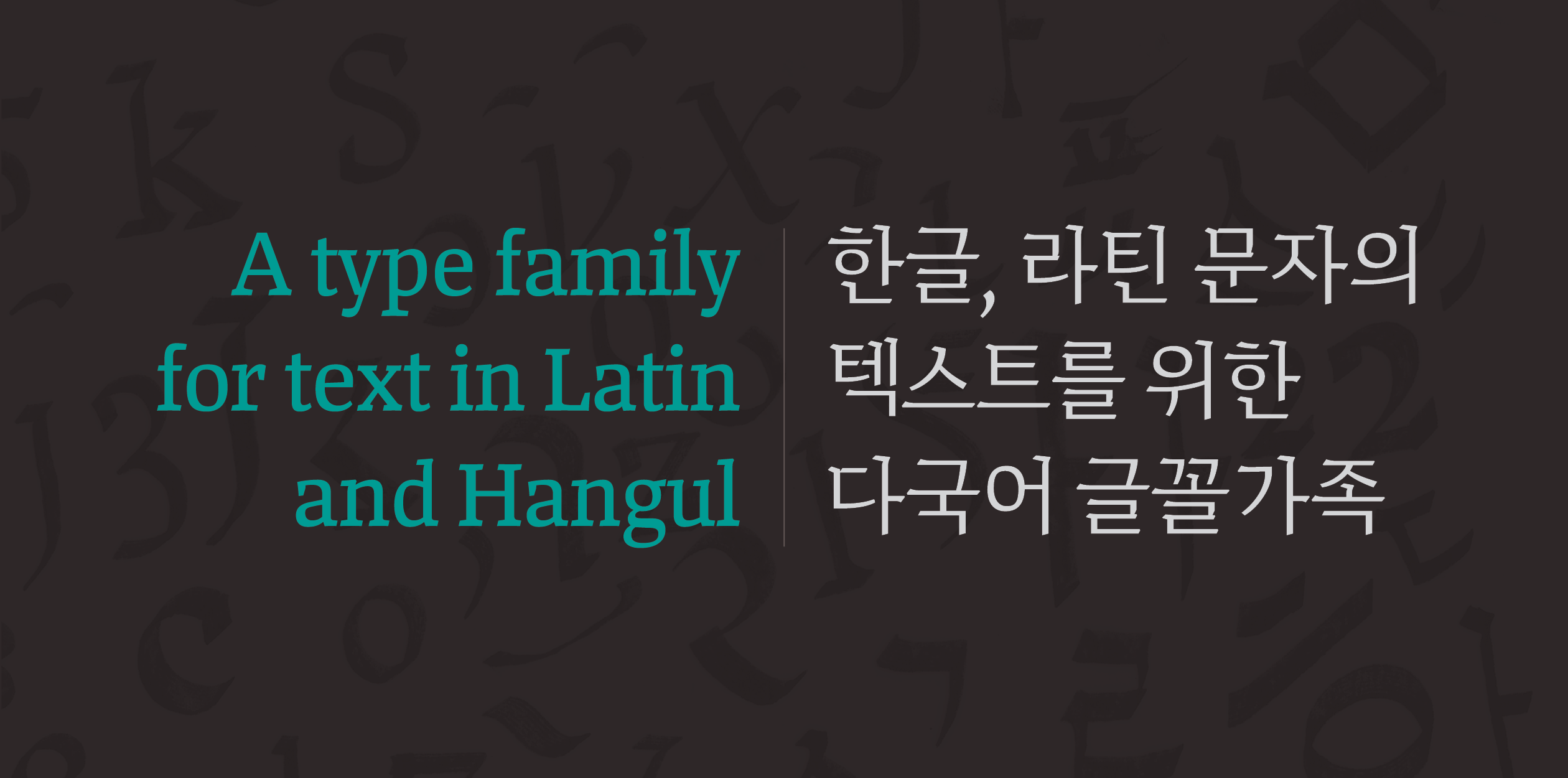
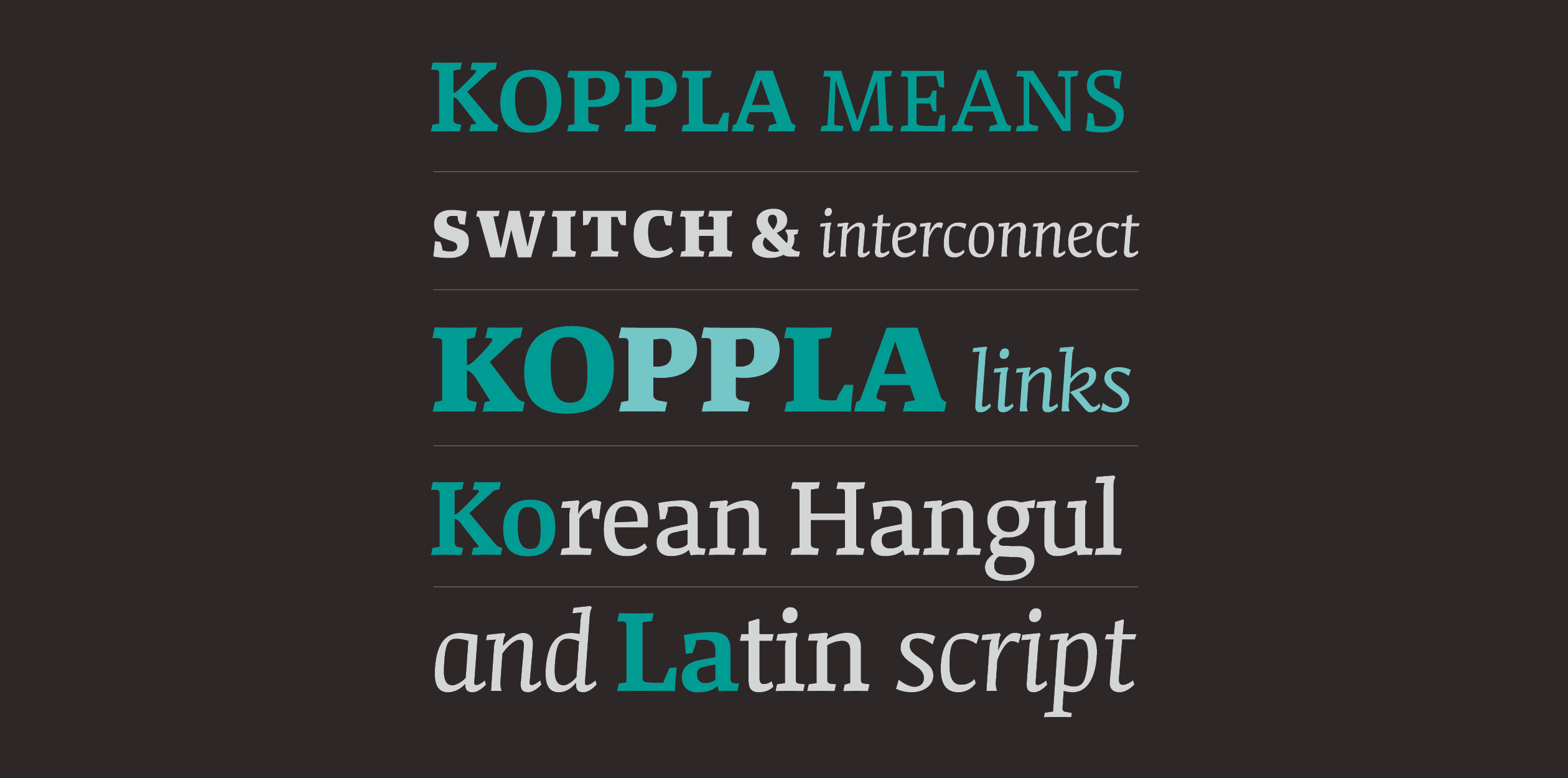
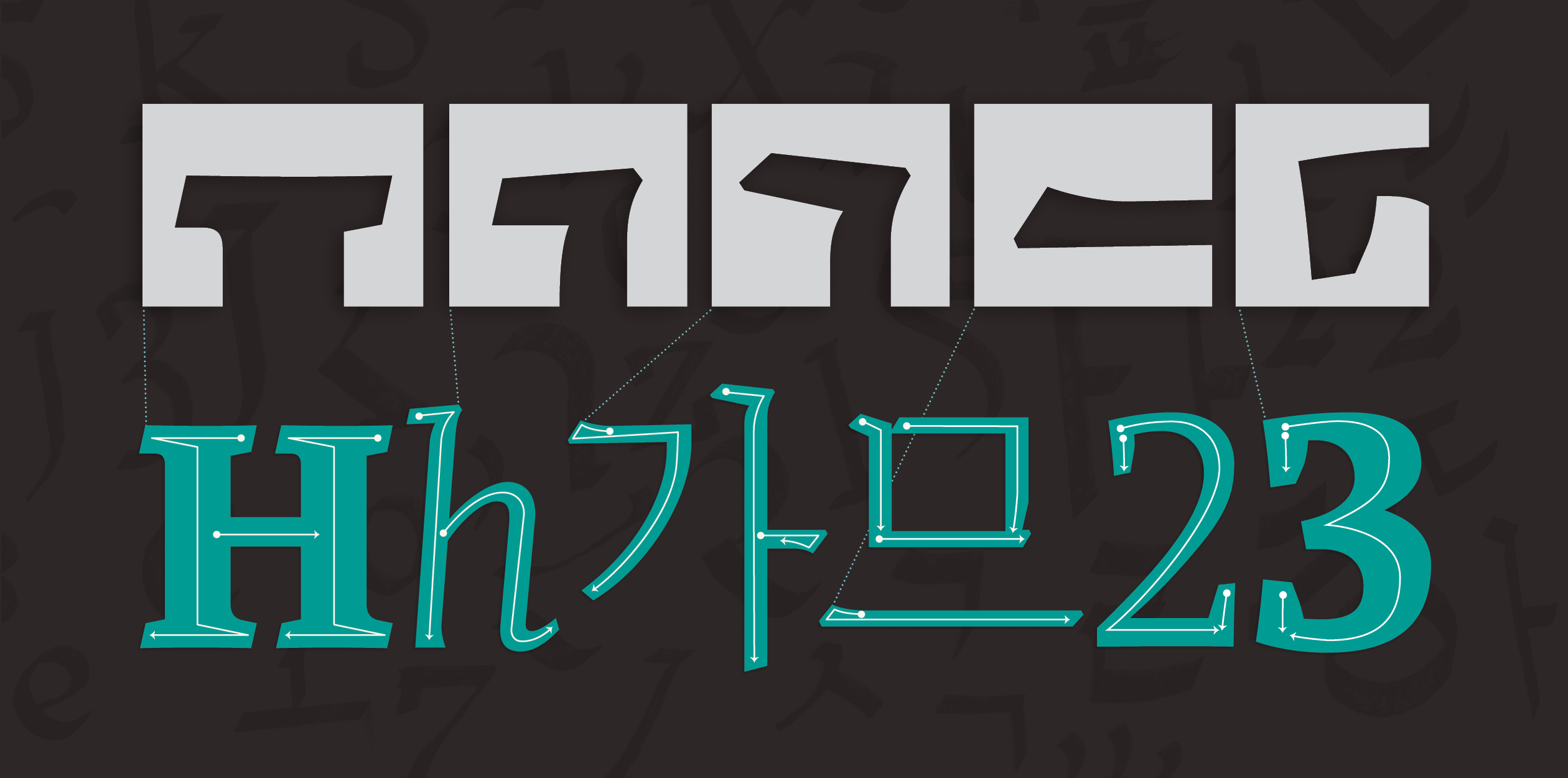
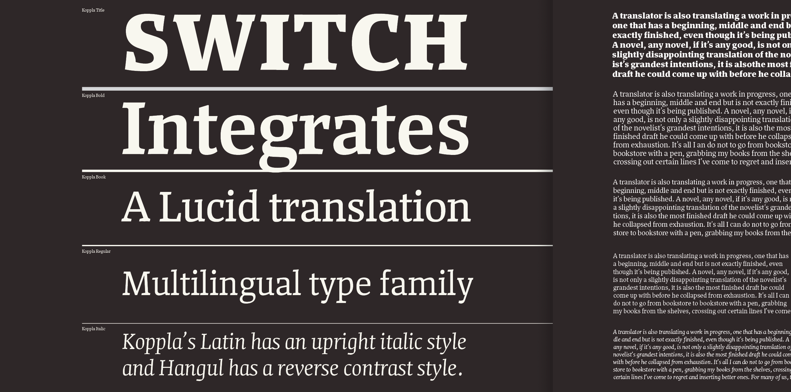
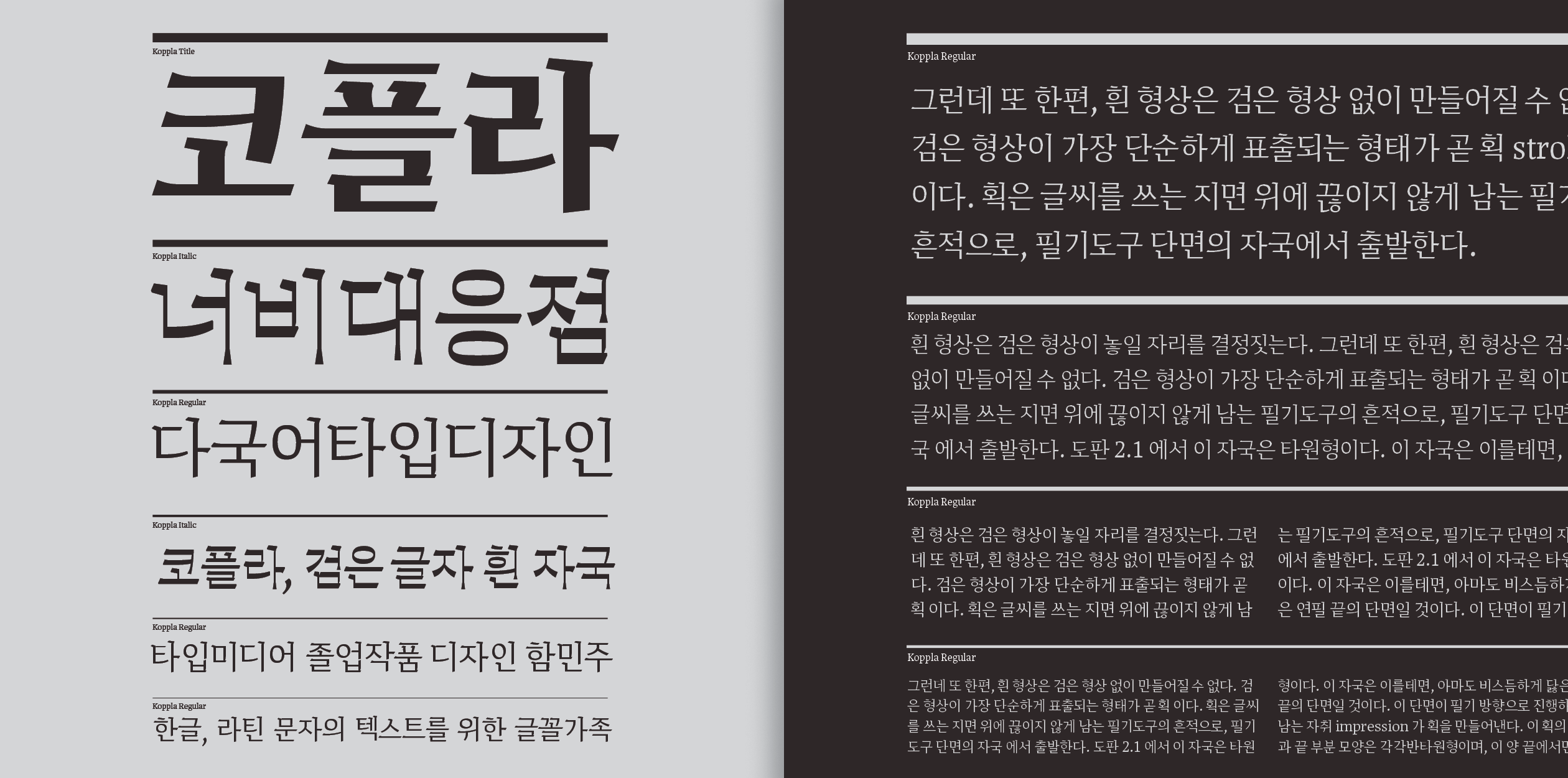
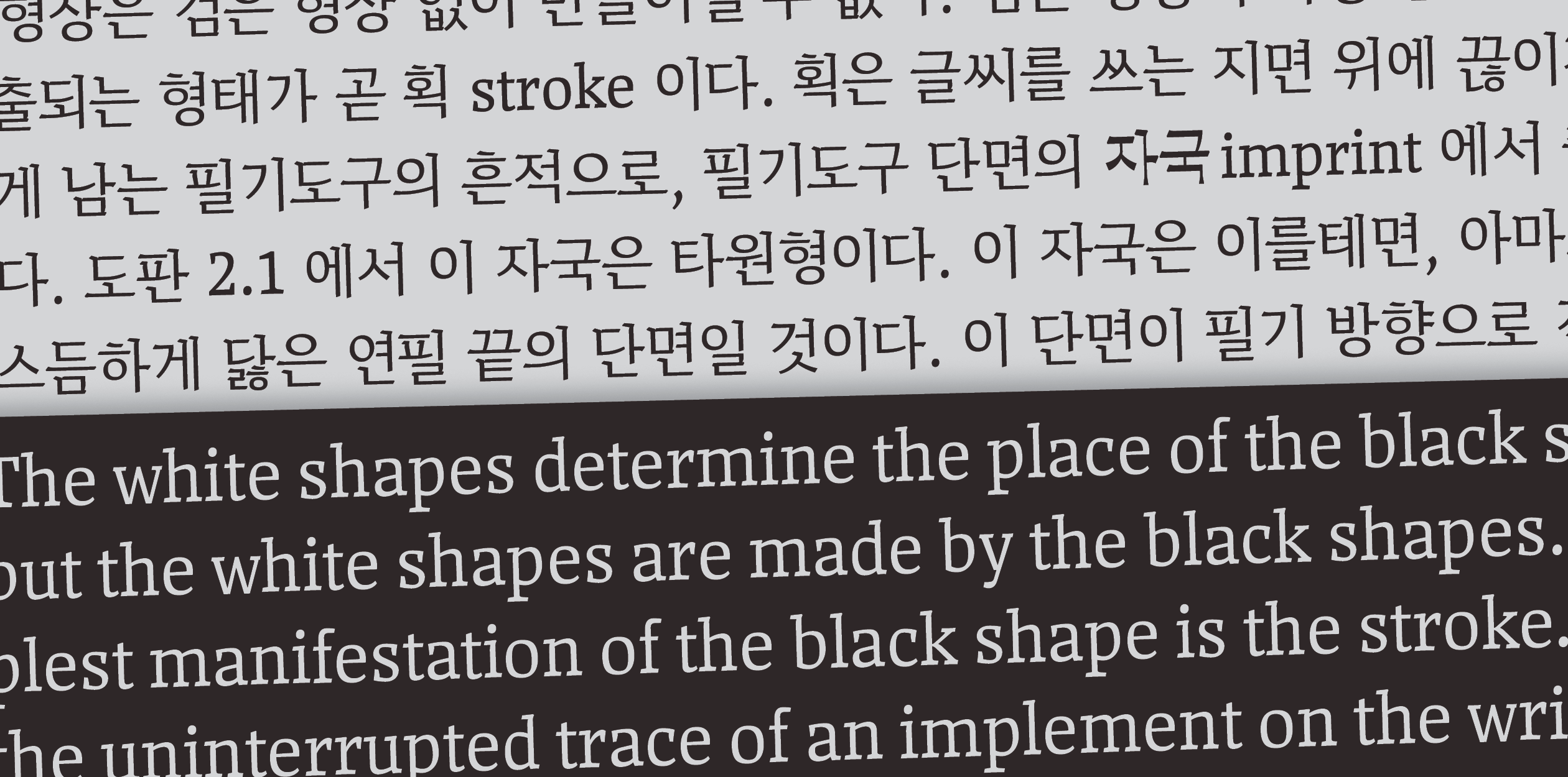
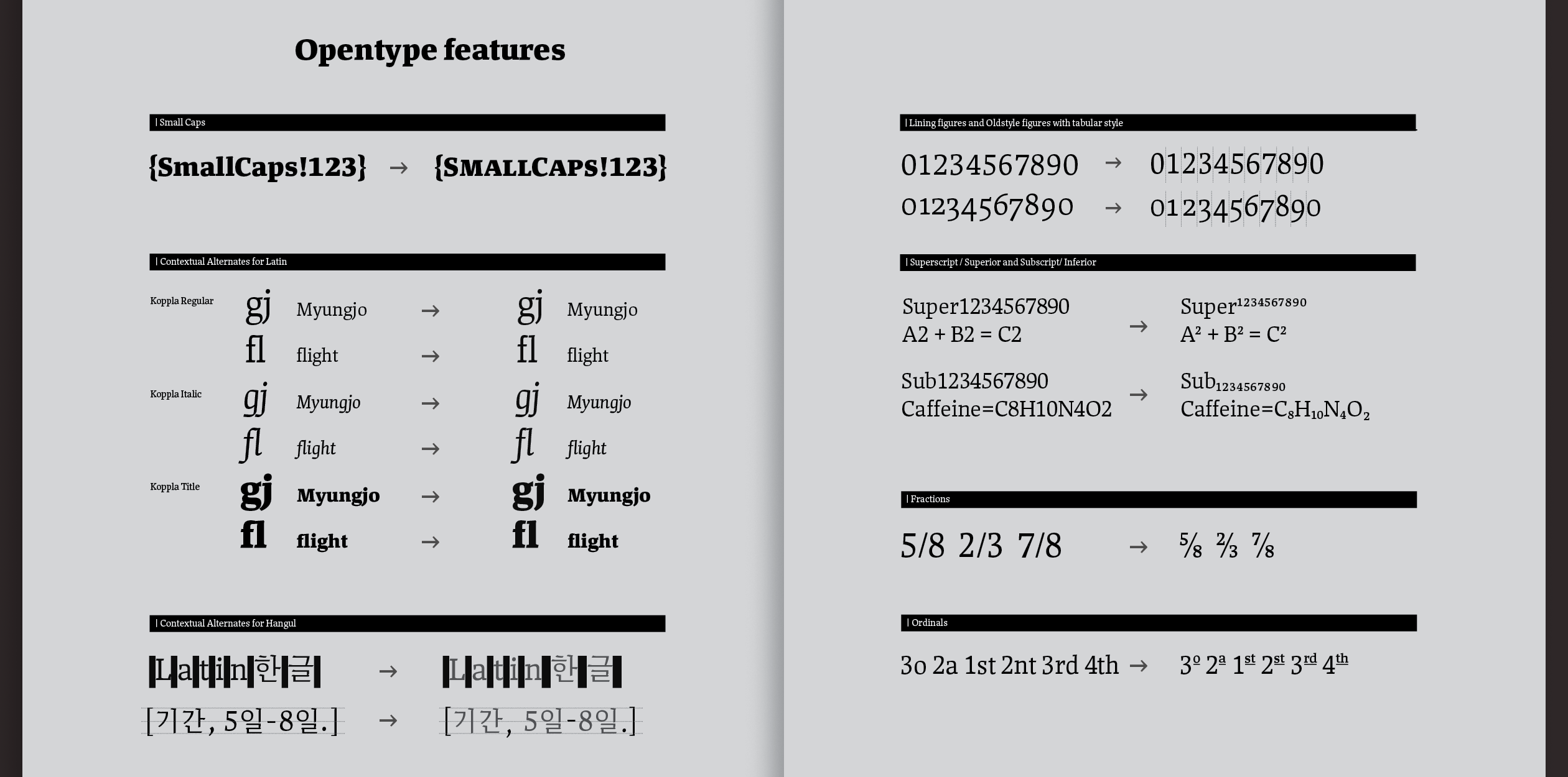
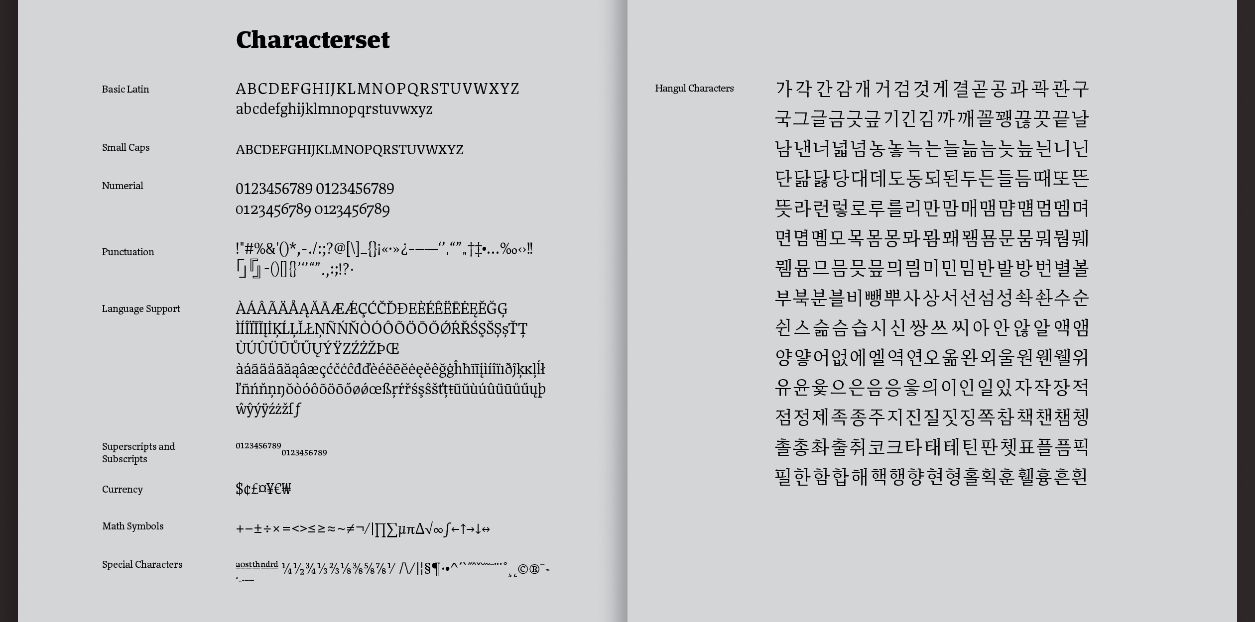
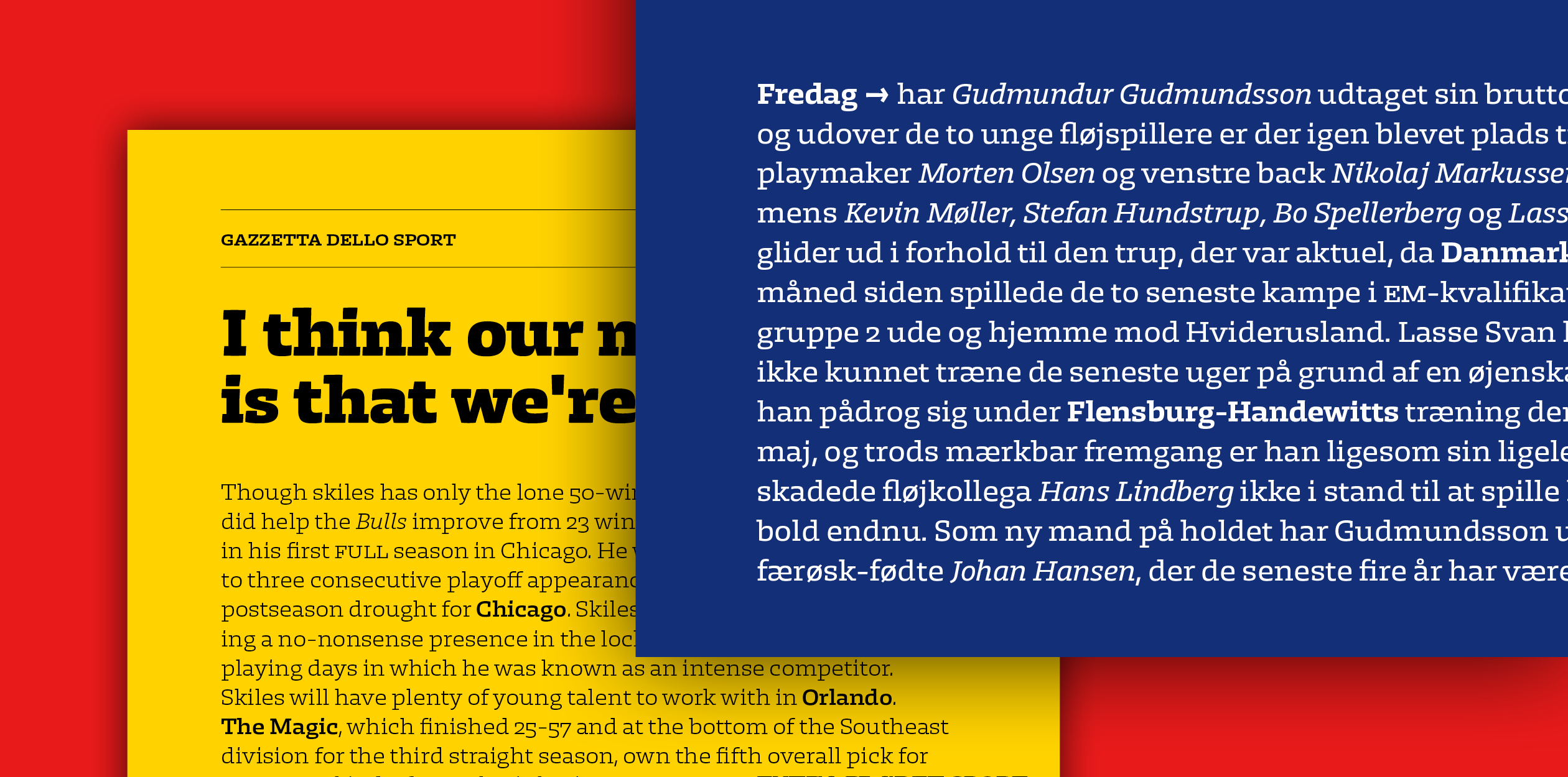
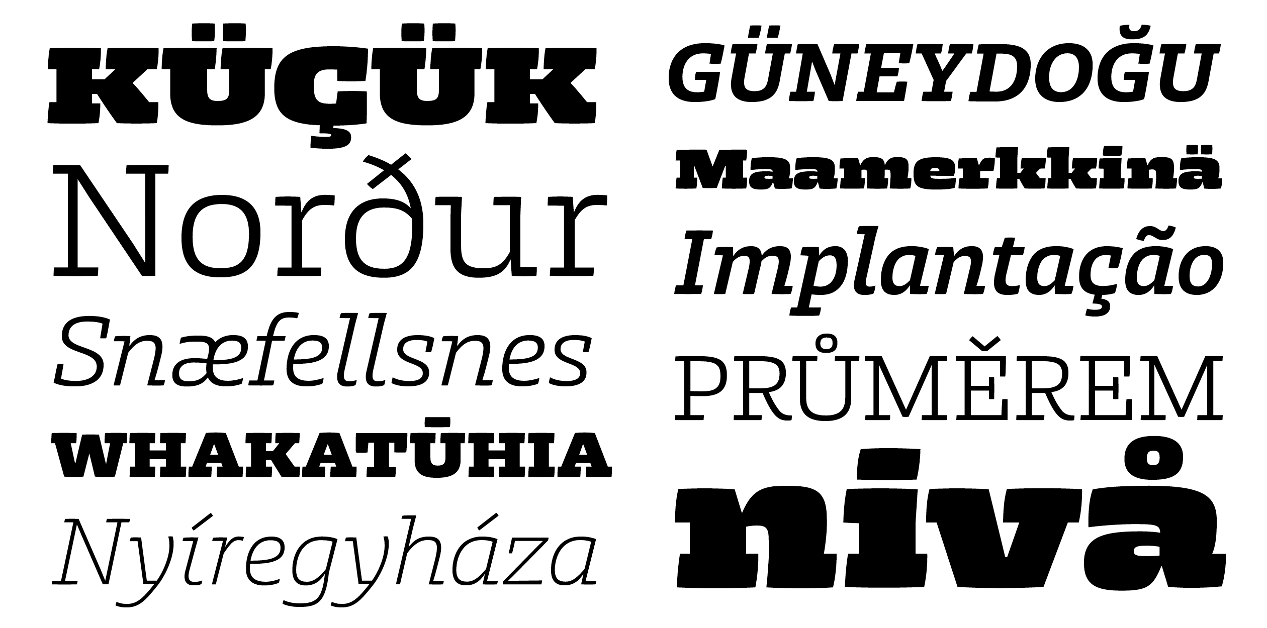
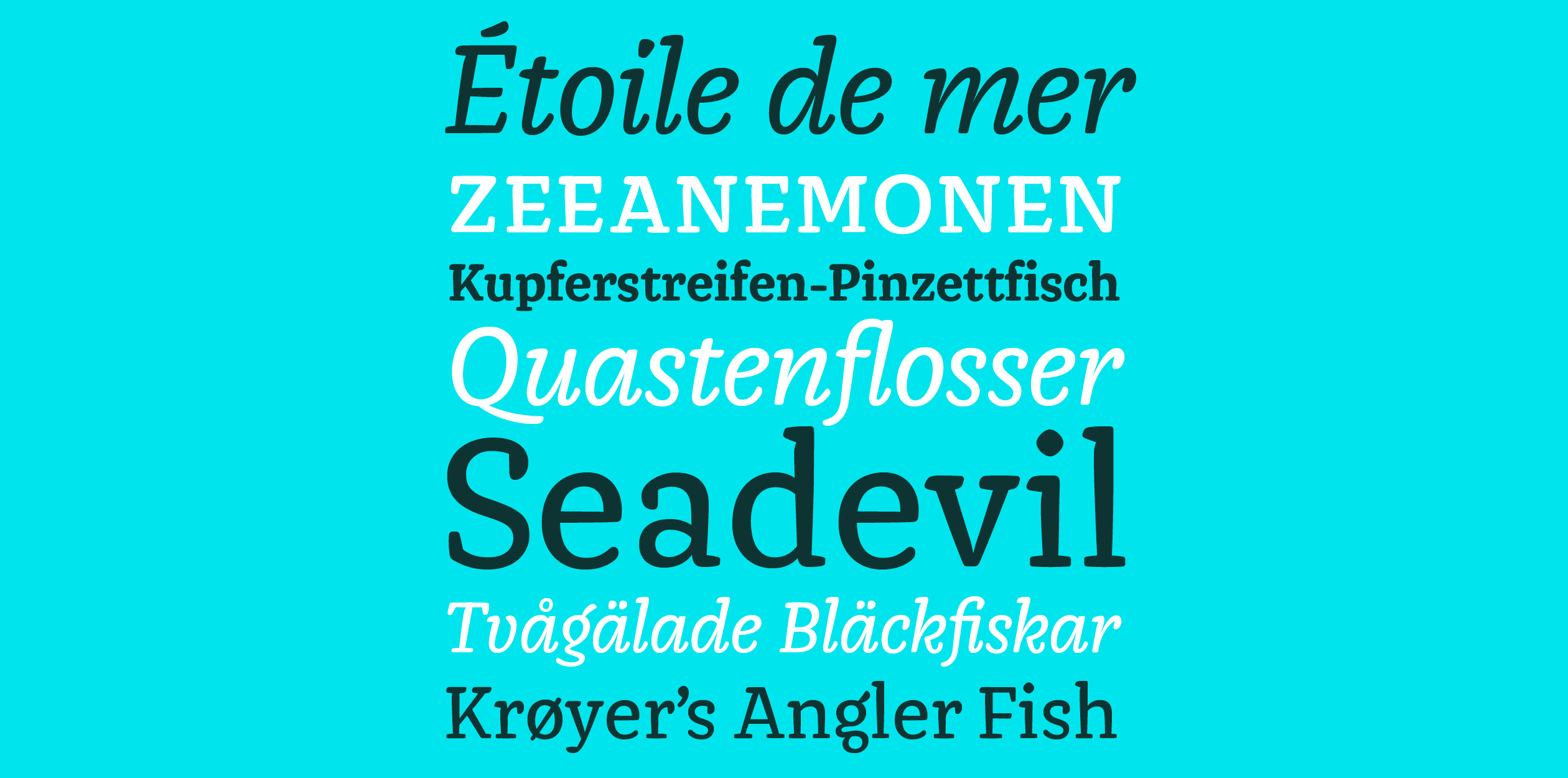
Koppla is an optimal type family for text in Korean Hangul and Latin with little to no typographic editing. It is a serif typeface which has a translation contrast based on broad nib writing. Latin and Hangul text texture are compact and solid, also alignments are harmonious thus they work together well. It consists of five styles: title, bold, book, text and italic for a text style and supports many languages with Latin script, as well as Korean. Koppla has a hybrid upright style italic for Latin and reverse contrast style italic (emphasize) for Hangul which came from various research and experiments to figure out how to emphasize and differentiate Hangul italic (emphasize) from Hangul regular text style effectively. As for naming, Koppla is a Swedish word which means switch, link and connect those meanings were well matched with this type family’s idea. Furthermore, it starts with Ko (stand for Korean) and end with La (stand for Latin). So Koppla links Korean Hangul and Latin script. Minjoo Ham got a motivation about Koppla type family form The Stroke Korean version (written by Gerrit Noordzij, Ahn graphics, translated by Jiwon Yu, 2014) and Multilingul typography seminar (2012) from Typo school in South Korea.
Minjoo Ham is a type designer, typographer and a graphic designer from South Korea. She studied graphic design at the Seoul Women's University (2005-2009) where she discovered her interest in type design. After graduation, she worked in S-core (CoreFont) as a font designer before completing TypeMedia master course at the Royal Academy of Art in The Hague. She is interested in research and type design of Latin and Hangul multi-script.
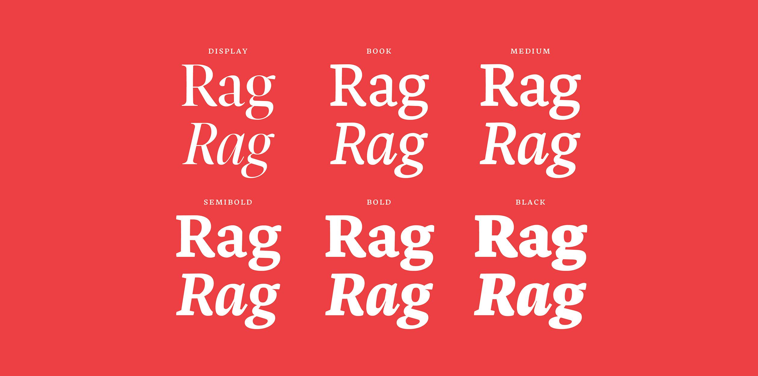
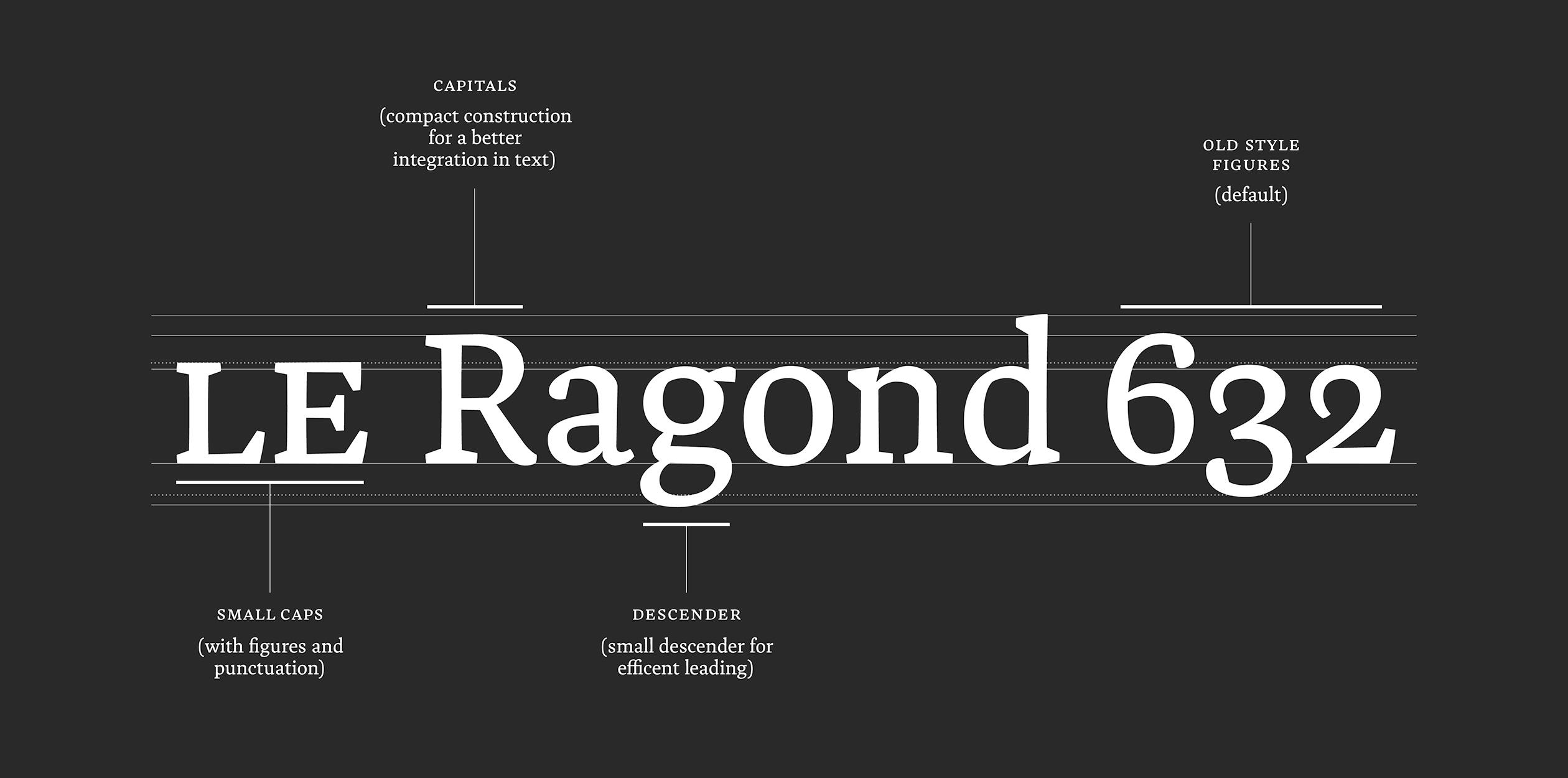
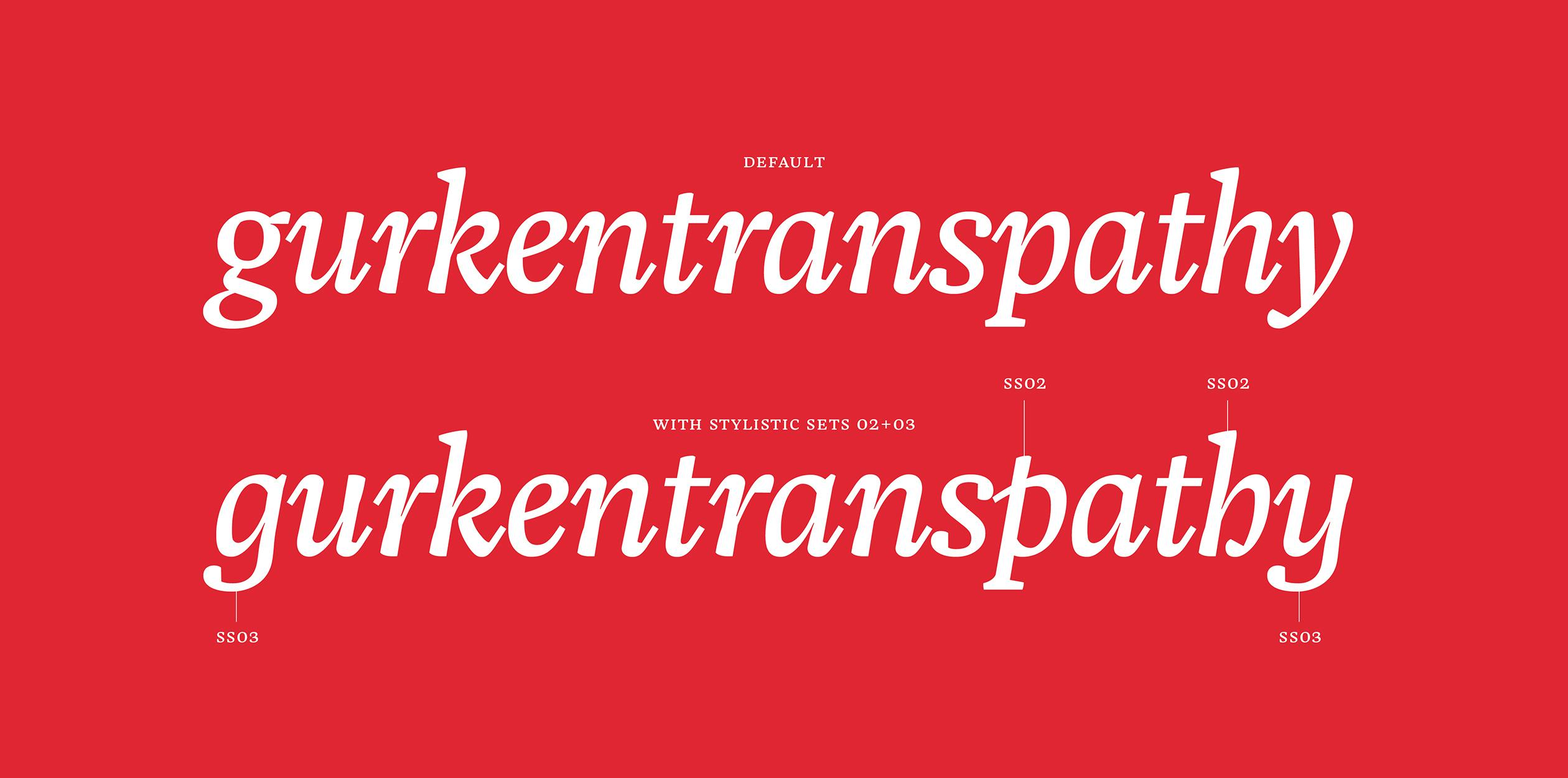

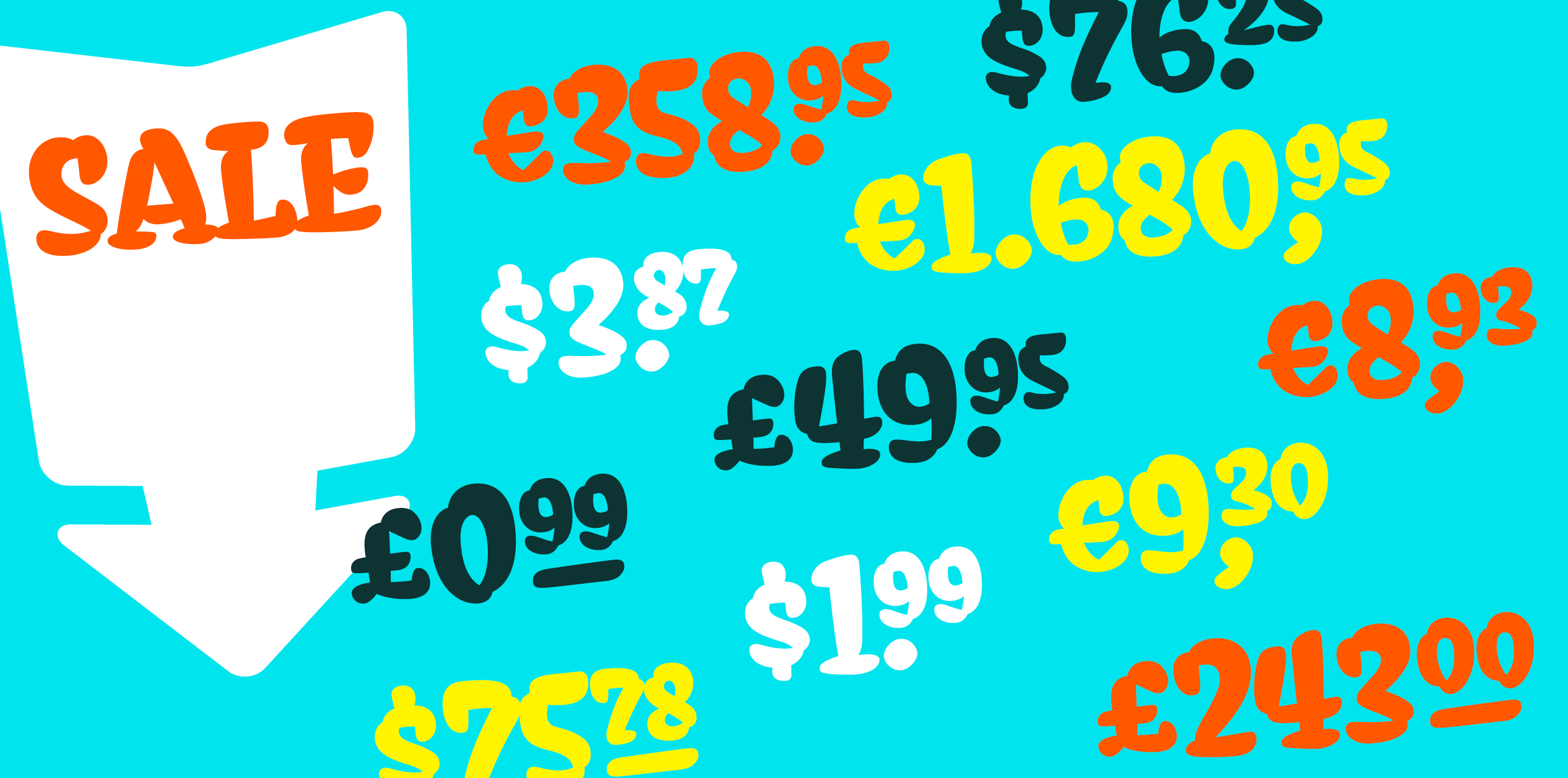
Elma is an ugly-duck-workhorse for texts of all sorts with an optimised spacing for the sizes of 9–11 PT. Elma has a robust construction with chunky-esque serifs, subtle rough and slightly quirky details but resonates in a yet serious appearance that combines traditional elements with modern functionality. Elma comprises five weights in ten styles (Book > Black, upright and italic). A rather narrow design and short descenders are made in favour of an efficient layout. Elma is accompanied by the beau Frederick, a display family that is deeply rooted in the design of Elma. The display styles are defined by hairlines and a more narrow construction, with a tight spacing optimised for big sizes. Tender details, hairline punctuation, small caps and an italic that melts on the tip of your tongue are completing this family. A number of sometimes questionable OpenType-features are making these families a delight and or dismay to work with. (Please feel free to contact me in case you are interested in the process of Elma and Frederick and everything that fell by the wayside)
Philipp is a typographer, type and graphic designer and likes to talk about himself in the third person, like apparently every sane person does. Before typemedia Philipp studied communication design at the Muthesius Academy of Fine Arts and Design Kiel (MAFAD), Germany. He started type design initially to fulfil his own typographical needs but got hooked on it somehow. Philipp graduated with a BA of Arts in 2014 and went on to study in The Hague at the Koninklijke Academie van Beeldende Kunsten (KABK). Philipp moved to Berlin after graduation from typemedia in hopes of becoming one of the cool kids.
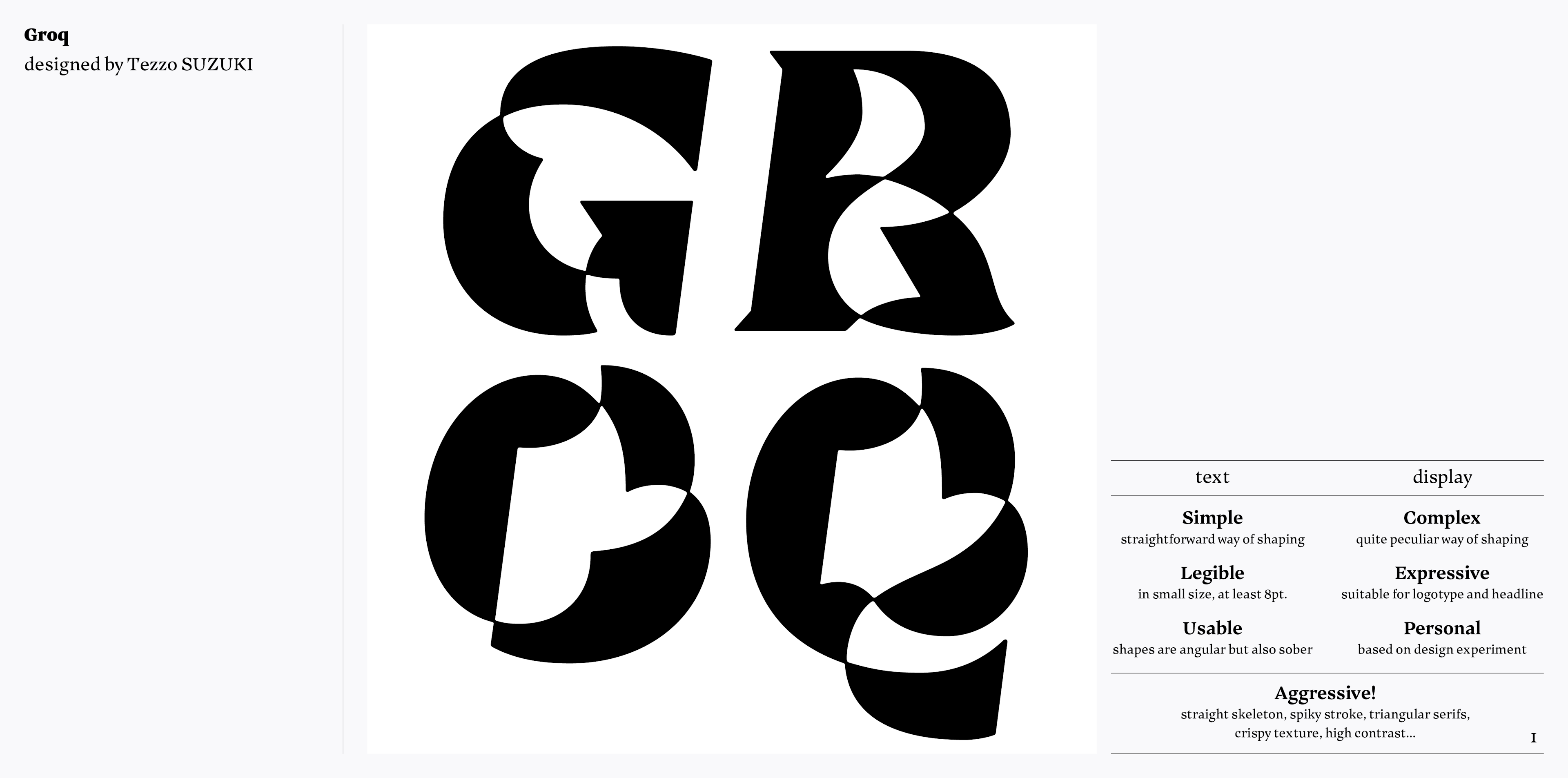
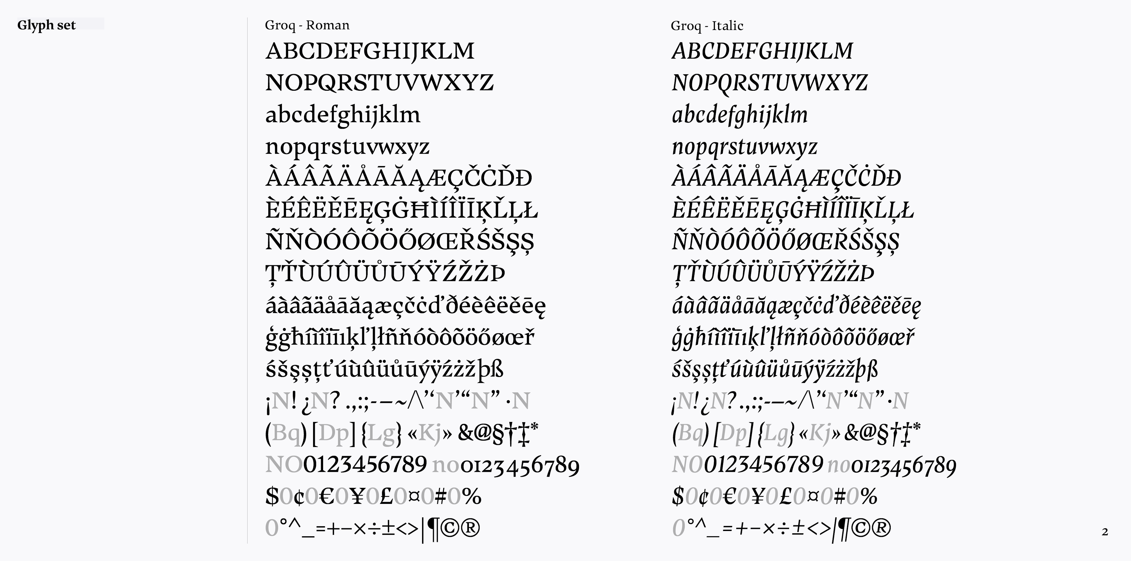
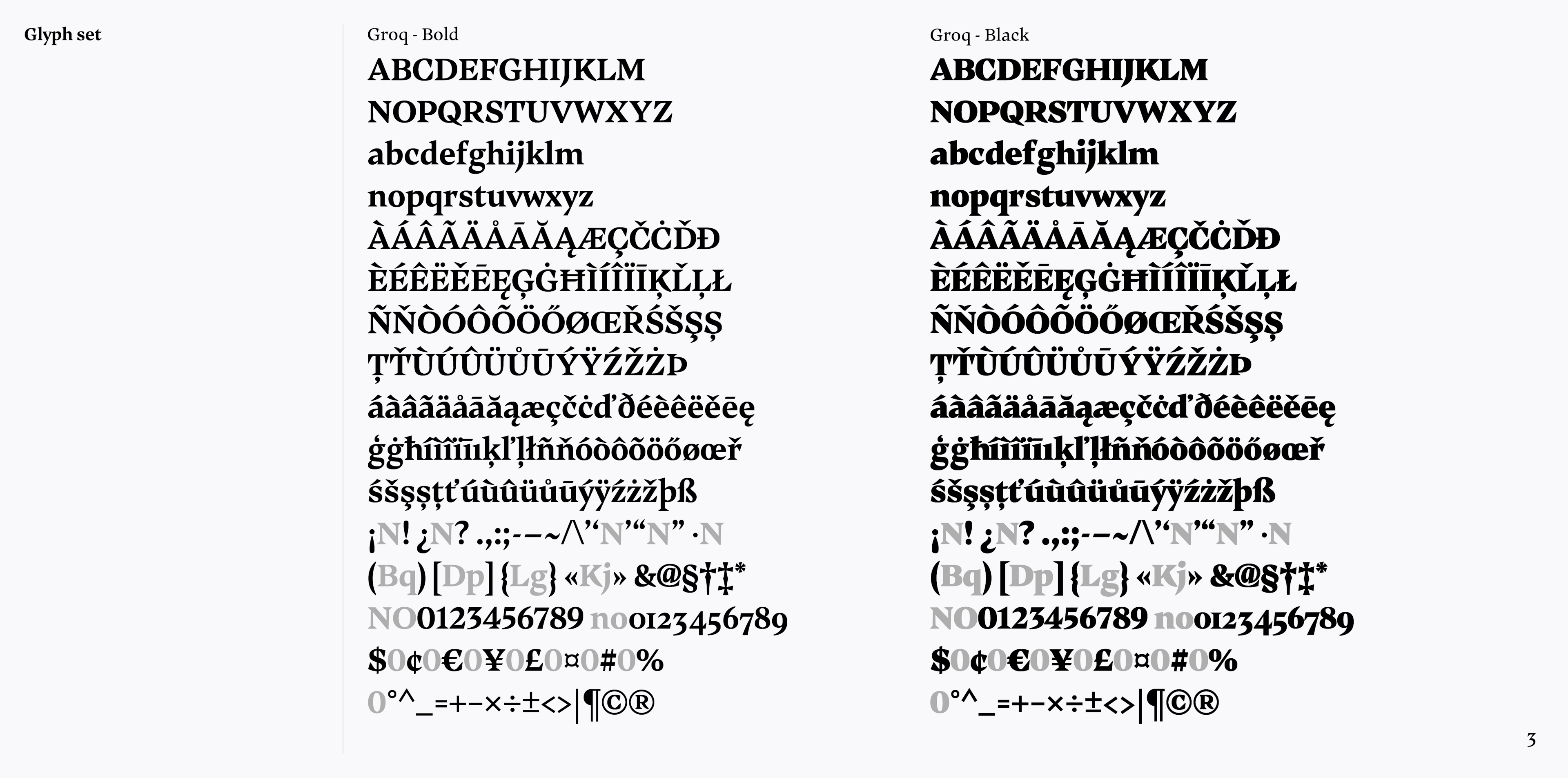
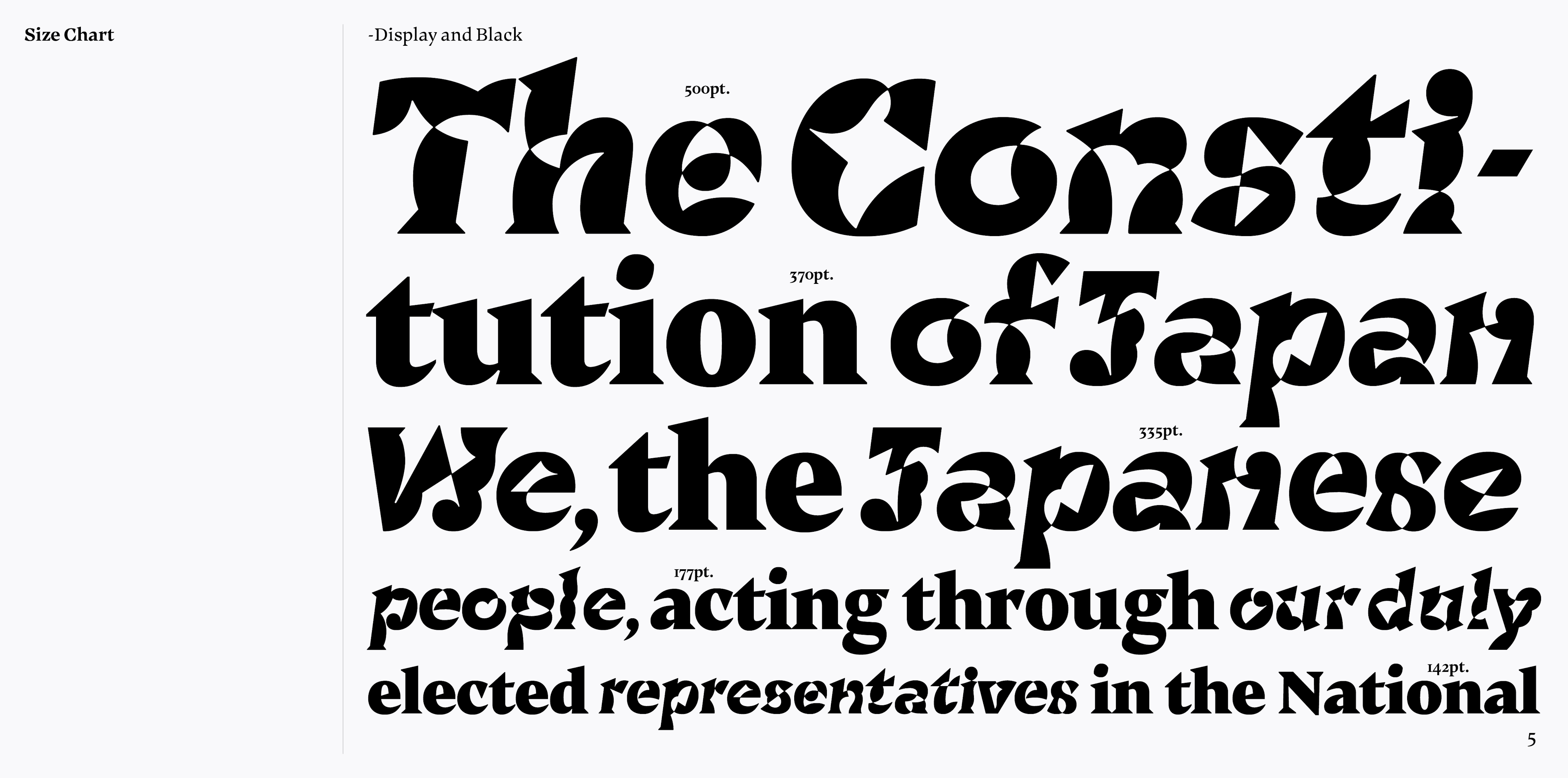
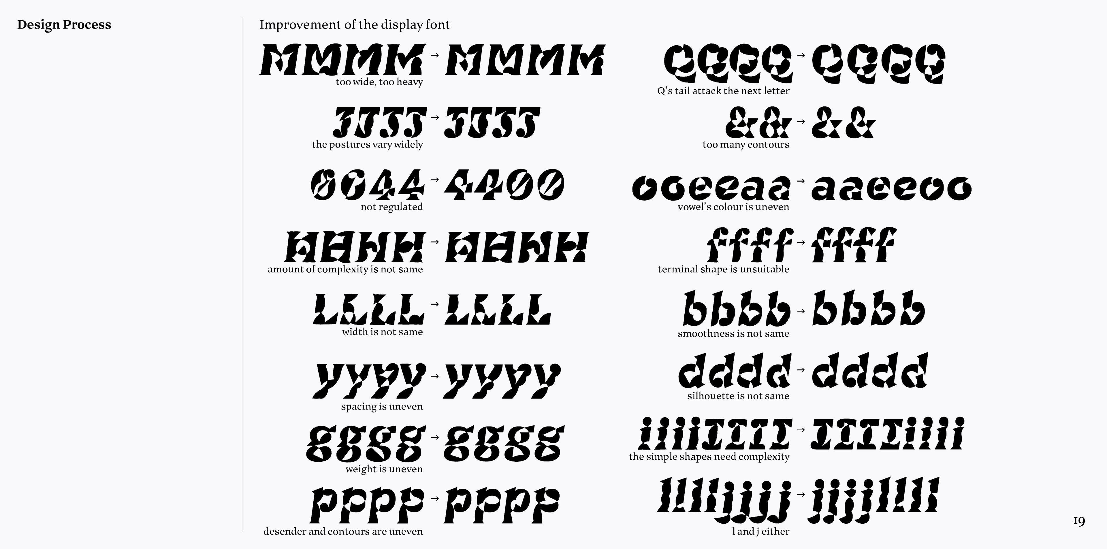
A type family including an extreme display font and companion fonts for text. These two have different design process but share some characteristics such as a simple basic skeleton, spiky serifs and the crispy texture. The Display might seem broken black letters at first. But actually each shape is drawn with one continuous stroke, it means both outer and inner contours are integrated into one loop. And also in this font you can use four alternates for all glyphs. During the t]m year, I often thought about the Latin alphabet in comparison with Kanji. Latin type is highly regulated and normalised, on the other hand it is almost impossible to control the Kanji character’s shapes and colour in such a strict way. But it also can be said Kanji’s unpredictable shapes have made texture freer and more vibrant. Though stylistic alternates usually work to embellish text, but in my case I made them to introduce a complexity, vibrancy and a slight confusion which is common in Kanji into Latin text.
A graphic designer born in Kanagawa, Japan in 1989. After graduation from Tokyo National University of Fine Arts and Music in 2013, he had been working as a freelancer. He put the passion into some different issues such as architecture (he was actually working as a sub-contracted graphic designer in an Architects firm KKAA in Tokyo for a year), comics (he made a comic book for the thesis project for a bachelor degree), and illustration (most of his works are based on hand drawn illustrations), but the biggest interest has always been about the characters. It includes not only type design but also calligraphy, lettering, semiotics, etc.
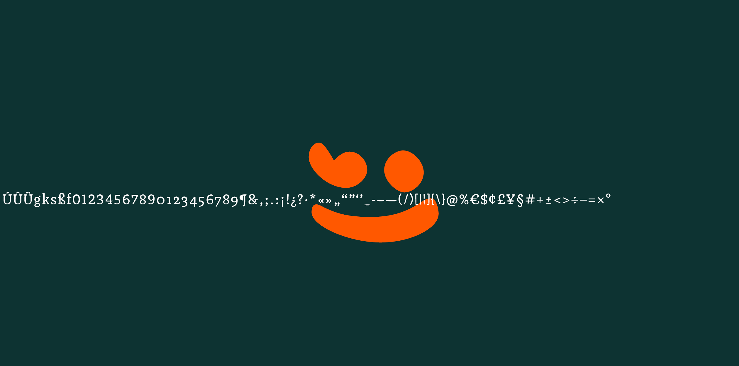
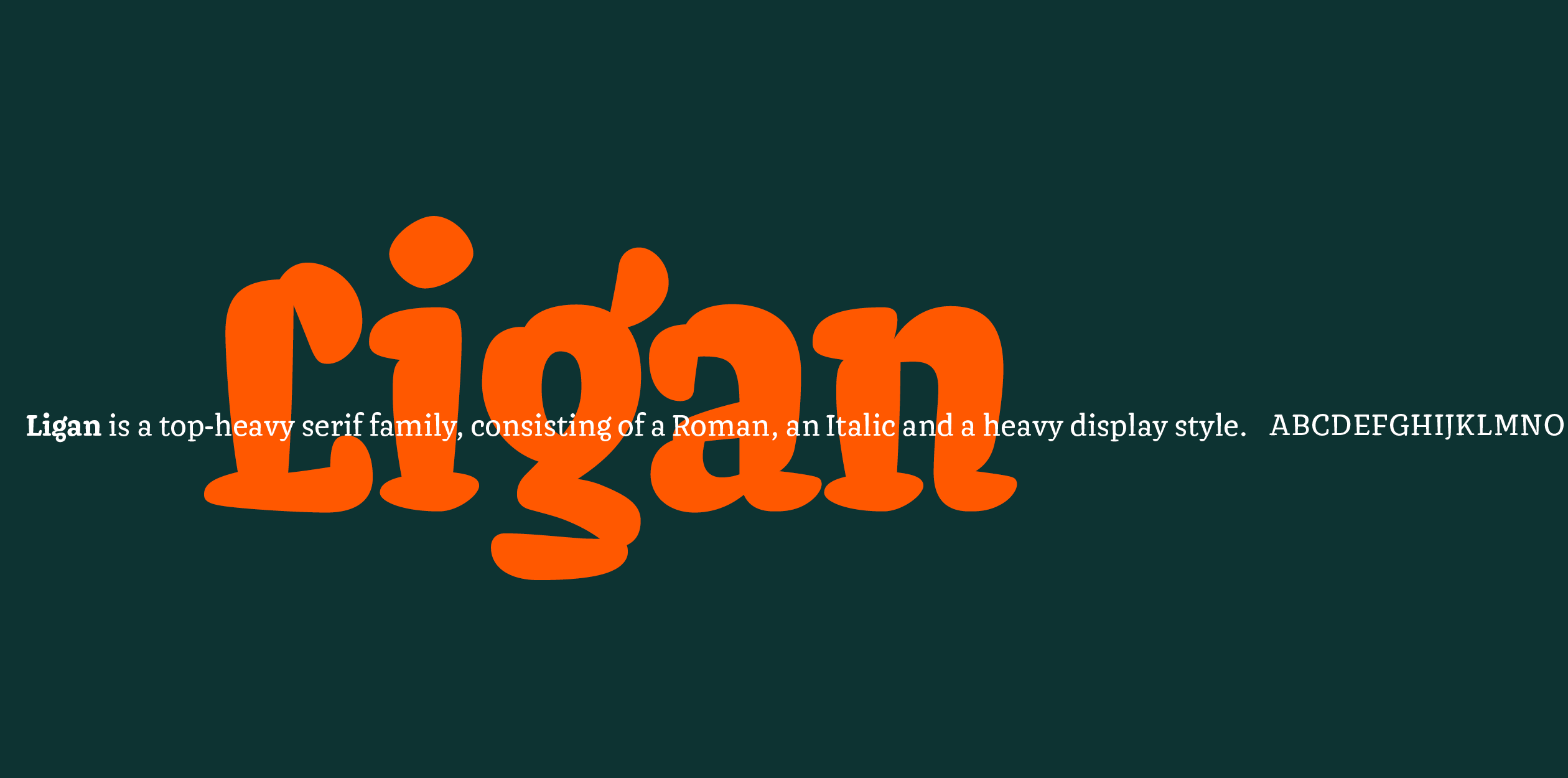
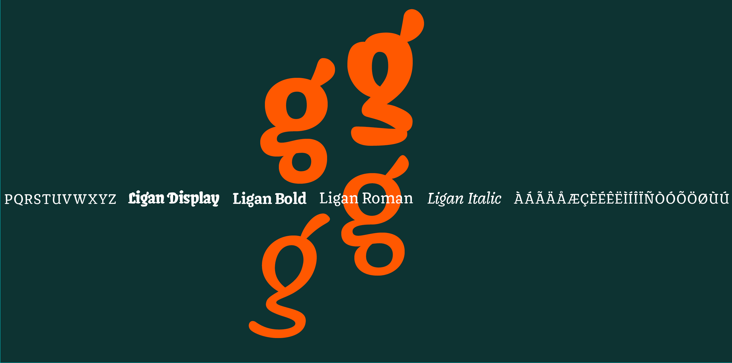
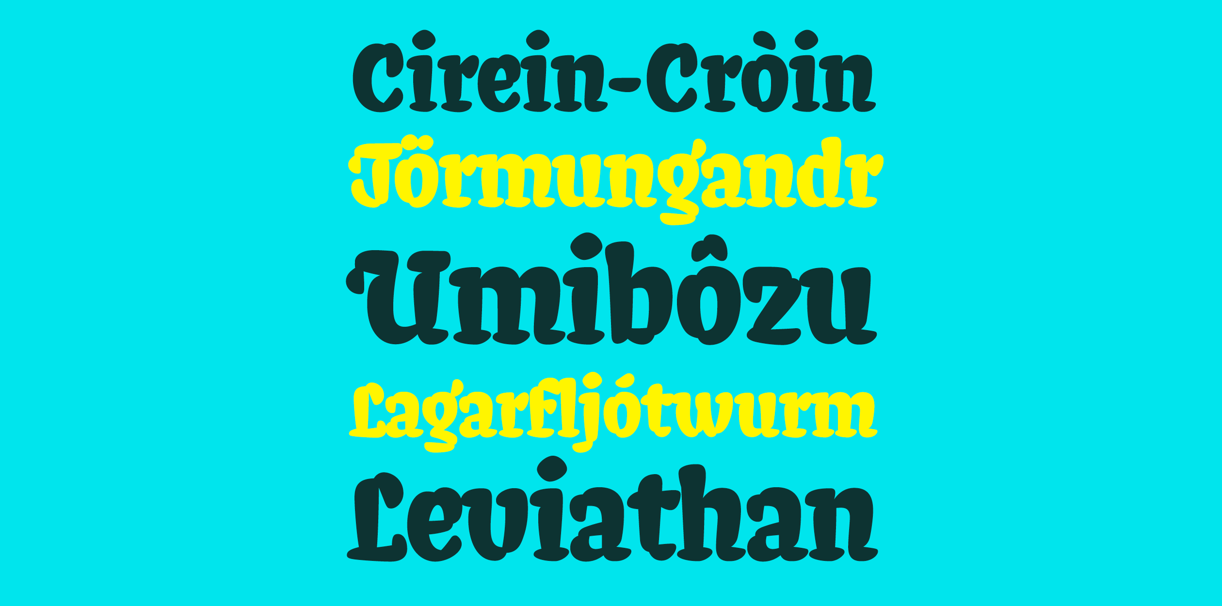
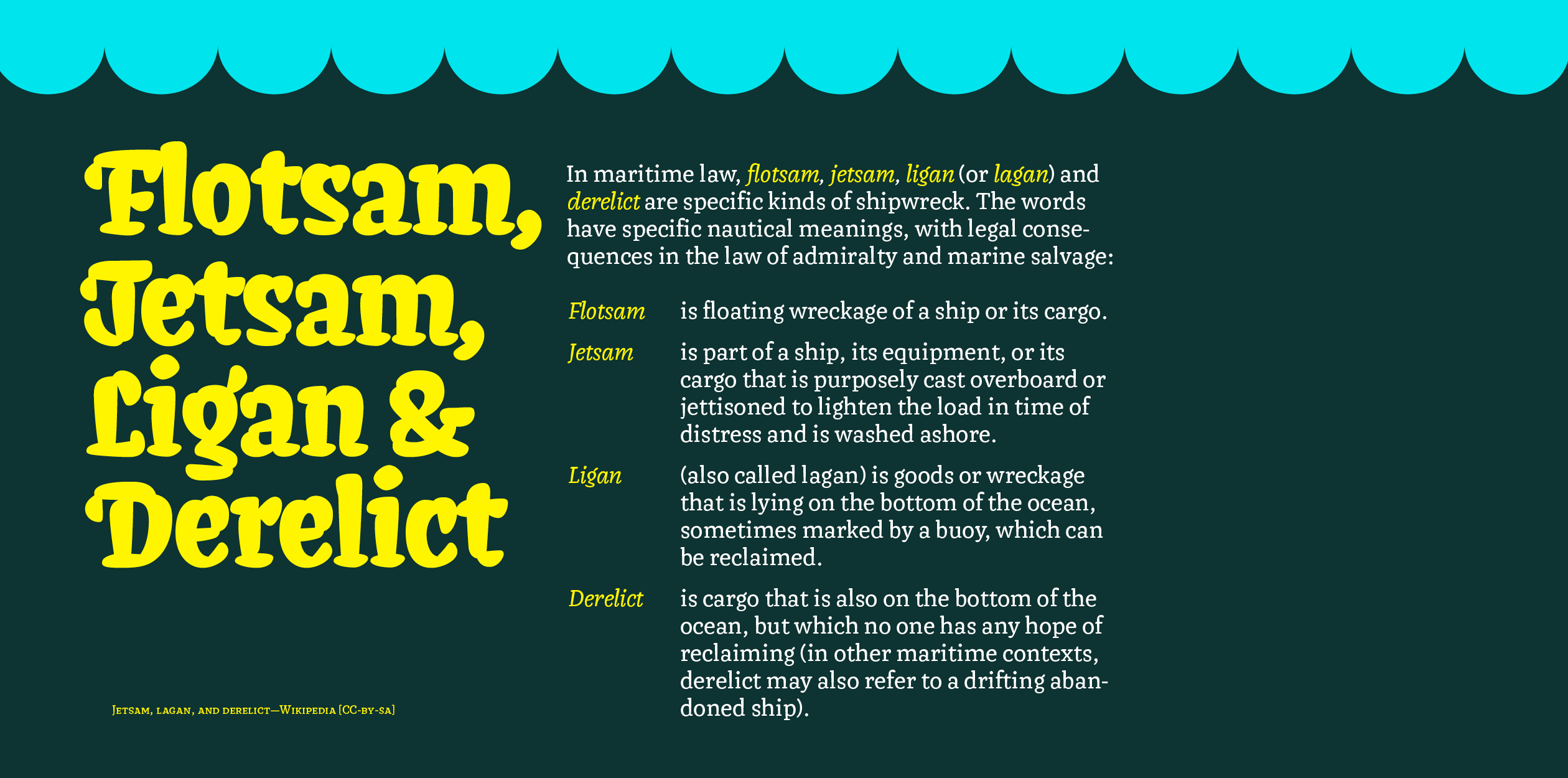
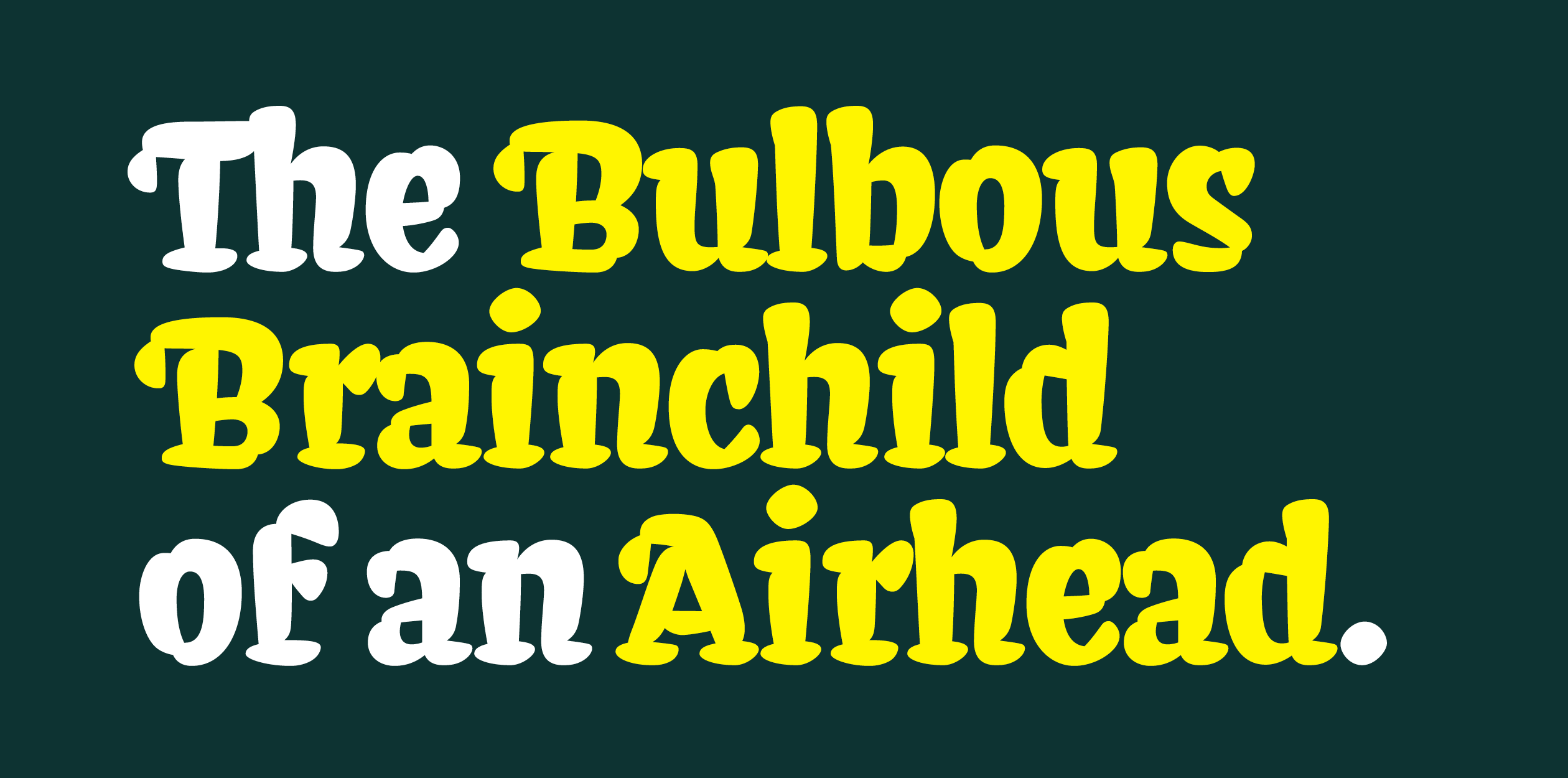
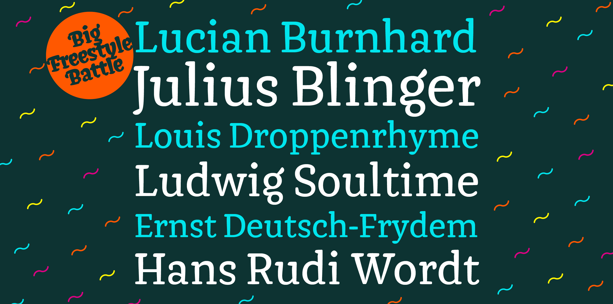
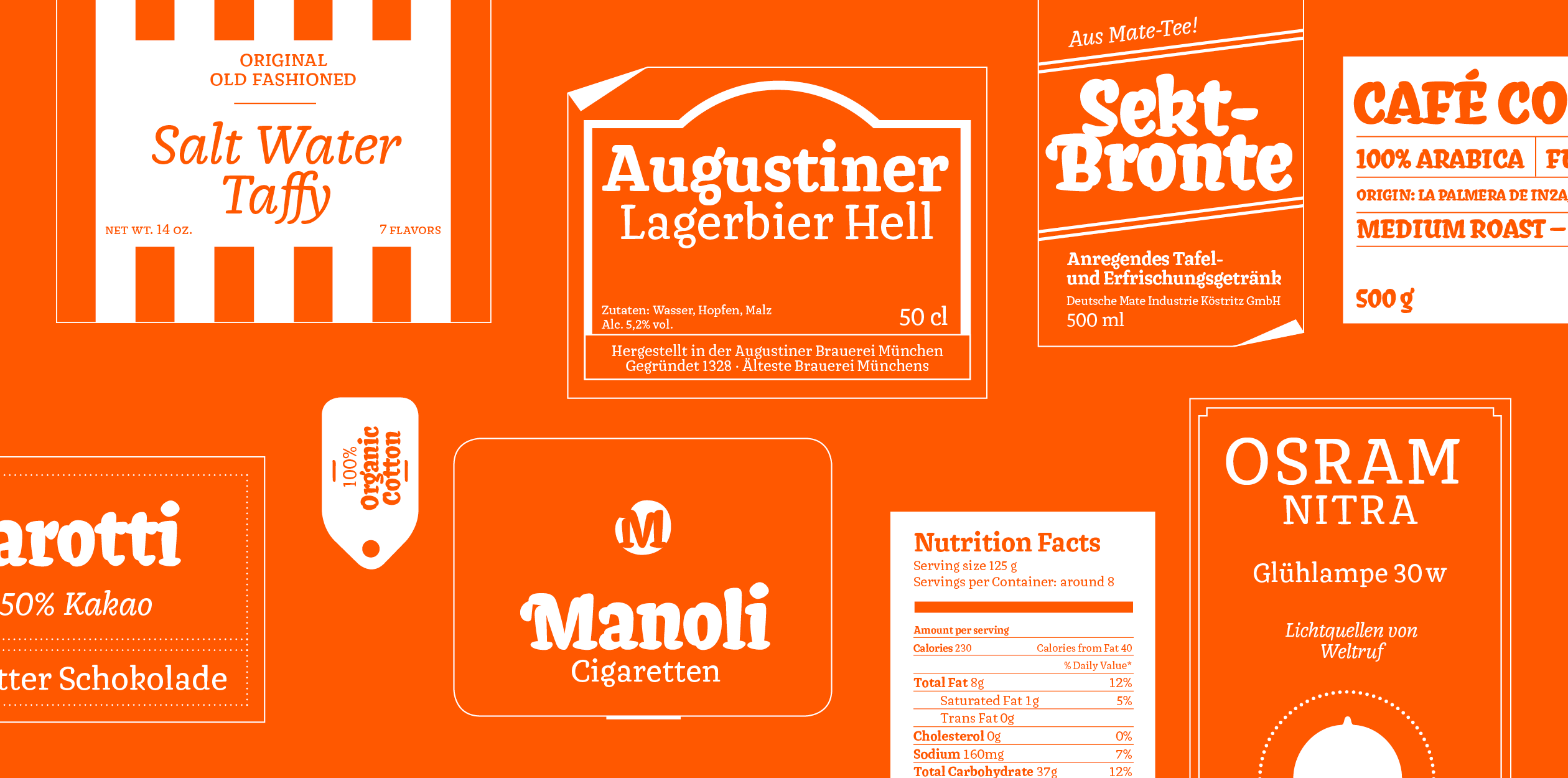
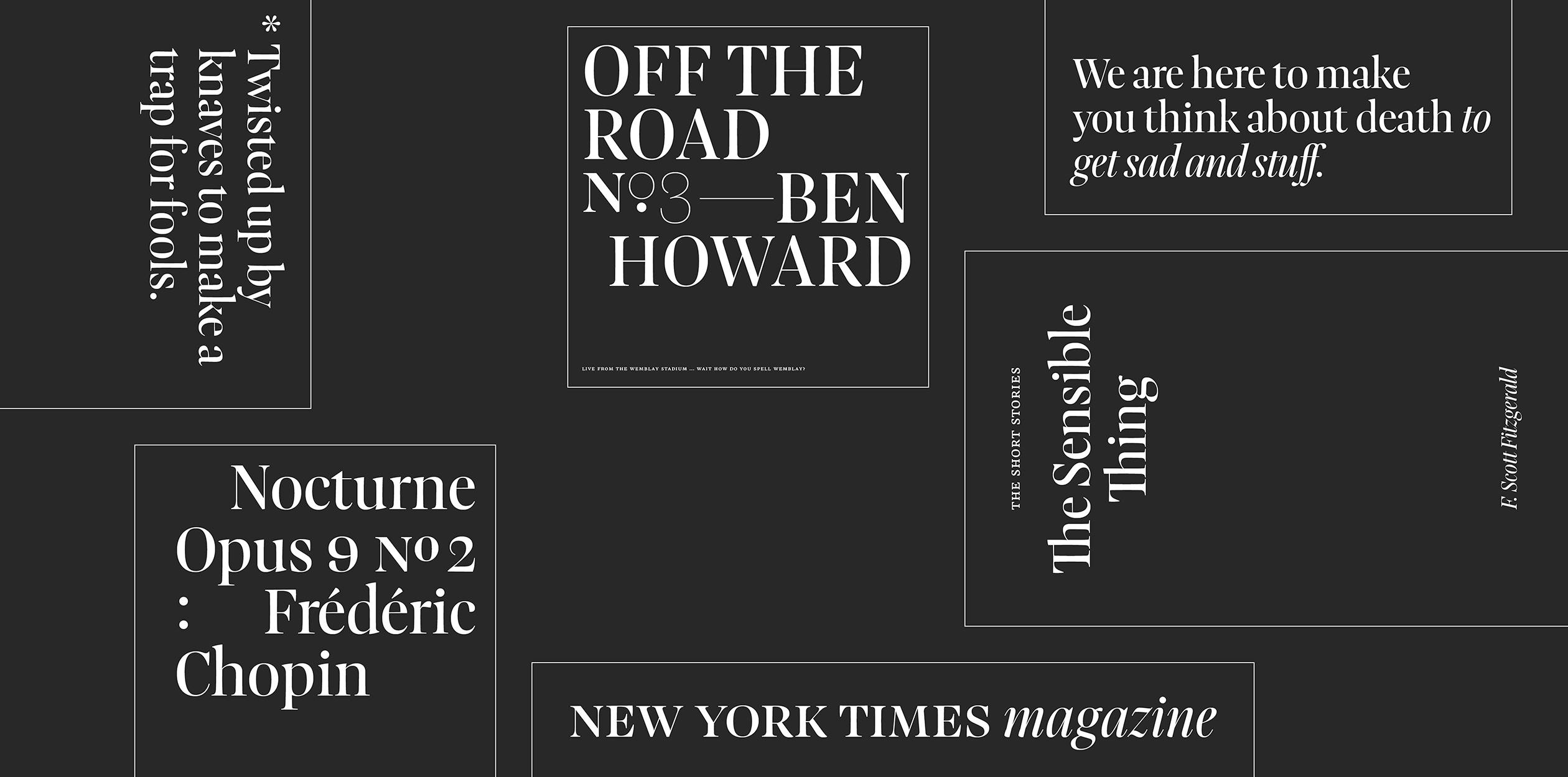
Ligan is a serif typeface family, consisting of a Roman, an Italic and a heavy display style. It features a top-heavy weight distribution that creates a unique word image. The terms heaviness and weight may be misleading though — Ligan’s soft letters look more like being inflated with bit too much helium, giving a balloonish, whimsical appearance. The hefty display style is best used for all that needs to be said big and loud. It’s reminiscent of a signpainters’ brush lettering — written with a lot of paint, making thick, bubbly, round strokes. The Roman and accompanying Italic’s weight and serif design make it more suited for text, but it’s also put to use best in informal settings. All of the styles can be used with each other or individually. Ligan can be used for posters, storefronts, yardsales, record sleeves, packaging for good things like candy or beer, birthday cards, carnival rides, flyers, baseball caps, books and everything that is not the Wall Street Journal.
Tilmann is a designer from Berlin, Germany. Before studying at TypeMedia he worked as a freelance designer in various fields, such as graphic design, lettering or illustration. His previous degree was in Visual Communication from the Berlin Weißensee School of Art.